Continuing where we left off last time, let’s talk about documenting a Tableau workbook this week. The thing is, as much as I like writing blogs and documenting my process, my workbook for the HIPAA breaches dashboard remake, quite frankly, is a mess, so I’m writing this blog for two reasons: a) to show you how you can document your own Tableau workbook and b) to document mine at the same time.
You never realize just how useful it is to document as you go… until you haven’t been doing it. That’s what I realized when looking at all the calculated fields I made in the reviz. It’s been a while since I last looked at it in detail, which makes it more difficult to retrace my steps. (If only Tableau was like Photoshop, which has a little window tracking all the changes you made.)
Naming Calculated Fields
Luckily, I did do something that should help jog my memory—I gave each of my calculated fields simple, descriptive titles, and wrote what it would be used for in caps at the very beginning of the calculated field, so that I could search for it more easily. For example, I added COLOR: to the beginning of these calculated fields, so I know I’ll be adding them to Color on the Marks Card:

Categories I’ll add at the beginning of calculated fields include:
- COLOR:
- FILTER:
- LABEL:
- TOOLTIP:
To make other things easier to find with the search bar of the Data Pane, I’ll also append the word “Set” or “Parameter” at the end of the name. Parameters have their own section at the bottom of the Data Pane, of course, but I find it more convenient to be able to search for everything at once.
Numbering Calculated Fields
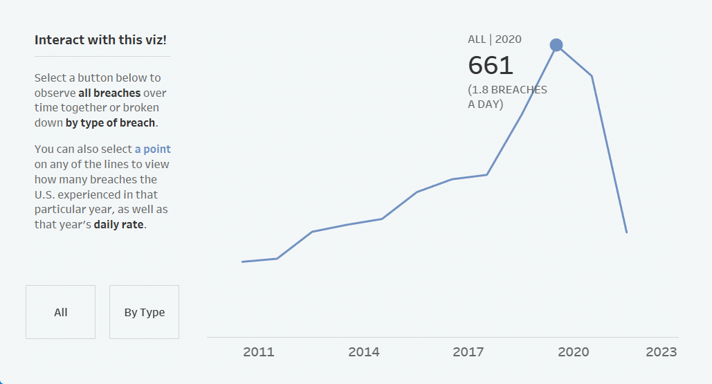
You can also number your calculated fields in the name, to indicate the order of steps you took to build a particular element of your view. For example, in the first section, when you click on a point, the corresponding label with the number of breaches and the daily rate of breaches for that year will show up.
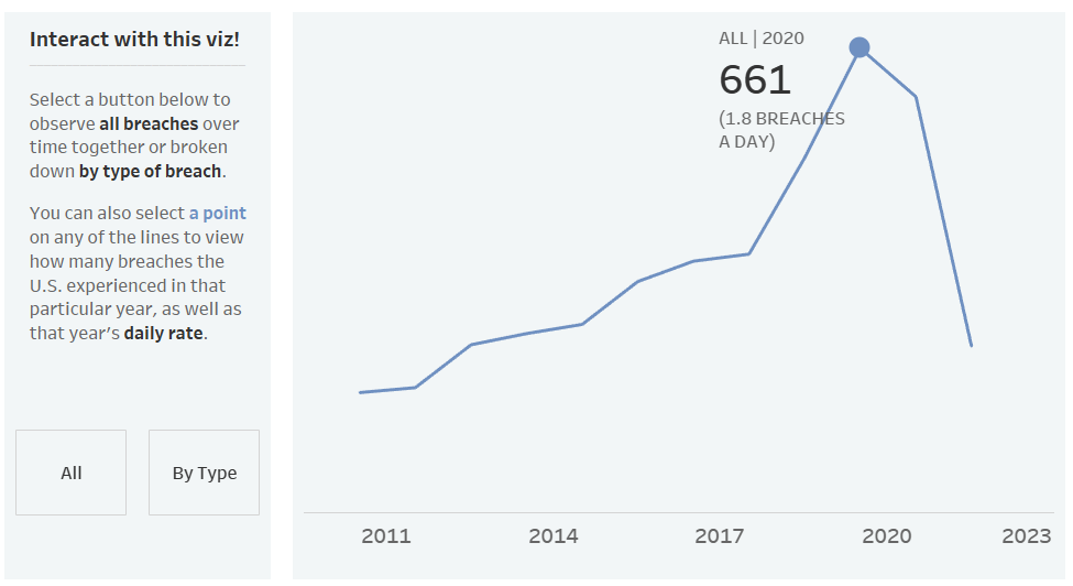
But before I could get that label to show up, I first needed to create the Selected Year Parameter, then a calculated field to connect the parameter to the view to return the year, yet another calculated field to return the number of breaches that occurred in that year, and so on.
Grouping Fields in Folders
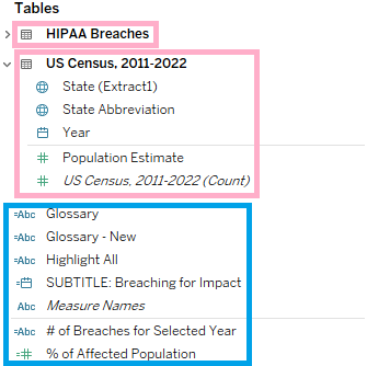
To make the numbering of your calculated fields even more powerful, you can group the relevant fields in folders, instead of tables. When they’re grouped by tables, all of the fields are grouped by dataset (or data source). Any calculated fields that only use fields from one dataset are grouped under that particular dataset/data source (e.g., calculated fields for the All Breaches vs. Type of Breach drill-down in the first section), while other calculated fields that make use of two or more datasets will appear under all the tables (e.g., anything pertaining to the % of Affected Individuals by State). See the screenshot below for an example, with the Tables in pink boxes and calculated fields using fields across datasets in a blue box:
To group by Folders instead, select the upside-down triangle next to the search bar of the Data Pane, then Group by Folder.

It’ll look like nothing has really changed, other than that you don’t have the table groupings anymore, with all the fields laid out in one list. That’s because you need to create the folders yourself. To create a folder, right-click a field and select Folder, then Create Folder…
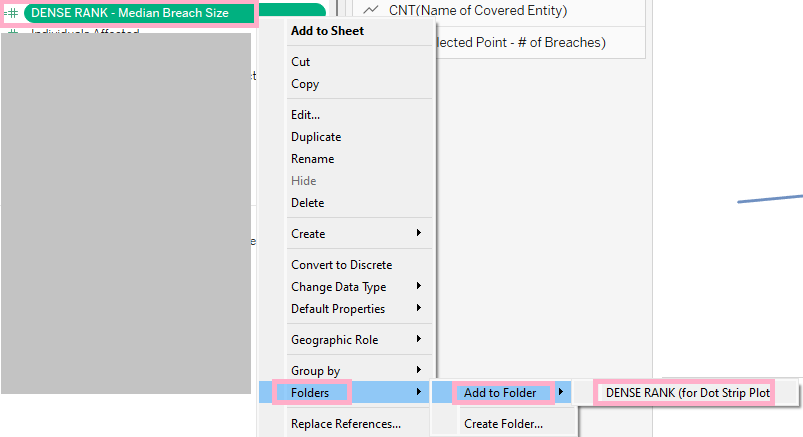
Here’s an example of me creating a folder that will hold all my DENSE RANK() calculated fields for the dot strip plot in the very last section of my dashboard, which compares how each state ranks with each other across different metrics (everything else is grayed out because, again, my workbook is currently a mess).

Now the folder contains one calculated field. To add more, I can right-click another field, select Folders > Add to Folder > [already created folder].
Or, to move multiple calculated fields to the same folder at once, I can also select a calculated field, then CTRL to select desired fields that aren’t in order, or CTRL + SHIFT to select desired fields that are in order (which could be the case if you’ve labeled calculated fields serving similar purposes with similar naming conventions), and drag the fields to the folder.
I may even recommend starting with folders before renaming calculated fields—if you don’t have the time to rename your calculated fields to number them, grouping them in folders would make it easier for you to number them later. Grouping by folder also helps prevent your numbering from going up too high. I easily have over 30 calculated fields in this workbook, so this would be a real problem for me. I’d also suggest numbering your parameters and worksheet/dashboard actions, too—this way, you know which calculated fields go together with which parameters and actions, despite them all being located in different areas.
Adding Comments inside Calculated Fields
Add a comment in the calculated field to save future you and/or others time in understanding a calculation by describing/explaining what it is doing.
To add a comment in your calculate field, start the note with double-slashes (//), like this:

I intend to reference this workbook more in the future whenever I need to review how to create a certain parameter, so I’m documenting every calculated field in plain language, even the ones that are easier to understand, just in case I need it, whether I forget how parameters work on a basic level or need to explain it to someone else. In the case of the latter, I’ll always have an example ready to copy and paste.
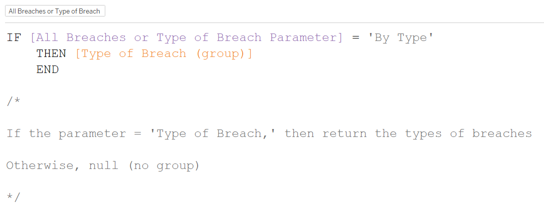
To add longer comments and avoid having to start every line with //, you can wrap a comment (or edit out parts of a calculated field that aren’t working or needed anymore in a slash and asterisk (/* comment here */).
You can have the /* and */ on the same lines as the comments, but I like putting line breaks in between to make comments easier to read (and find), like below:
Adding Comments (or Tooltips) to Fields
Default comments to calculated fields are tooltips that appear when you hover over a field. I like them a lot because if I need a little more context than provided in the title of a calculated field, I can save myself a click by hovering over it. Another thing I like about default comments is that you can add them to plain fields as well (understandably, you can’t edit fields that are in the data and thus add comments inside those), so if there are fields in the data that require more information, you can provide it in the tooltip.
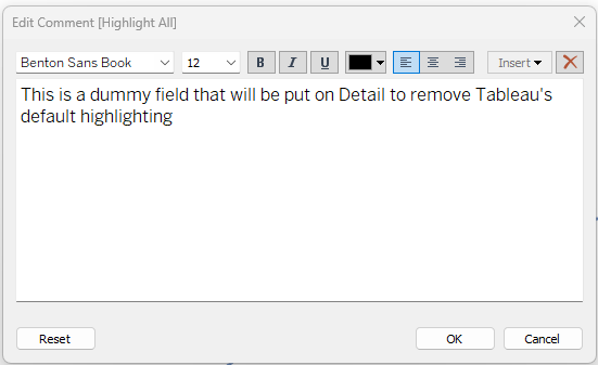
To add a comment to a field, right-click a field, then Default Properties > Comment… In the example below, I am adding a comment to the dummy field I’m using to remove the default highlighting Tableau does when you select an object (blog on that in the future).

You can customize the font type and size, too!
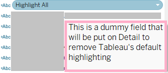
Ta-da! Now, when I hover, I’ll see the comment I added to the field (in the pink box):
Naming Workbook Tabs
Let’s step out of calculated fields now to organize the rest of the workbook. Similar to naming calculated fields, I give each tab a descriptive but concise title, so that I have a general idea of what it holds without having to click it. Tableau helps you out by providing a little preview of the sheet when you hover over it, so I don’t prioritize naming them as much as I do with calculated fields; I usually name the sheets after I’m done building them. Also, like how I name calculated fields, I’ll start the tab name off with the what section it pertains to. If it’s a BAN, I start with, “BAN - [type of BAN].” For this particular dashboard, I also named them as Section 1, Section 2, etc.
Color-coding Workbook Tabs
You can color-code your tabs to save yourself time reading the tab names. Right-click the tab, then select Color, then the color you’d like to use.
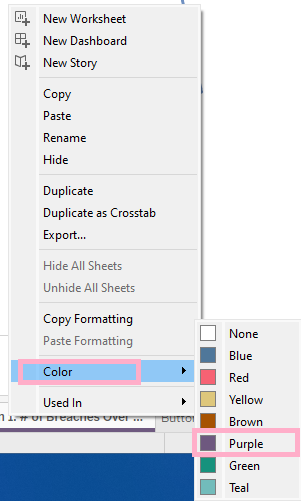
For this dashboard, I color-coded the sheets by the section they belong to. You can also color-code them by the type of sheet they are, like orange for ‘testing/troubleshooting’ sheets. It doesn’t matter how you go about it, as long as you’re consistent within that workbook (sort of like with visualization best practices—one color should only mean one thing to avoid confusion).

Crosstab(s) of Calculations
Naming and numbering your calculated fields are good documentation practices and all, but if you want to see how they’re all working together without having to open up a new sheet to test it out every single time you need to jog your memory, consider creating crosstabs of your calculations to show what they looked like each step of the way.
These crosstabs are really useful for showing the “in-between” steps, as it’s unlikely that you built complex calculations all in one go, for two reasons. For one, it would’ve been more difficult to troubleshoot one complex calculated field (and easier to run into errors—easier to have to troubleshoot) than troubleshoot each piece/calculated field at a time, and for another, you wouldn’t have been able to reuse the different pieces in other calculations if needed.
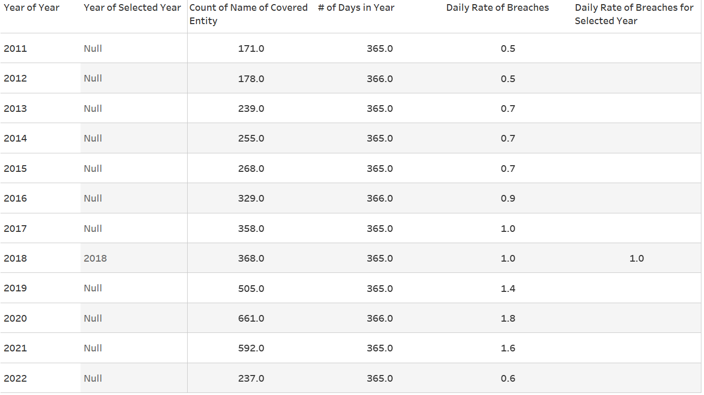
For example, I created a calculated field for the Selected Year with the corresponding parameter for Section 1, showing the number of breaches over time. Again, when you click on a point, the label appears, showing the number of breaches and the daily rate of breaches.
Instead of writing out the Selected Year part of the calculation for both the number of and daily rate of breaches over and over again, I just reused the original piece in the two new calculated fields. Below is a screenshot of a simplified crosstab I used to check that everything was working properly for the calculation showing the daily rate of breaches for the selected year. As you can also see, I haven’t gotten around to numbering my calculated fields yet, but doing that will help you put together your crosstabs more easily.
Captioning Your Worksheets
My final tip for documenting workbooks is one of my favorite ones. Did you know that you could add a caption to your worksheet? Tableau’s default text for captions describes the view, which you can edit to better describe it for screen readers, just like if you were editing Text on the Marks Card. In addition to describing the view, you can also use the caption to document the steps taken to build the view. I’ve been documenting how I built some Workout Wednesdays this way, so that I’ll be able to reference it in the future. If your organization uses a platform like Notion for longform documentation, definitely do that, but know that captions offer you another venue for explaining or describing how calculations and worksheet/dashboard actions work together.
To turn on the caption, go to a worksheet, select Worksheet at the top, then Show Caption.

A little caption under your view will then show up, with Tableau’s default description based on what’s in your view.

It’s not particularly descriptive in my opinion (especially since Tableau transcribed YEAR(Year) as just “Year Year”), so it’s best to word it yourself by double-clicking on the caption.

You can even click and drag the caption to wherever you want! If the caption is short, I like to keep it under the Marks Card.

If it’s particularly long, I will stick it between in between the Filters/Marks Card and the view:

That’s all for this week! I hope that you’ve found this blog useful regarding getting ideas for how to document your own Tableau workbook. As I’ve previously mentioned, I have found that documenting my work through this blog has gone a long way in helping me understand certain concepts while also helping others, so documentation is beneficial for a multitude of reasons. Until next time :)