Build your Team
Enhancing your data team with ours
Our consultants come armed with both technical and soft skills to support you to make the most of your data.

The Data School has been paramount to our success at JLL. It has allowed us to bring in highly skilled Tableau and Alteryx consultants. It saves considerable time trying to recruit contractors as I know their skills and training are to the highest standard. Over the past 5 years my team has developed analytical insights which have generated multi million dollar savings of which a considerable amount can be attributed to the Data School consultants we have had working on projects.
Paul Chapman, Global Director of Performance Management, BI and Innovation at JLL

Alteryx
Partner of the Year
EMEA
Tableau
Community Impact 2024
EMEA ESMB
DataIQ
Data for Good Champion
Finalist
DataIQ
Best Data Academy or Skills Development
Finalist

Alteryx
Partner of the Year
Europe

DataIQ
Data for Good Champion
Champion
Tableau
Data for Good 2021
EMEA
What our consultants are working on
We believe that sharing knowledge and expertise is key to driving innovation and growth in the data community. That's why we're excited to share our latest insights, tutorials, and industry trends with you through this blog.
Written by our team of experienced data consultants, these posts aim to solidify their own learning while giving back to the community.


Sun 22 Jun 2025 | Ted Evans
DAX Directions
This past week in the Data School, we've been revisiting writing DAX in PowerBI, which has been fun to get stuck back in to query languages to keep my knowledge fresh and to continue the learning process

Tue 17 Jun 2025 | Svetlana Brazukevich
Dashboards everywhere #2
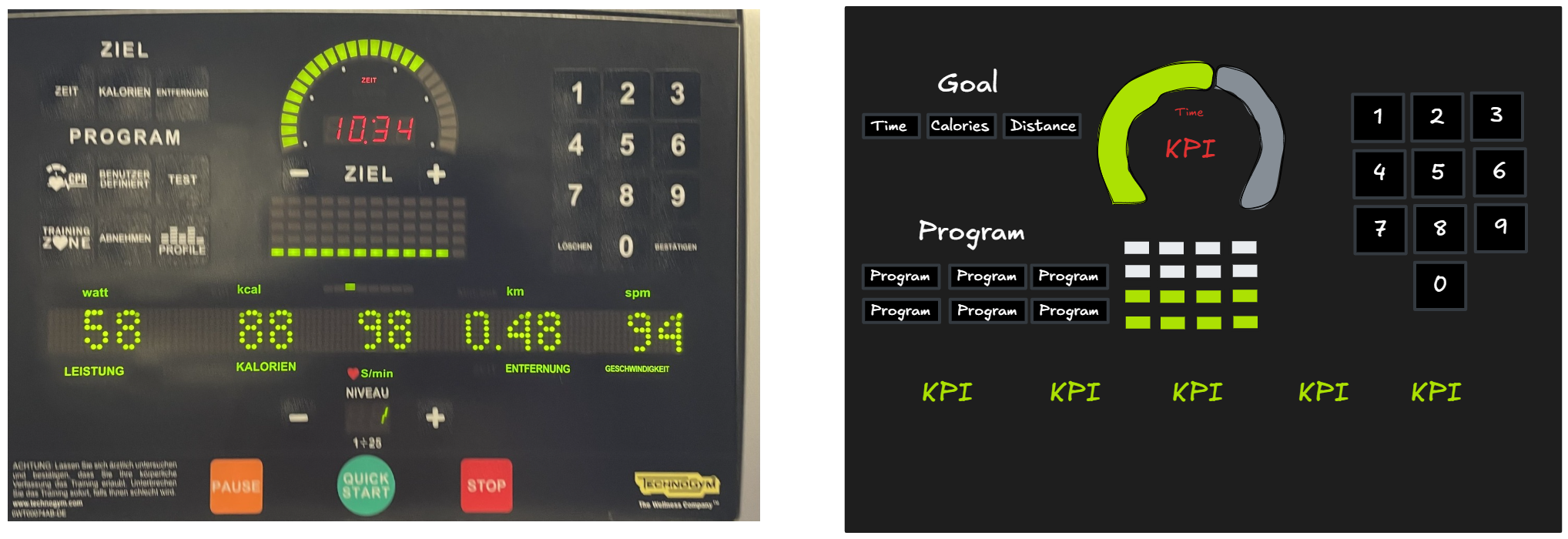
Cardio Machine Screen
Welcome to this series of posts where I share dashboards I've noticed around me. This time, I found an "analog" dashboard at my gym. It's a cardio machine screen that works on the electricity produced while using it


Tue 01 Jul 2025 | Stephan Christner
LOD! LOVE OF DETAIL OR LEVEL OF DETAIL?
In diesem Blogpost versuche ich heute mal einfach zu erklären, was LOD (Level of Detail)-Ausdrücke sind, wozu man sie braucht und wie man sie in der Praxis einsetzt.
Was sind LOD's?
LOD's ist ein eher komplizierteres Thema und vielleicht nicht direkt beim ersten mal verständlich


Fri 27 Jun 2025 | Ollie Ross Russell
Using Parameters to create a drilldown bar chart, with a reset button.
In a recent dashboard, I wanted to create a clean and simple drilldown bar chart that let the user explore a breakdown of incidents by group — and then drill into more detail with a single click

Mon 30 Jun 2025 | Marc-Anthony Tucker
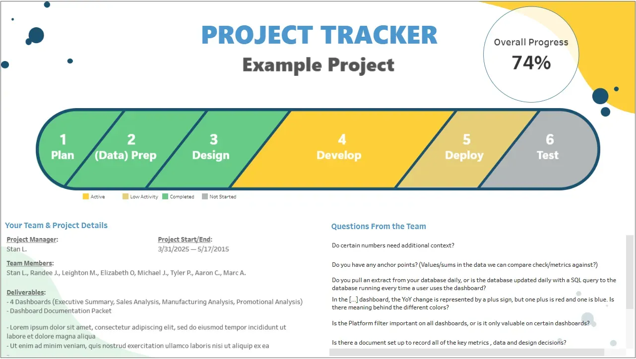
Project Management Tracker Dashboard — Inspired by Pizza
I recently built a new Tableau dashboard that’s a little different from your usual project tracker. And yes, it’s loosely inspired by the Domino’s Pizza Tracker.


Fri 27 Jun 2025 | Joseph Darton
Fire Safety Incidents Power BI Dashboard
Friday Project number 4 involved taking a previous consultants sketches and creating them in Power BI. The dataset itself covers fire safety incidents in Atlanta from 2021-2022 which is to be reported to the Fire Marshall


Thu 26 Jun 2025 | Claudina Mukangabo
Favourites Tools in Alteryx
Within Alteryx, you’ll find the Favourites tab, which displays tools you’re most likely to use when preparing data. In this blog, I’ll briefly explain the functions of these tools for cleansing, parsing and transforming your data

Thu 26 Jun 2025 | Louis Phipps
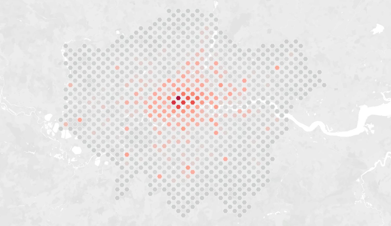
How to Create a Hexbin Map in Tableau
When to use a hexbin map?
Hexbin maps are particularly insightful when you have a high density of data points that overlap with each other on a map. You could use a density map, but you won't be able to see the values for each data point


Sun 29 Jun 2025 | Andrew Buchanan
Time Series Forecasting in Alteryx
What are the Time Series Tools?
The Time Series module allows you to model time based data and forecast future values with confidence. In this blog I will cover the ARIMA, ETS, and TS Forecasting tools and how they can be used to achieve your predictive modelling goals


Mon 23 Jun 2025 | Mandy Wan
PowerBI Friday Project: Complete!
Hi all! After another busy week of training, DS52 were asked to put their newly attained PowerBI skills into practice in the Friday project

Fri 27 Jun 2025 | Zainul Abedin Natha
Week 4 Project - Insurance Claims Report in Power BI
Overview
This phase of the project focused on refining the planning and design of a Power BI report to analyse customer complaints related to insurance claims


Wed 25 Jun 2025 | Elizabeth Archer
Using Bookmarks in PowerBI
It is week 4 of The Data School and we are learning how to use PowerBI. When creating visualisations in a page (known as a dashboard in Tableau), we might want to preset/save a view for the user to switch to easily
Want to know more?
Whether you're planning for the future or you have a project that needs to get started next week our team are more than happy to help.
Complete our contact form with your name, company email and a brief message and we will get back to you as soon as we can.