An impressive graphic (Sample Superstore) in just a few steps!
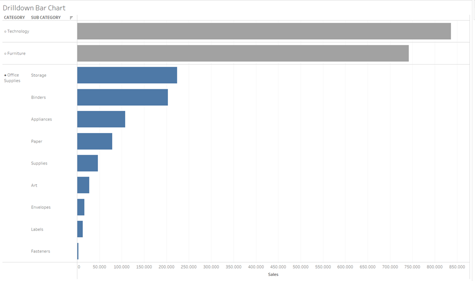
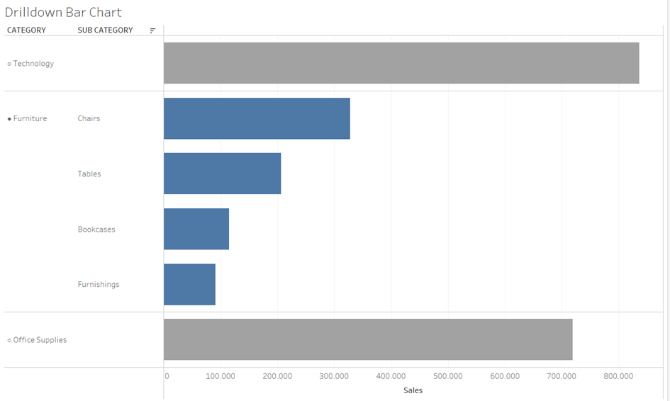
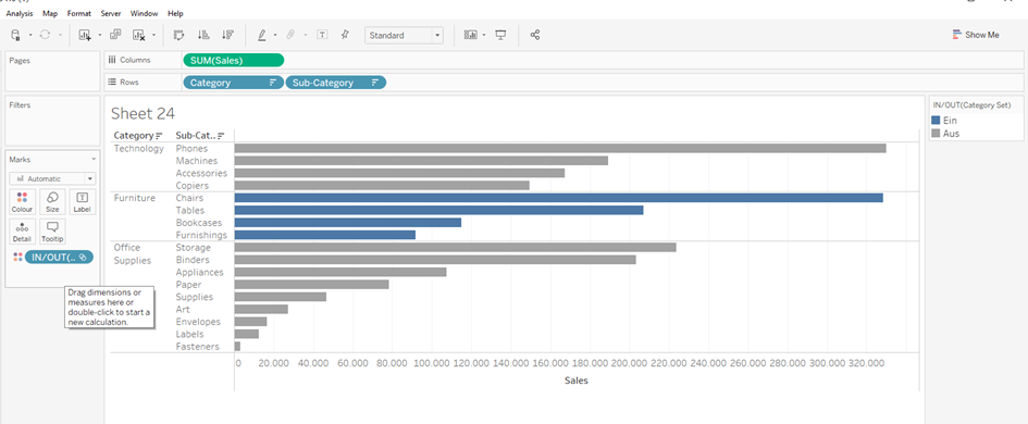
As a result, I want a bar chart where I can select a category. When I click on Furniture, my circle is filled in, my subcategory is colored and the other categories are grayed out. When I click on Technology, my circle is filled in... and so on
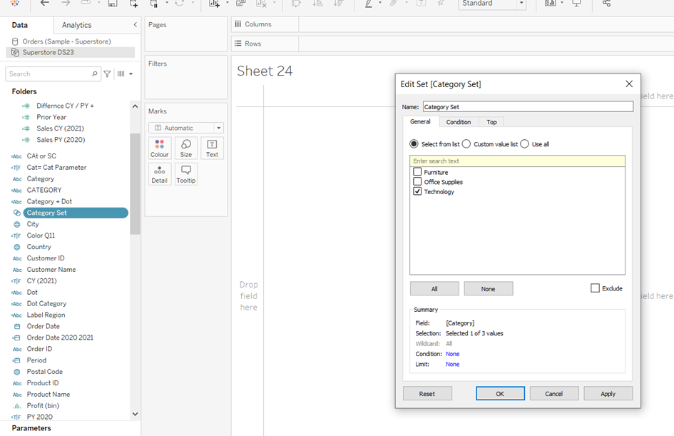
The first thing I do is create a set :
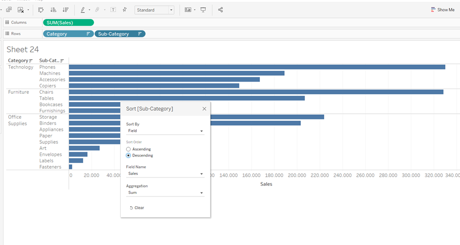
Then I create the following chart and sort my Rows :
Now I pull my Category Set on color into the Mark field:
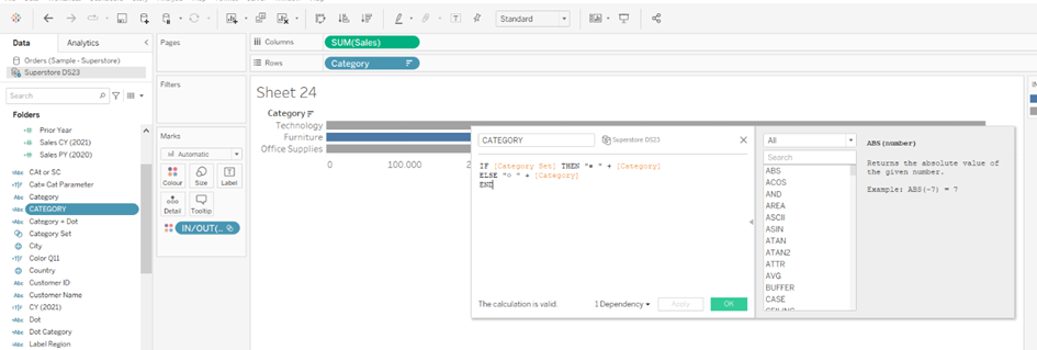
A calculating field for the Circle ●/○ follows and take the Sub Category from the Rows again:
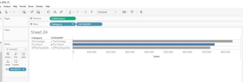
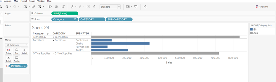
Drag it to the Rows and should get the following image:
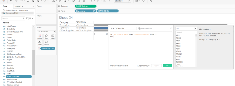
Then follows the next calculation for the Sub Category:
Drag it to the Rows and should get the following image:
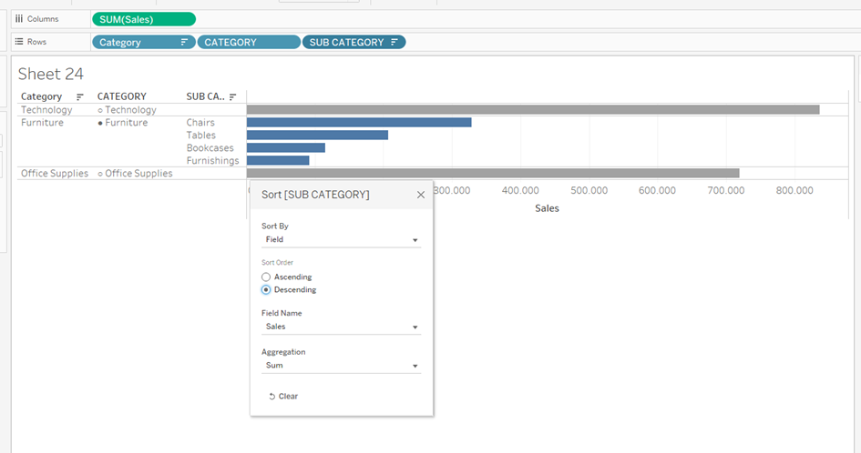
To get a Drilldown Bar Chart I sort the Sub Categroy field:
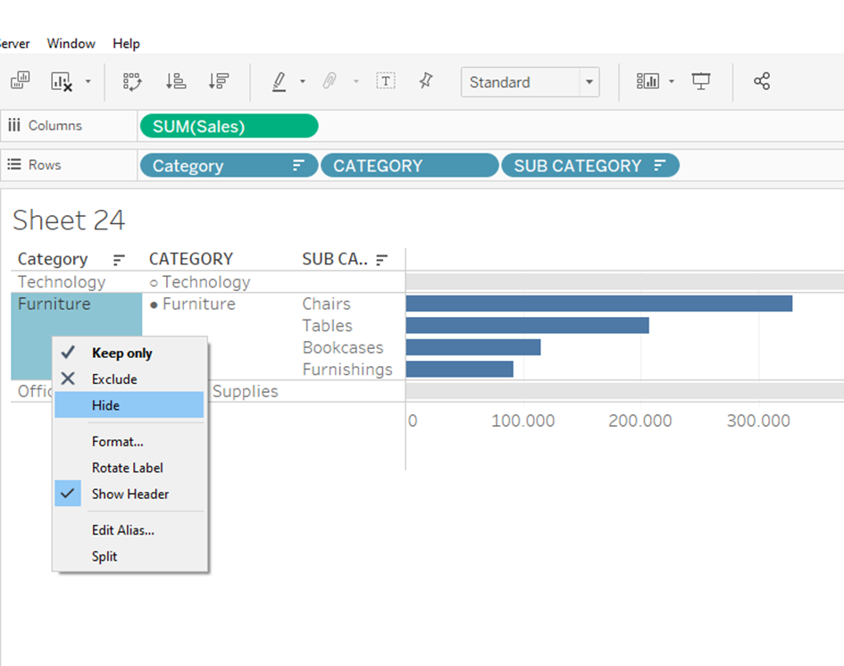
I don't want the first Category field in my view anymore:
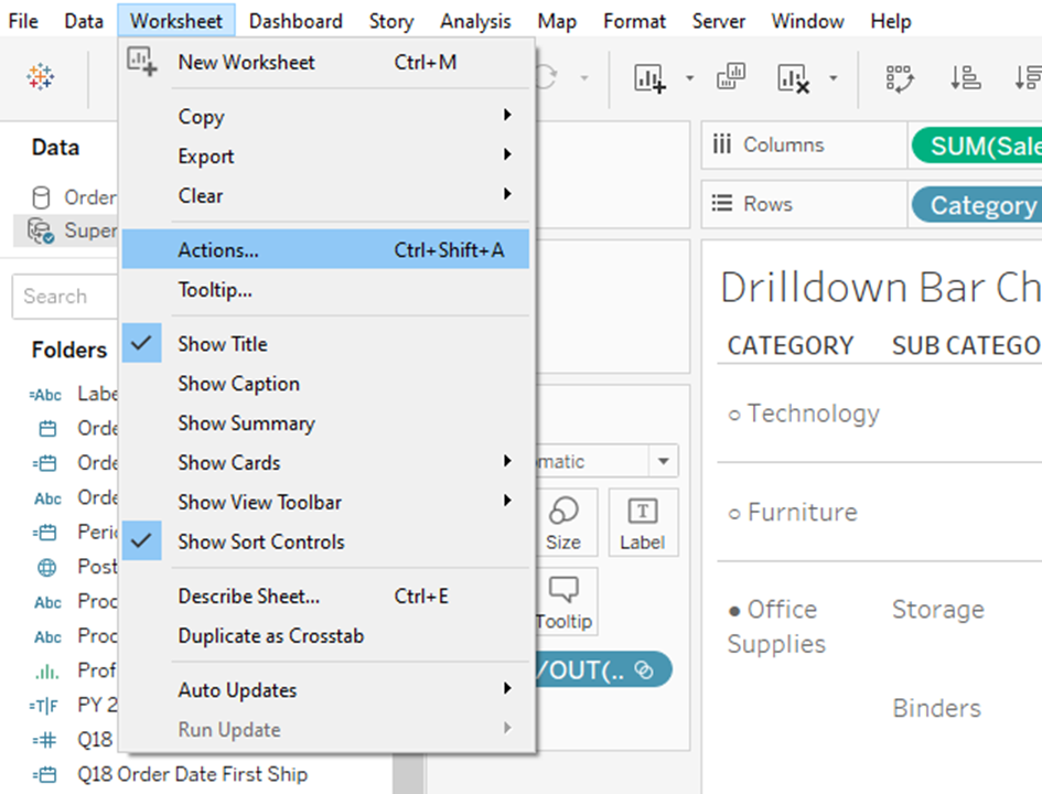
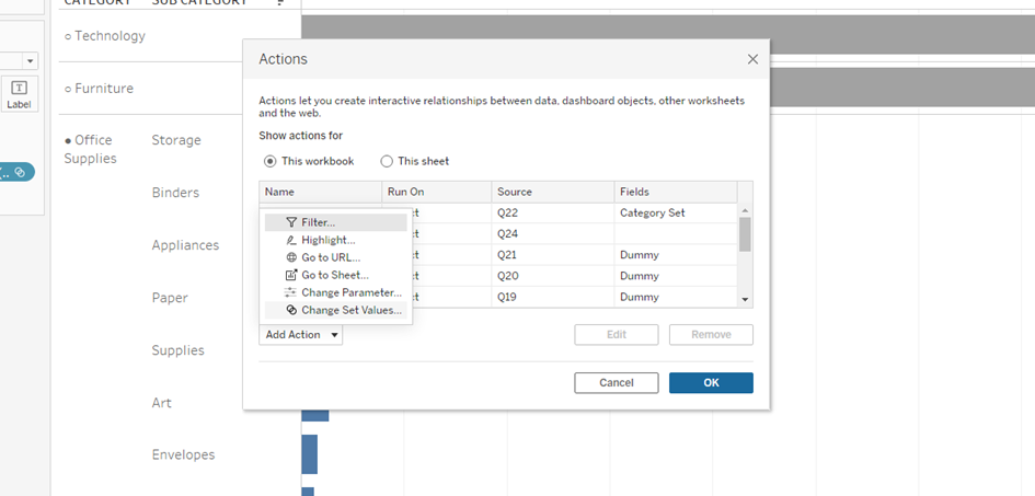
For interactivity, I just need to set my sheet to be activ:
Then I select Change Set Values:
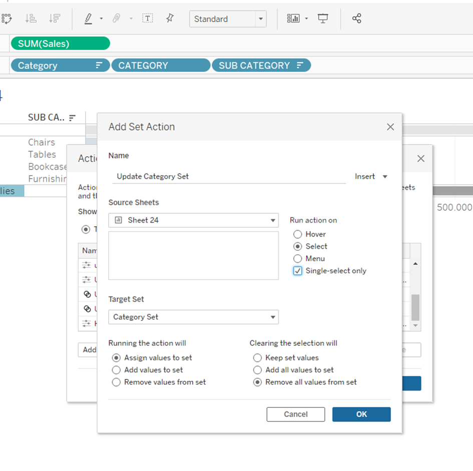
And set it as follows:
And ready is my Chart: