


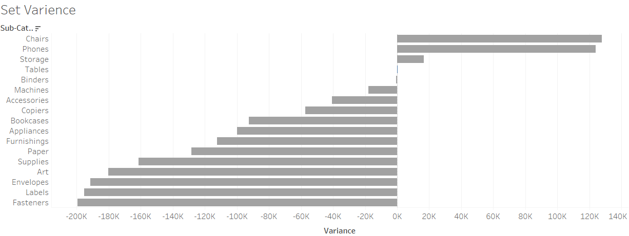
Going over both set and parameter actions today, we learnt some pretty neat stuff that both of these functions can do. One of these was the variance chart, which compares a selected fields sales or similar measure with those around them, and you get to see the comparison between them all. Here's a preview of what one looks like.
To start, we'll be using everyone's favourite data set, Superstore - Sales.
Let's create a set based on Sub-Category:
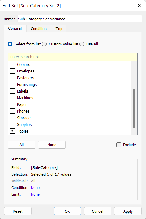
We've chosen tables randomly, as we'll use this to see if the set is working when we incorporate actions later down the line.
We're going to tackle the calculated fields first, as these are some of the more complex parts of the making of this chart, and frankly, it's just good to get this out of the way.
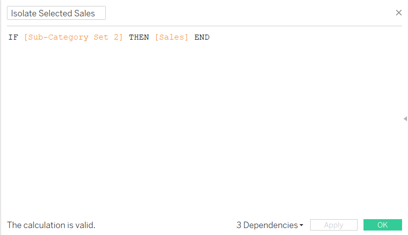
This field is saying that for whatever sub-category finds itself within the set, its' sales will be shown.
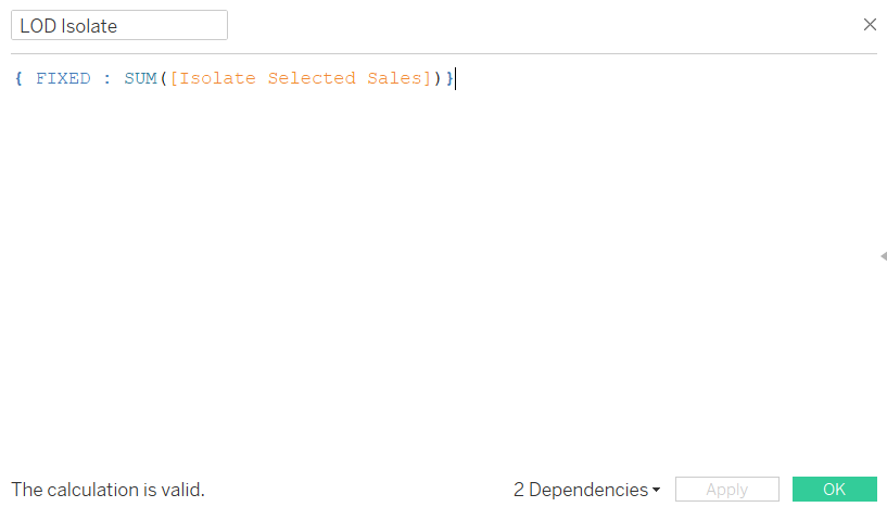
Now we use everyone's favourite calculated field type, a Level of Detail calculation. What this does is it fixes that previous calculation at a row-level and will return the sum of sales for the particular sub-categories that find themselves within the set.
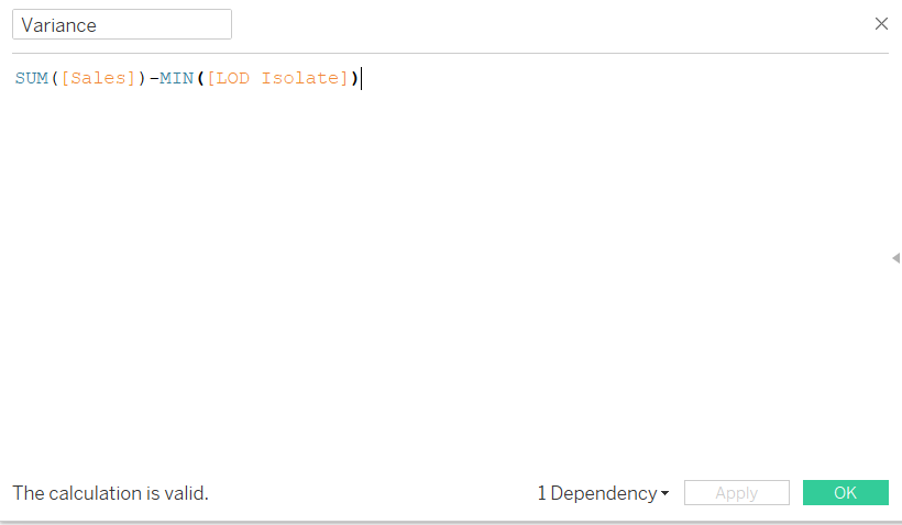
Finally, this variance calculation will subtract the sales figure returned for the specified sub-category against the sum of sales in general, and since this will be in our columns, it'll be all the other sub-categories sales compared to the sub-category we're comparing it to.
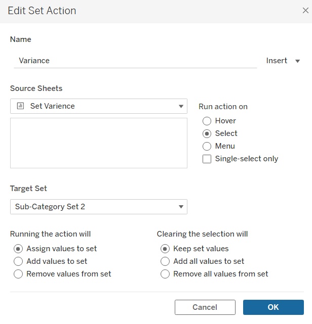
Finally, our set action will, on click of a sub-category, assign sub-categories to the set and keep those values until another sub-category is clicked.
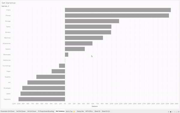
Hopefully, doing all these steps got you the same outcome as the one in the GIF above. This chart was really interesting to make and I can definitely see myself using this down the line.