


Ever wanted to make your line chart have a ball at the start and end of it? Me neither, but here's how you can do it anyway!
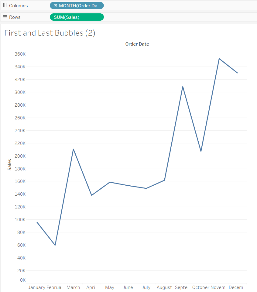
Using Superstore, let's throw Order Date on columns, and sales on rows. Nothing too fancy.
After this, we need a calculated field to identify the specific fields at the start and end of the line. One could say to see these fields, we'll be looking at the First and Last parts of the line (see what I did there? It's a hint).
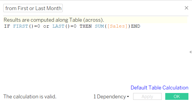
In the terms of both First and Last, we're asking if they equal 0. This is because for First, 0 represents the very first field and with Last, 0 represents the very last field. With this in mind, the field is asking if they are the First and Last fields of the view, and if they are, to give us the sum of sales. In doing this, all the other fields bar the very first and last ones will be null.

By dragging this field next to sales on rows, we can see the fruit of all our labour. We've got two circles at the very first and very last part of the line.
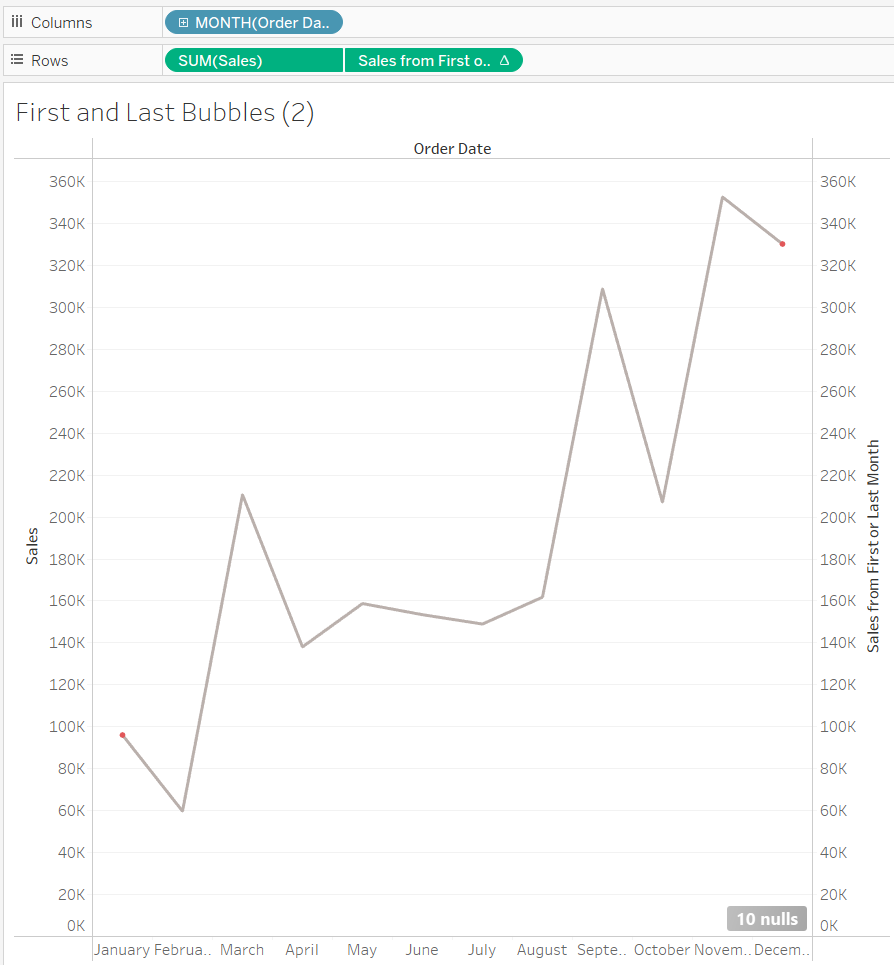
Dual axis-ing these two together and synchronising the axis will give us our treasured line chart with two circles, one at the start and one at the end.
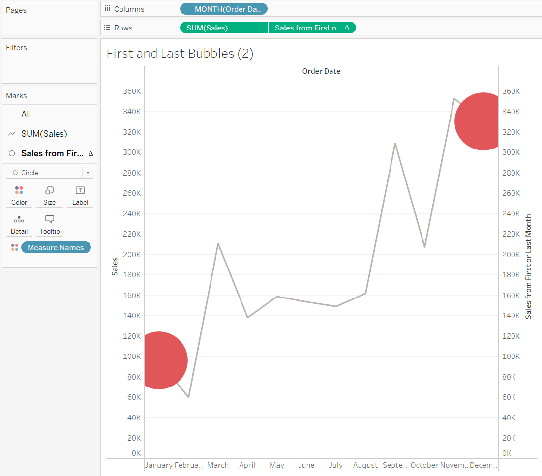
For even more circle-ness, we can change the shape type of that calculated field to a circle, and modifying the size of those circles, we can really emphasise that circle-ness. In addition to aesthetics, these circles add a nice focus to the view you've made and help indicate to viewers specific areas of the chart. You can modify the calculation and have it highlight the Min/Max of the lines, which might yield a more interesting analysis angle.