


In this blog, I'll be sharing how I redesigned the 2026/W23 Coachella Lineup Makeover Monday, showcasing my thought process and intentionality with design.
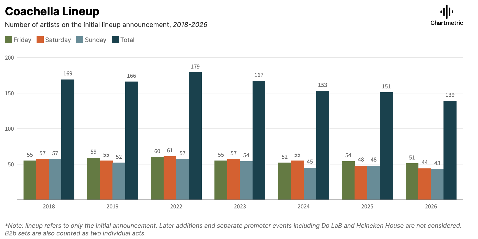
This is the original visualization:
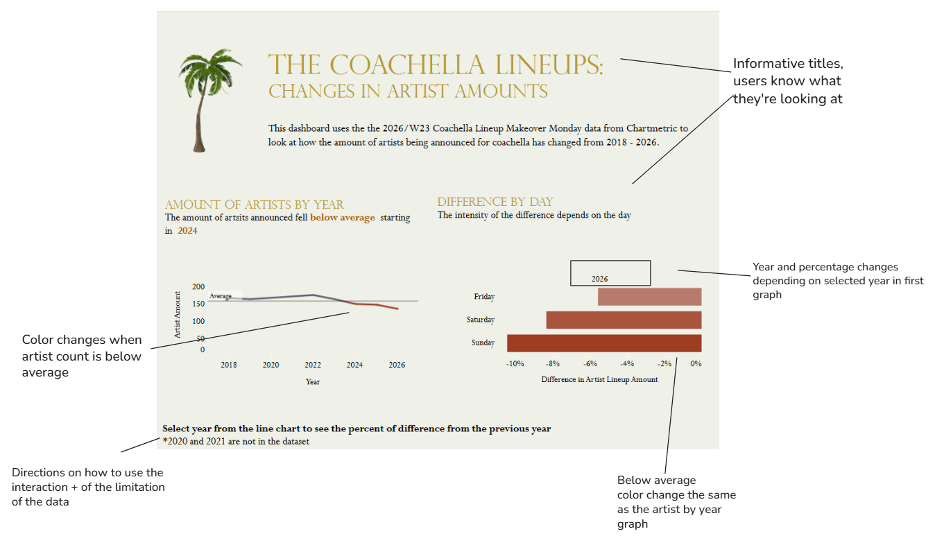
And this is the end product:
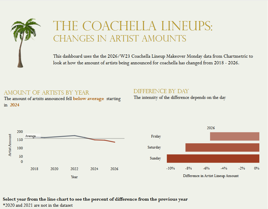
You can find it on Tableau Public here: Coachella Dashboard.
Planning the redesign
My initial goals were to:
- Understand what the chart is trying to convey
- Understand areas for improvement
What I took away from this visualization is that it's asking two questions: (1) Has the artist amount changed over time? (2) Is the change different by day of the week?
With the current chart setup, with there being 28 bars, it's hard to compare the bar sizes by sight, making it difficult to immediately understand the takeaway. Other things that I noticed were that the title was vague and the color choices don't seem meaningful or help with the analysis.
This led to the following goals for my redesign:
- Incorporate a more meaningful title
- Write out the takeaways
- Have a graph that's easy to compare
Creating a sketch
Before I built the new visualization in Tableau, I created a sketch to organize my thoughts and understand how I wanted the end product to look.
Here is what that process looked like:
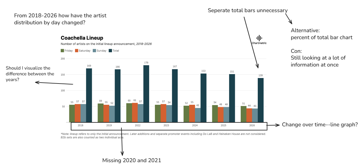
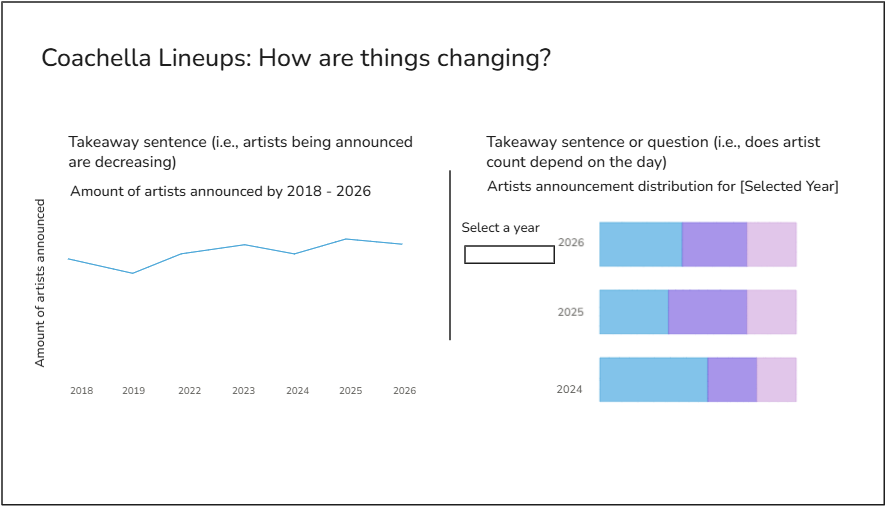
I separated the original chart into two for the purpose of minimizing cognitive load and separating the questions being asked. The first graph answers "How is the change of artists announcement overall" while the second graph looks at the distribution by day. The initial goal was for each day (Friday, Saturday, Sunday) to be a color in a bar, with the total being the total for that year.
My other thoughts were that:
- I wanted a filter for the second graph to avoid visual overload, and a dynamic title to make it clear what visualization is being looked at
- I wanted informative titles to give the user more of an understanding of the purpose and takeaway
- I realized that two dates are missing (2020 and 2021), likely due to covid, so I knew to be more intentional while building my charts and to understand how that may impact my analysis. I also plan on noting the missing dates somewhere for transparency
Getting to the final product
After reviewing my first concept sketch, I realized I wanted to be more purposeful with color. To do this, I added an average line in the artist by year graph, and added color for when the amount of artists drop below average. This way, the user can tell at a glance when the decrease occurs.
Additionally, while looking at the data and whether the graphs answered the questions I presented, I consulted internally for a more effective way to present the difference by day. In the end, I decided to make the graph interactive--where the year selected in the first graph affects the second one, which displays the percent difference from the previous year (see below).
And that's how I did the Makeover Monday. Thank you for going on this journey with me!