


As a data analytics consultant, my job is not just to analyze data. It is also to determine the best way to turn that data into something useful for the people who need it.
And as someone who enjoys data visualization, I understand as well as anyone that when starting a dashboard, it can be tempting to jump straight into building charts and laying out the final design.
But before diving into that, we need to take a step back and ask a more important question:
Who are we actually building this for?
This is where user stories come in.
What Is a User Story?
A user story is a simple way of defining the user, what they need, and why they need it.
In analytics, this is essential to delivering an effective solution.
A dashboard is not just a collection of charts. It should help someone better understand a situation and make a decision. If we do not understand the user first, then even a well-designed dashboard can miss the mark.
That is why user stories are so useful early in the process. They help us stay focused on who is actually using the dashboard and what they need from it, rather than simply making visuals.
Understanding the User
Before writing a user story, we first need to understand the user a little more deeply.
For me, the easiest way to think about this is through three ideas:
- Tasks: What are the day-to-day activities of the user?
- Information: What data does the user need to complete those tasks?
- Decisions: What decisions do they need to make as part of their role?
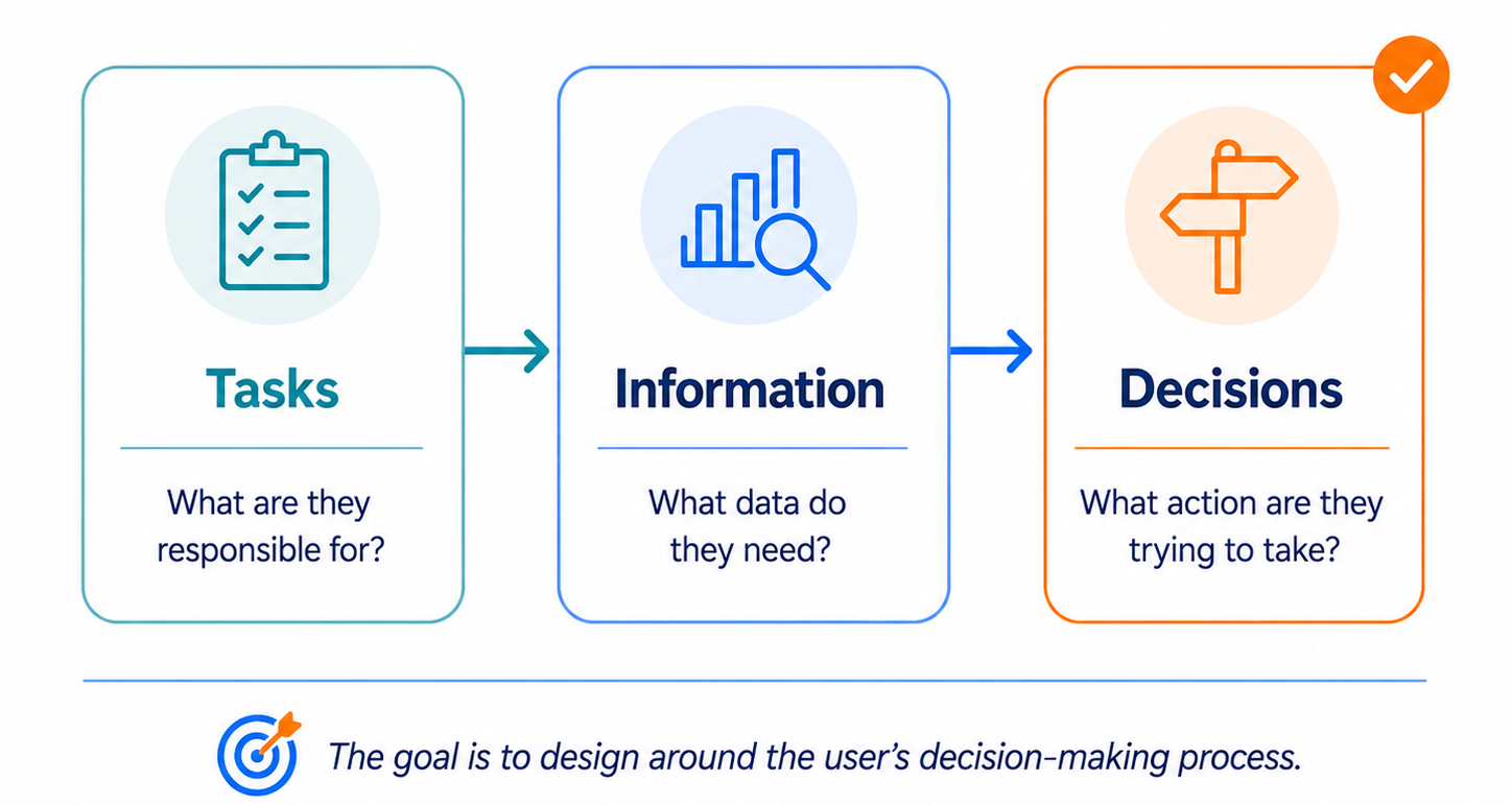
Thinking through these areas helps us put ourselves in the client's shoes.
Instead of immediately asking What charts can I build with this data?, we can begin asking questions like:
- What does this user need to know?
- What questions are they likely to ask?
- What information would help them make a decision?
- What action might they take after using the dashboard?
This changes the way we approach dashboard design. We stop building around the data alone and start building around the user's decision-making process.
For example, a regional sales manager may monitor the performance of different stores as part of their day-to-day responsibilities. To do that, they may need information such as sales, profit, and performance trends. Ultimately, they may use that information to decide which locations require additional attention or resources.
That is what makes user stories so valuable. They help us connect the dashboard to a real purpose.
They also help keep the work focused. Without a user story, it is easy to include too much, explore the wrong angle, or create something interesting that is not actually useful.
A good user story gives us direction before the dashboard build even starts.
Writing the User Story
Once we understand the user, we can write the user story itself.
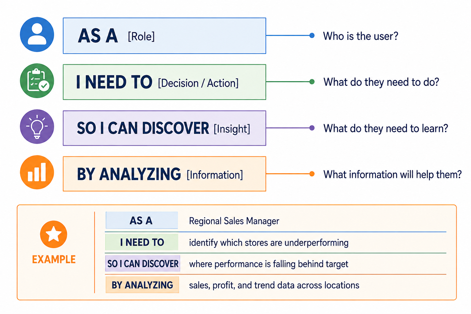
A simple structure for this is:
AS A [Role]
I NEED TO [Decision / Action]
SO I CAN DISCOVER [Insight]
BY ANALYZING [Information]
Each part has a purpose:
- AS A identifies the user.
- I NEED TO explains what they need to do.
- SO I CAN DISCOVER explains what they need to learn.
- BY ANALYZING identifies the information that will help them get there.
It reminds us that the point of a dashboard is not just to show data. It is to help someone discover something meaningful and do something with it.
Example
Let's continue with our regional sales manager.
A user story might look like this:
AS A Regional Sales Manager
I NEED TO identify which stores are underperforming
SO I CAN DISCOVER where performance is falling behind target
BY ANALYZING sales, profit, and trend data across locations
This already tells us a lot.
It tells us who the dashboard is for, what they need to do, what they are trying to discover, and what information will help them get there.
More importantly, it allows us to start thinking about the questions the dashboard should answer from the client's perspective:
- Which stores are performing below target?
- Are sales declining everywhere, or only in certain locations?
- Is low performance being driven by sales, profit, or both?
- Which locations need attention first?
Those questions can then begin guiding what we actually build.
Instead of choosing charts simply because they work with the available data, we can ask whether each part of the dashboard helps answer one of the user's questions.
That is the value of the user story.
It helps us think through the dashboard from the client's perspective before we ever start building.
Conclusion
Before building a dashboard, it is worth taking the time to understand the user first.
User stories help us do that.
They help us think in the client's shoes, focus on the questions that matter, and design dashboards that support real decisions rather than simply displaying data.
So before opening Tableau, Power BI, or any other tool, start with the user.
Ask who they are, what they need to know, and what decision they are trying to make.
Once those answers are clear, we can start building with a purpose.