


A good dashboard does more than display information.
It helps users explore that information and answer different questions without needing a new visualization for every scenario.
In Tableau, there are several ways to make a dashboard more flexible and interactive. Instead of creating separate visualizations for every metric or perspective, you can build a visualization that responds to the user's selections.
In this guide, we'll look at two techniques for doing exactly that:
- Measure Switching
- Dimension Switching
Together, these techniques allow users to control both what they analyze and how they analyze it, all within the same visualization.
Measure Switching in Tableau
What Is a Measure?
A measure is a field that contains quantitative, or numerical, data that can be aggregated and analyzed. Measures are typically used to perform calculations such as sums, averages, minimums, or maximums.
For example, in this dataset, Passing Touchdowns and Interceptions are both measures. They contain numerical values that can be aggregated across players or teams.
The goal of measure switching is to allow the user to choose which measure is displayed in a visualization without having to create a separate worksheet for each one.
In this example, the user will be able to switch between Passing Touchdowns and Interceptions using a parameter.
Step 1: Create the Measure Parameter
To begin, click in the Data pane and select Create Parameter.
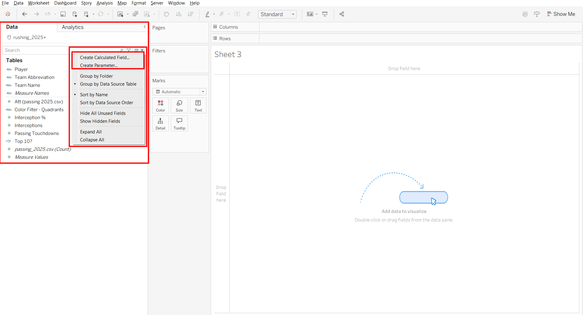
Once you have done that, a window will appear where you can create and configure the parameter.
Create a parameter for the measures you want the user to switch between. In this example, those measures are Passing Touchdowns and Interceptions.
Set the data type to String, then select List under Allowable Values.
Add each measure as a value in the list. You can also use the Display As column to control how each option appears to the user.
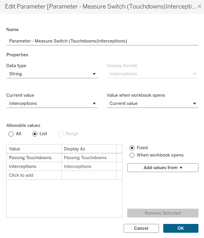
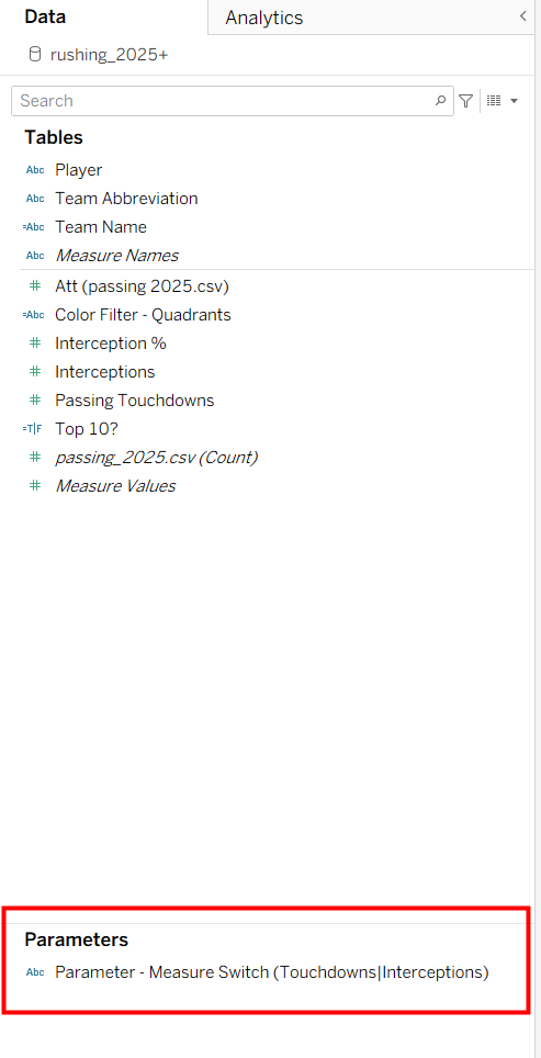
Once the parameter is created, you can find it at the bottom of the Data pane under Parameters.
Step 2: Create the Calculated Field
Next, click the drop-down arrow in the Data pane again and select Create Calculated Field.
This calculated field will connect the parameter to the actual measures in the dataset.
Create the calculated field by referencing the parameter we just created. The calculation checks the value selected in the parameter and returns the corresponding measure.
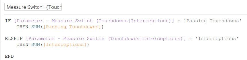
If Passing Touchdowns is selected, Tableau returns Passing Touchdowns. If Interceptions is selected, Tableau returns Interceptions.
Step 3: Add the Calculated Field and Parameter to the Visualization
Now you can build the worksheet.
Place the calculated field we just created on Columns and place the dimension you want to analyze on Rows.
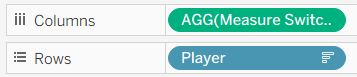
Instead of using Passing Touchdowns or Interceptions directly in the visualization, the worksheet now uses the calculated field.
Next, navigate back to the Parameters section of the Data pane. Click the drop-down arrow for the parameter and make sure Show Parameter is selected.
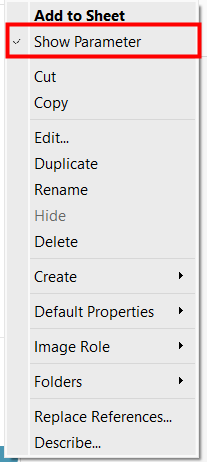
The parameter control will now appear alongside the visualization.
You can switch between Passing Touchdowns and Interceptions, and the visualization will update automatically based on the selected measure.
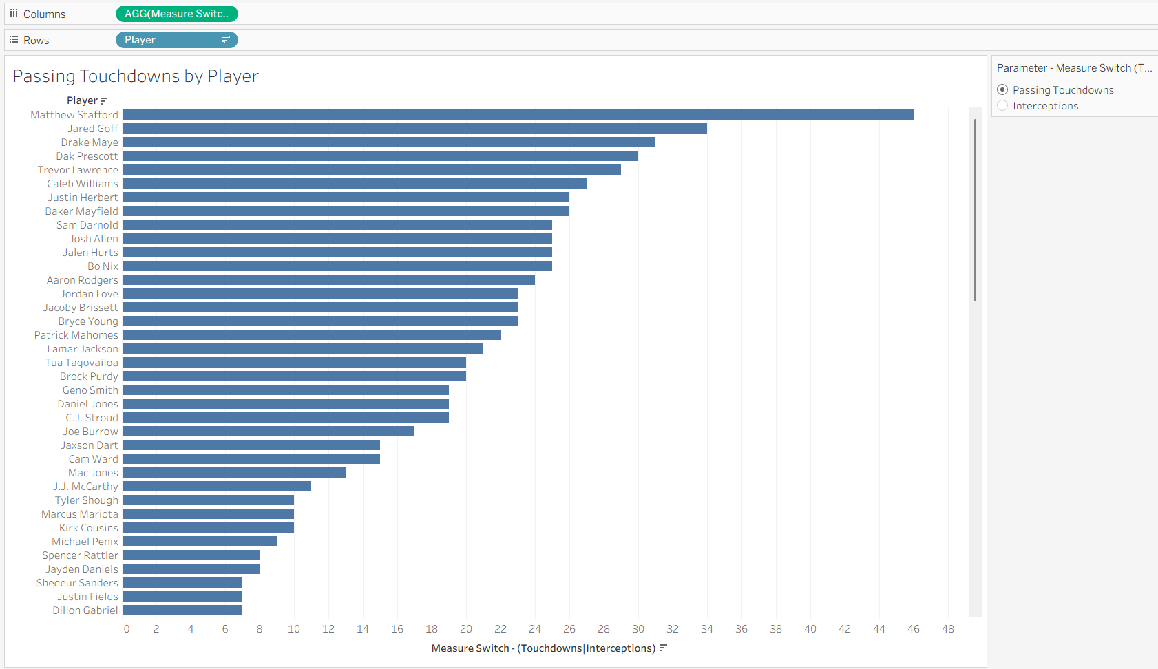
Now you have a working measure switch!
Dimension Switching in Tableau
What Is a Dimension?
While measures tell us what we are measuring, dimensions determine how we break that information down.
A dimension is generally a categorical field used to organize, group, or segment data in a visualization. Dimensions can include fields such as Player, Team, Region, Category, or Department.
In this example, Player and Team are dimensions.
Instead of creating separate worksheets for a player-level view and a team-level view, we can use dimension switching to allow the user to choose how the data is displayed.
The process is very similar to measure switching. We will create a parameter, connect that parameter to our dimensions using a calculated field, and then use that calculated field in the visualization.
Step 1: Create the Dimension Parameter
Just as we did with the measure switch, click the drop-down arrow in the Data pane and select Create Parameter. This time, we will add Player and Team as our options.
Set the data type to String and select List under Allowable Values.
In this example, the underlying value for the team option is Team Name, while the Display As value is simply Team. This lets us keep the parameter control clear for the user while still referencing the correct field in our calculation.
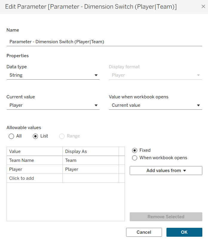
This parameter will control how the measure in the visualization is broken down.
Step 2: Create the Calculated Field
Next, click the drop-down arrow in the Data pane again and select Create Calculated Field.
Just like with the measure switch, this calculated field connects the parameter selection to the fields in our dataset. This time, however, it will return the dimension selected by the user.
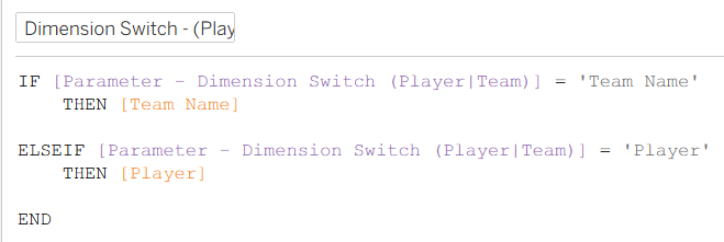
If Player is selected, Tableau returns the Player field. If Team is selected, Tableau returns the Team Name field.
Step 3: Add the Calculated Field and Parameter to the Visualization
Now you can build the worksheet.
Place the measure you want to analyze on Columns and the new dimension switching calculated field on Rows.
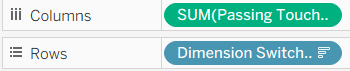
Then, show the dimension parameter just as we did with the measure parameter.
You can now switch between Player and Team, and Tableau will automatically update the visualization based on the selected dimension.
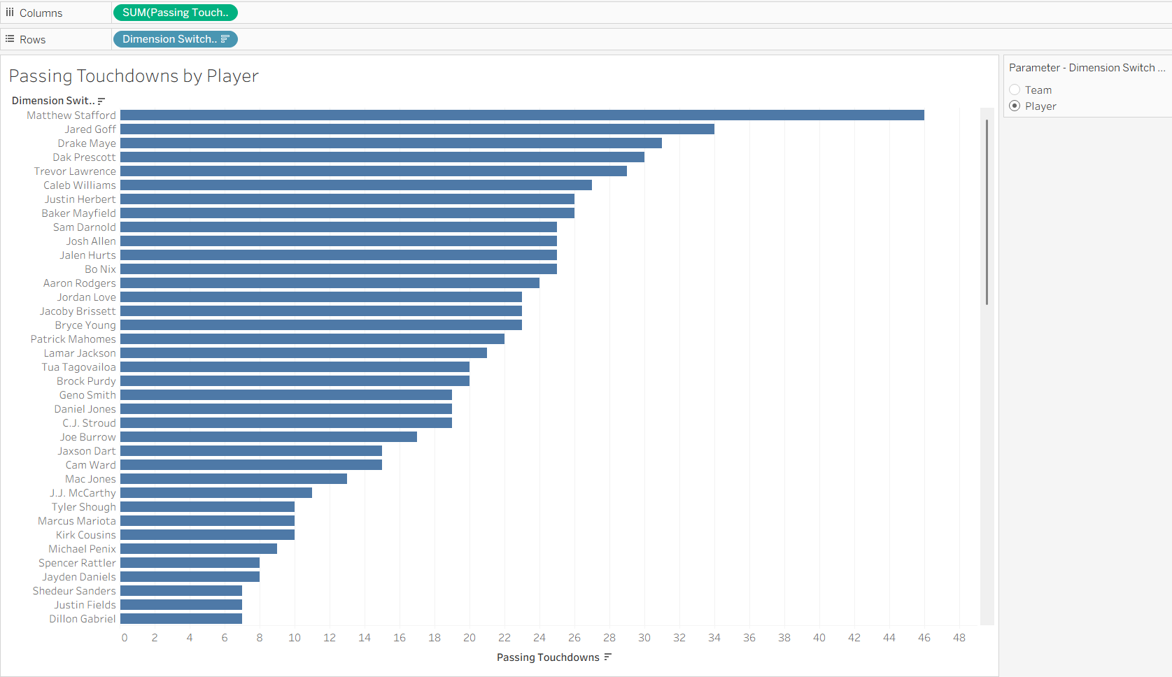
The same worksheet can now display Passing Touchdowns by Player or Passing Touchdowns by Team without creating two separate worksheets.
Combining Measure and Dimension Switching
Now that both switches are working, we can use them together.
Place the Measure Switch calculated field on Columns and the Dimension Switch calculated field on Rows.
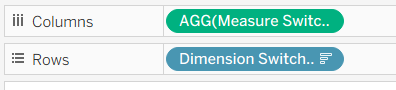
The measure switch controls what is being measured, while the dimension switch controls how that measure is broken down.
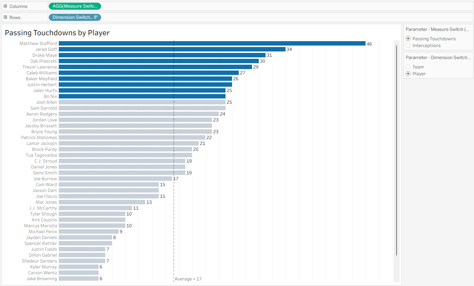
Using the same visualization, you can now move between four views:
- Passing Touchdowns by Player
- Interceptions by Player
- Passing Touchdowns by Team
- Interceptions by Team
Instead of building a separate worksheet for each combination, the user can control both the measure and dimension from a single view.
Congratulations! You Can Now Switch Measures and Dimensions
Measure switching and dimension switching are simple ways to make Tableau views more interactive without adding unnecessary worksheets.
By using parameters and calculated fields, we can give users control over both what they want to analyze and how they want to analyze it.
Measure switching changes the metric being displayed, while dimension switching changes how that metric is broken down.
Together, they allow one visualization to answer multiple questions while keeping the dashboard clean and flexible.