


What Is Dynamic Zone Visibility?
In a previous post, we looked at how Measure Switching and Dimension Switching can be used to change what is displayed within the same visualization.
Dynamic Zone Visibility, or DZV, takes this idea one step further.
Instead of switching between different measures or dimensions within the same visualization, Dynamic Zone Visibility allows us to control which dashboard zones are displayed. In this example, we will use it to switch between entirely different visualizations.
For example, you may want a user to choose between a bar chart and a scatter plot depending on how they want to explore the data. Rather than displaying both charts at the same time or creating separate dashboards, we can use Dynamic Zone Visibility to control which visualization appears.
In this guide, we will build a dashboard that allows the user to switch between a bar chart and a scatter plot using a parameter.
Building the First Visualization
For our first visualization, we will use a bar chart showing Passing Touchdowns by Player.
Step 1: Create the Parameter
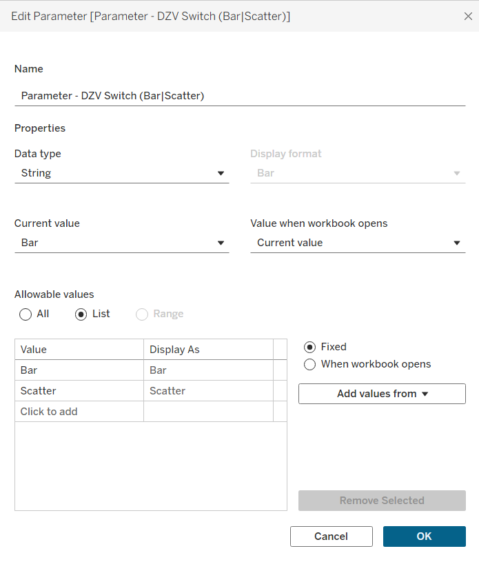
To begin, click the drop-down arrow in the Data pane and select Create Parameter.
Because this post can be followed on its own, we will walk through the parameter setup again rather than assuming you completed the previous tutorial.
Set the data type to String and select List under Allowable Values.
For this example, add our two visualization options:
- Bar
- Scatter
This parameter will eventually allow the user to control which chart is visible on the dashboard.
Step 2: Create the Calculated Field
Next, click the drop-down arrow in the Data pane again and select Create Calculated Field.
For the bar chart, create a calculated field that checks whether the parameter is currently set to Bar.

This calculation will return True when Bar is selected and False when Scatter is selected.
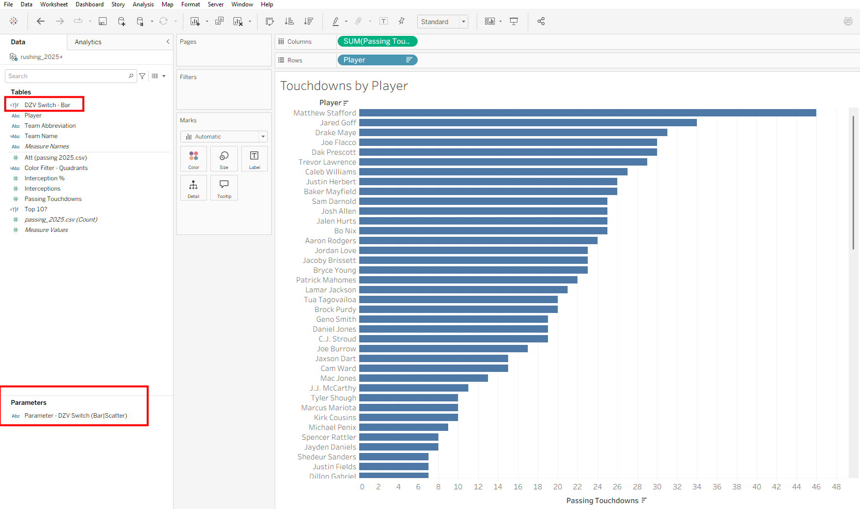
For this example, our bar chart displays Passing Touchdowns by Player. Once the calculation and parameter are created, you should see both fields available in the Data pane.
Step 3: Show the Parameter
Next, right-click the parameter in the Data pane and select Show Parameter.
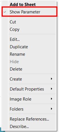
The parameter control will now appear alongside the worksheet, allowing you to switch between Bar and Scatter.
Step 4: Add the Calculated Field to Filters
Now drag the calculated field we created for the bar chart onto Filters.
When the filter window appears, select True and click OK.
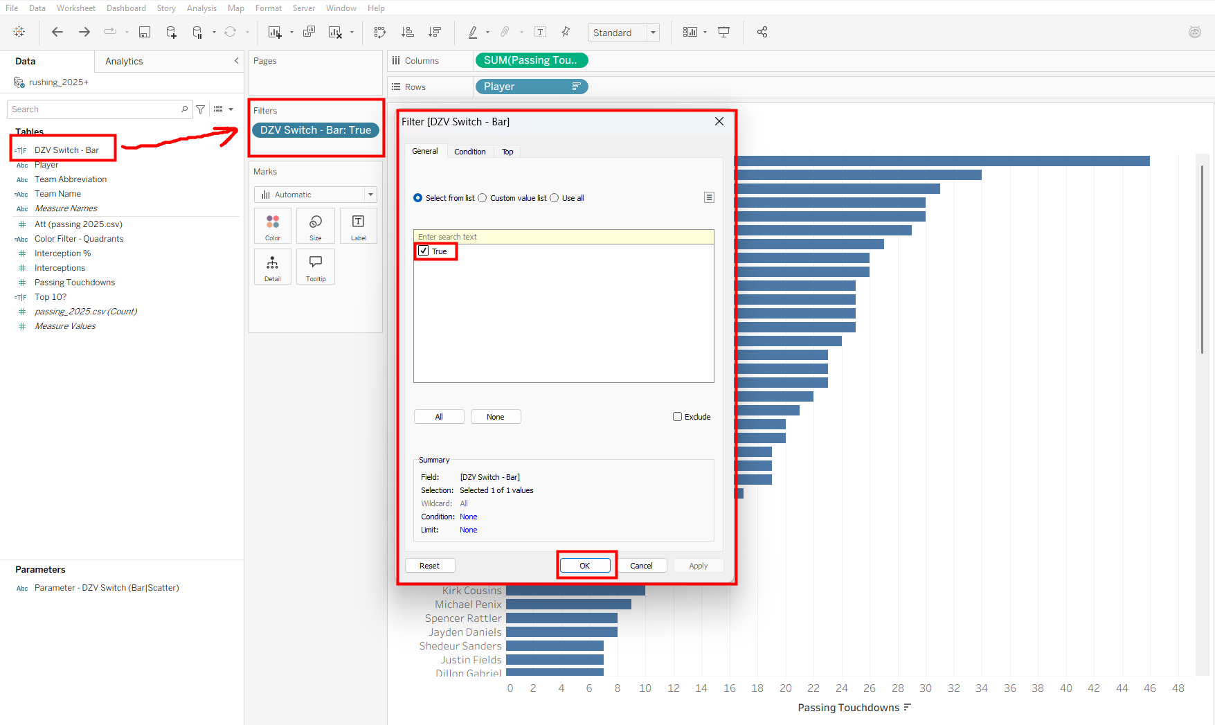
By filtering the worksheet to True, the visualization will only display when the parameter is set to the value associated with this chart.
Your worksheet should now look similar to this, with the calculated field set to True in Filters and the parameter visible on the right.
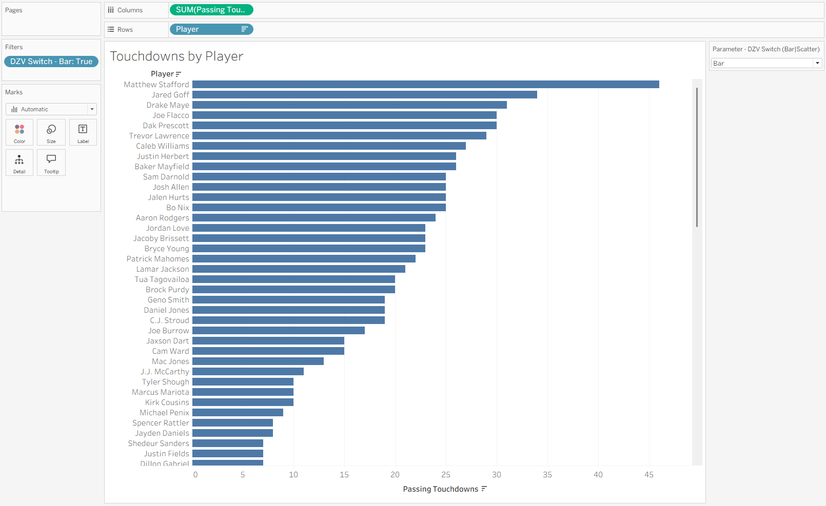
Now our first visualization is ready!
Building the Second Visualization
Next, we will create our scatter plot.
Because we already created the parameter, we do not need to create another one. Both visualizations will use the same Bar/Scatter parameter.
Step 1: Create the Second Visualization
Open a new worksheet and build the second visualization.
For this example, our scatter plot compares Passing Touchdowns and Interceptions by Player.
Step 2: Create the Calculated Field
Create another calculated field using the same process as before.
This time, however, the calculation should check whether the parameter is set to Scatter.
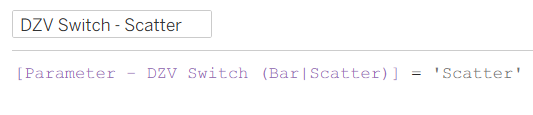
The logic is the same as our first worksheet. When Scatter is selected, this calculation returns True.
Step 3: Show the Parameter and Add the Filter
Show the same Bar/Scatter parameter on the worksheet.
Make sure Scatter is selected in the parameter, then drag the new scatter calculated field onto Filters and select True, just as we did for the bar chart.
Your scatter plot should now display when Scatter is selected.
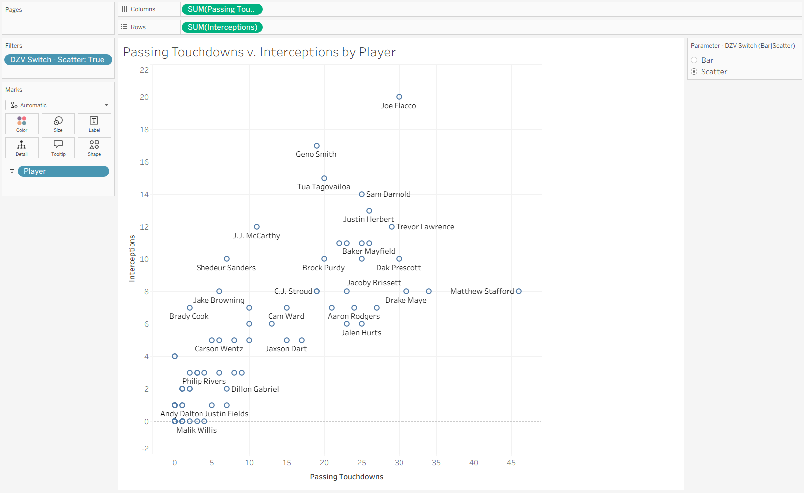
We can also test whether our calculation is working.
Change the parameter from Scatter to Bar.
Because this worksheet is filtered to only display when the Scatter calculation returns True, the scatter plot should disappear.
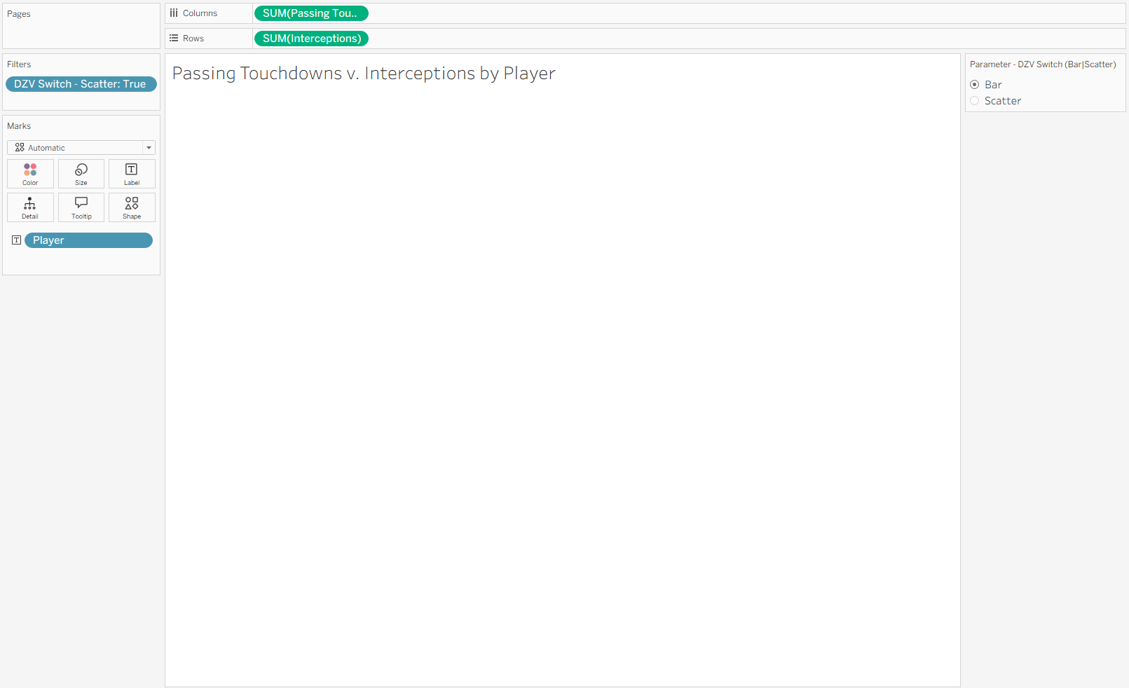
This is exactly what we want.
Now both worksheets are ready, and we can bring them together on a dashboard.
Adding Dynamic Zone Visibility to the Dashboard
Step 1: Create a New Dashboard
Create a new dashboard and add your first visualization.
For this example, we will start with the bar chart.
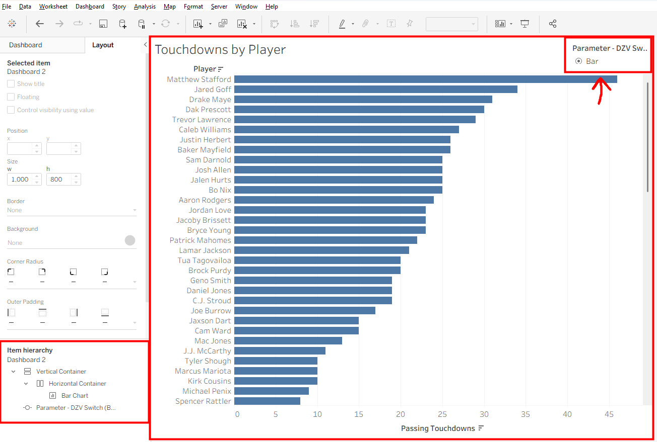
When the worksheet is added, you should also see the parameter control appear on the dashboard.
We want the parameter to control both visualizations, so position it outside of the individual chart container where it can remain visible regardless of which chart is currently being displayed.
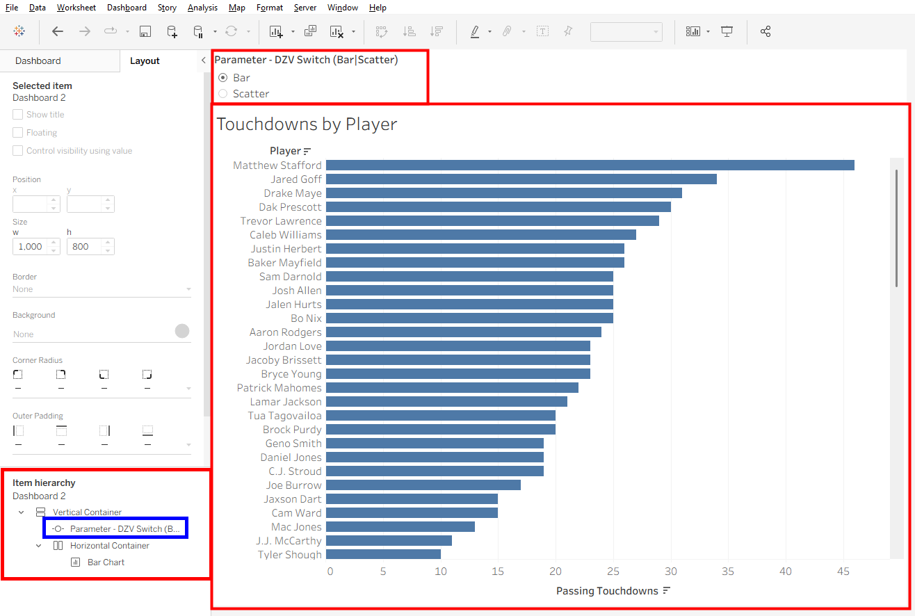
Next, add the scatter plot to its own container below the bar chart.
You should now have something similar to this:
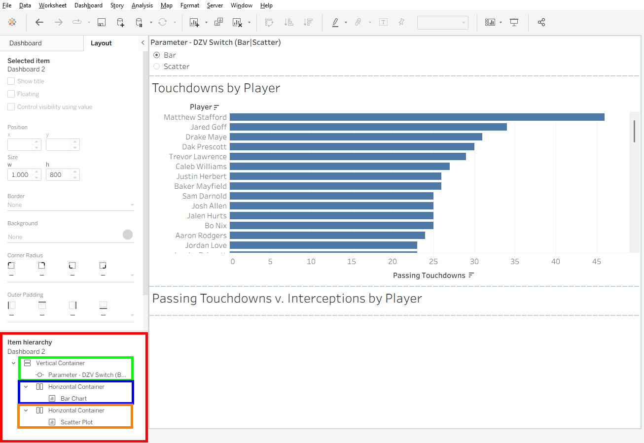
At first, you may notice that one of the visualizations does not appear.
That does not mean something went wrong.
Notice that the parameter is currently set to Bar. Because our scatter plot is filtered to display only when Scatter is selected, Tableau is already applying the logic we created earlier.
Step 2: Control the Visibility of Each Visualization
Now we can apply Dynamic Zone Visibility.
Select the container that holds the bar chart.
In the Layout pane, select Control visibility using value and choose the calculated field associated with the bar chart.
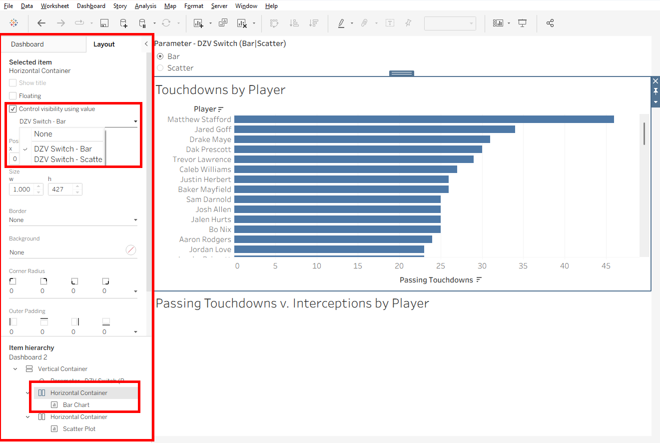
This tells Tableau that the entire container should only be visible when the Bar calculation evaluates to True.
Next, select the container holding the scatter plot and repeat the same process.
This time, select the calculated field associated with Scatter.
Now test the parameter.
Select Bar, and the bar chart will appear.
Select Scatter, and the scatter plot will take its place.
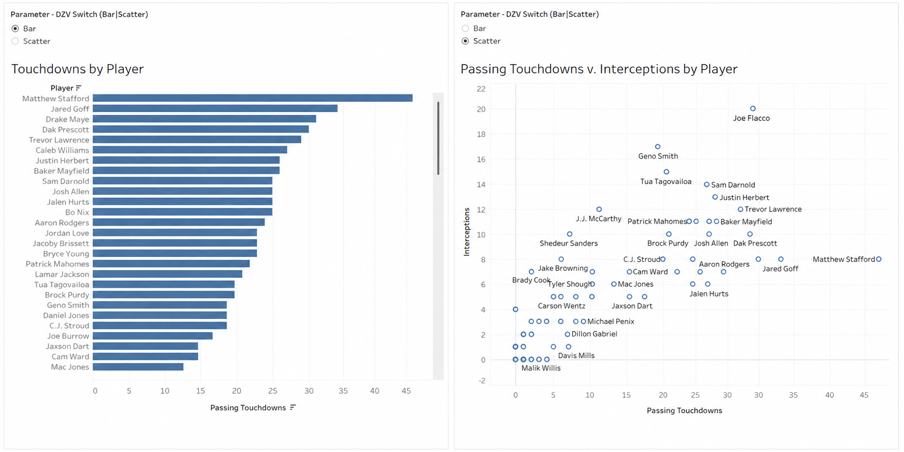
Congratulations! You now have a dashboard that can dynamically switch between two completely different visualizations.
Extra Credit: Combine Dynamic Zone Visibility with Measure and Dimension Switching
Now that you know how to switch between different visualizations using Dynamic Zone Visibility, we can take things one step further.
In the previous post, we learned how to use Measure Switching and Dimension Switching to change what is displayed within a visualization.
By combining those techniques with Dynamic Zone Visibility, we can create a dashboard that allows users to control:
- Which measure they analyze
- Which dimension they analyze it by
- Which type of visualization they use
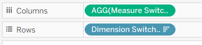
For the bar chart, you can place the Measure Switch calculated field on Columns and the Dimension Switch calculated field on Rows.
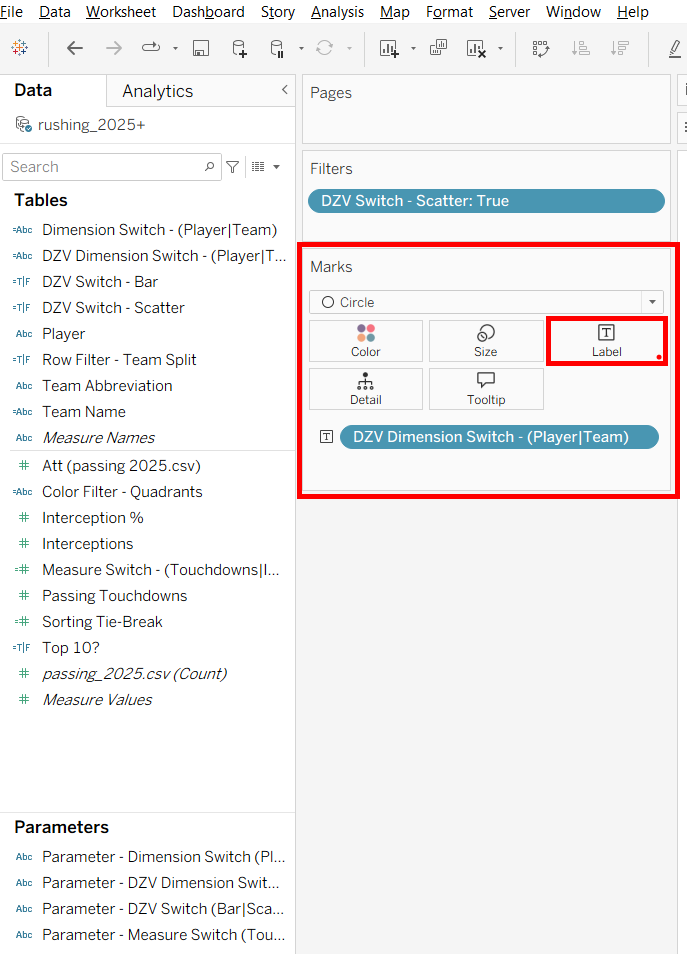
For the scatter plot, you can incorporate the Dimension Switch into the view as well by placing it on the Label.
Then, following the same Dynamic Zone Visibility process we just completed, both views can be brought together into one interactive dashboard.
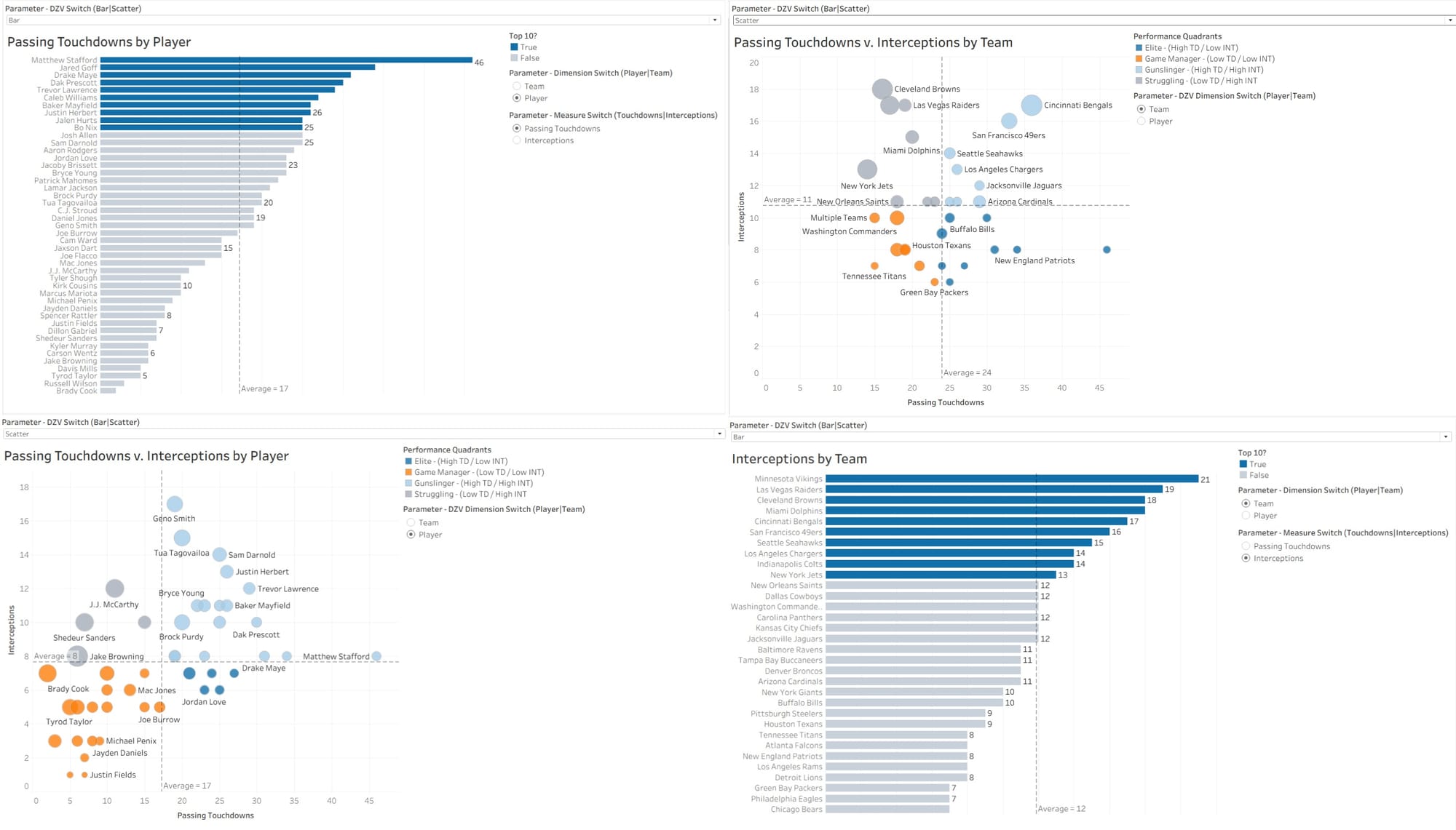
The final dashboard can now switch between Player and Team, between different measures, and between the bar chart and scatter plot.
Congratulations! You Can Now Use Dynamic Zone Visibility
Dynamic Zone Visibility gives us another way to make Tableau dashboards more flexible and interactive.
While measure and dimension switching allow us to change what is displayed within a visualization, Dynamic Zone Visibility allows us to change which visualization is displayed.
By using parameters, calculated fields, filters, and visibility controls, we can let the user choose how they want to explore the data without filling the dashboard with every possible visualization at once.
And when we combine Dynamic Zone Visibility with measure and dimension switching, we can create an even more dynamic dashboard experience.