


When we think about accessibility in Tableau, a lot of the time we think of colour blindness. But there are so many other groups of people we don't realise that we're excluding by the way we design dashboards.
It is of course less often that we design specifically with accessibility in mind, however regardless of this what is important is knowing what design points to consider when we need to do this.
With this being our last week in training, today we were educated on designing for accessibility and were challenged to do so in 3.5 hours.
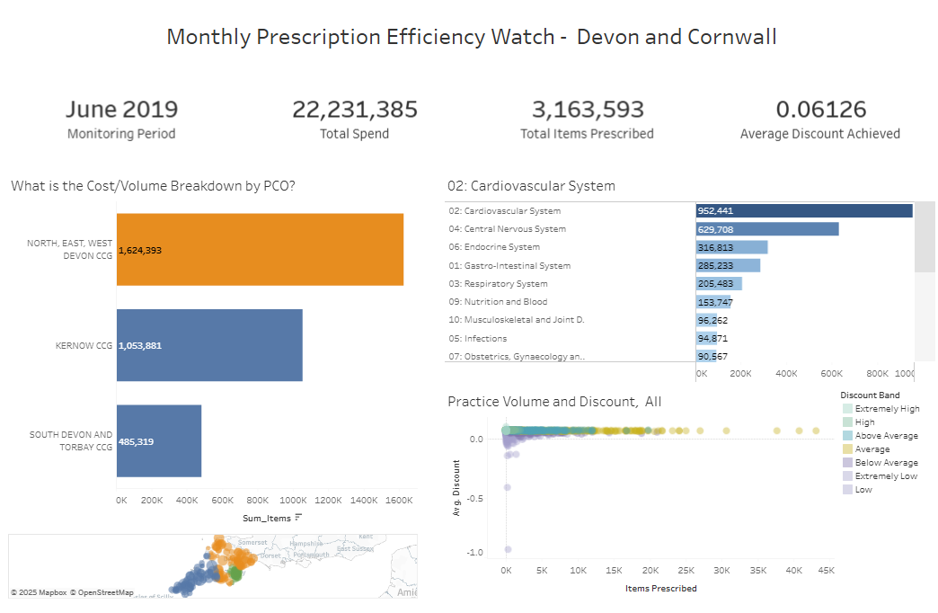
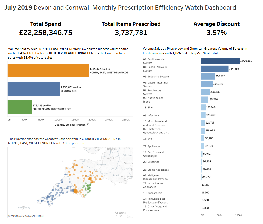
I picked to redesign an existing KPI dashboard to be more inclusive of a Chief Operating Officer who uses a screen reader (image below).
My approach to this task was to use the narrator in combination with keyboard only controls to experience what it is like to navigate a dashboard like this - and I found out very quickly the limitations.
The KPIs weren't read out, any text on the charts were ignored and for the map and scatterplot the narrator only explained what fields were being displayed (such as the PCO areas being on colour, the practice locations being on detail) without any description of what is actually happening.
But the most important thing was, I didn't get any answers by just listening to the board.
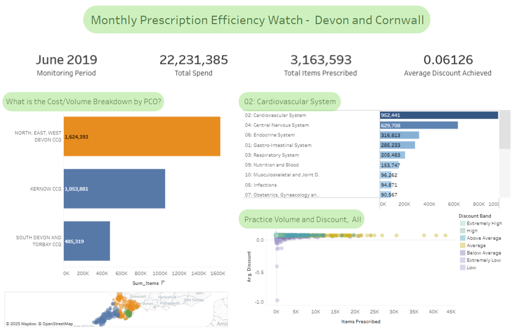
One of the first things I changed was moving the date KPI into the title, so it would be read straight away.
Then I changed the rest of the KPIs into titles instead of using the sheet so that the narrator detects it. I also changed the structure of the KPI, so that the descriptor is read out first (there was only one month of data, otherwise I would use the max!).


The next steps were to call out important values within the charts. This involved writing many of the same calculations repeatedly to call back the maximum and minimum values. And with those values, it meant that I could then use them in the title (and so with new data they would dynamically update).
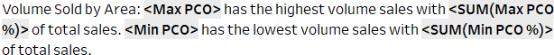
And though the titles seem long, this is the only way for the narrator to recognise text and for it to dynamically update.
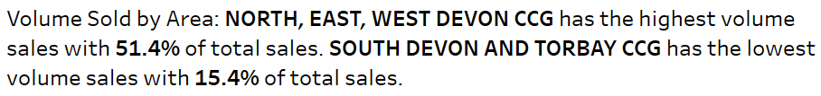
So for the bar chart I showed the highest and lowest performing areas, I pointed out which surgery had the greatest cost per item, and for the bar chart detailing the physiology and the chemical volumes I pointed out the physiology with the greatest volume of sales.
Due to time constraints I didn't include the scatterplot, and instead focused on the KPIs and the 3 other charts. After doing those I did some formatting (making text bigger, darkening light text, labelling the axis) to form my final dashboard.
Of course there are still some things I want to change. The aim of my particular challenge was to make a dashboard that was inclusive to a screen reader, and I realised how it was a bit of a challenge to redesign something that already exists.
For me, it reiterated that my style of dashboard building is to build it up from scratch, but of course by altering what exists there is that element of familiarity - especially for those who don't require screen reader assistance.
Overall it was a great challenge to undertake which made all of us think a bit more differently about how we will design for the future.