


Some use cases for a pareto chart:
- What percentage of customers contribute to overall sales? E.g If 10% of customers make up 90% of sales, as a business, this could indicate you're either overly reliant on, or highly specialized around that customer base.
- What percentage of suppliers contribute to overall business costs.
- What % of players scored over 50% of all PL goals scored last season? (demo below)
Example and follow-along
Data used: An aggregated version of makeover monday 2026 week 22 'Arsenal 25/26 champions". The data file used here contains an individual player name and how many goals they scored last season.
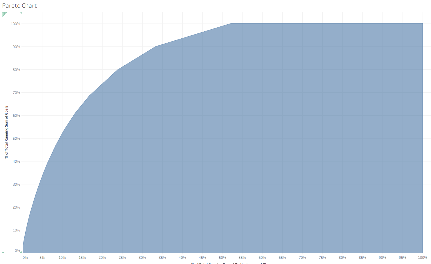
In this chart, you can see what percentage of players contributed to the total goals scored in the 25/26 Premier League season, alongside each individual player's contribution.
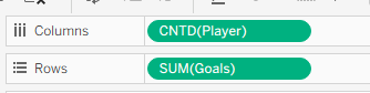
- Rows and columns: Count of distinct players on columns, sum of total goals for the season on rows
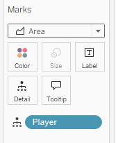
- Chart type and level of detail: Add player onto detail and change the chart type to area
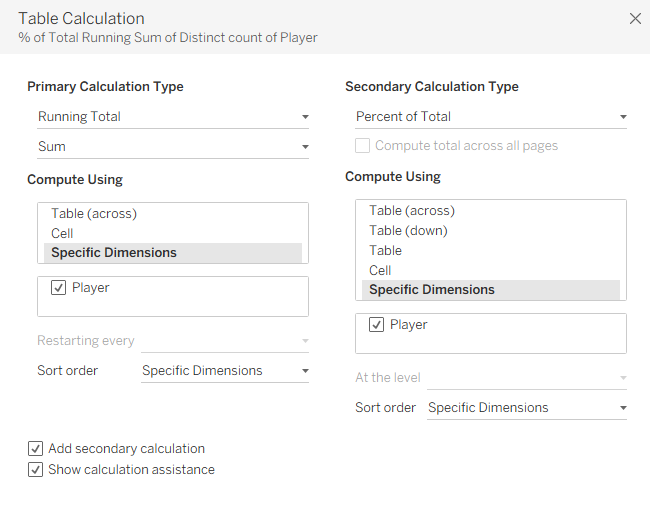
- Using table calculations: Right click on count of distinct players in columns and add a table calculation. Configure the table calculation as per below. It’s important to note that not all primary calculation types allow you to add a secondary calculation.
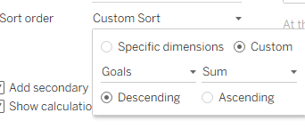
- Sort order: For both the primary and secondary calculations, configure the custom sort below:
- Repeat steps 3 and 4 for the SUM(Goals) field.
- Now the chart should look like this
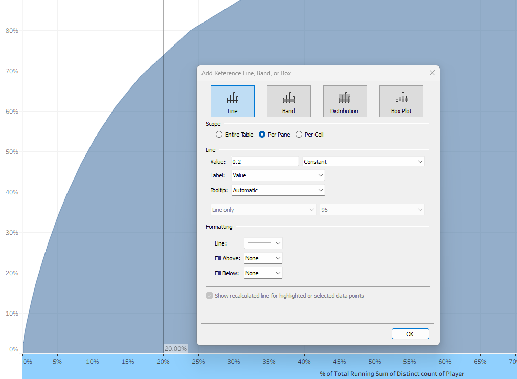
- Next, add reference lines. This can be done by right clicking on an axis and selecting ‘add reference line’.
- Finally, add formatting, colors, and additional reference lines to enhance the visualization and help tell the story.