


Another week, another revamp of an old dashboard. I sat down to update my U.S. Avocado Market dashboard this time, and like last week, I figured I was just cleaning it up. But it turned into something bigger. It's really about three things for me: reviewing my past work and seeing how I'd improve it with what The Information Lab has taught me, practicing the skills I've picked up, and keeping the original around too. It wasn't great, but it was mine at the time, and seeing it next to this version is the clearest way I have of measuring how much I've grown.
The user story
Every chart on this dashboard is built around the same underlying question: what's actually driving the avocado market, and does it move the way people assume it does? The original version tried to answer that with a wall of charts that mostly just displayed data without pointing anywhere. This version is built so each chart answers a specific piece of that question. Does volume actually predict revenue, or can they diverge? Do prices really peak in the fall, or is the real story what happens right after the peak? And when a market holds the top spot, does it hold it all year, or is there real movement happening underneath it? Three charts, three angles on the same core question, instead of a handful of charts with no direction.
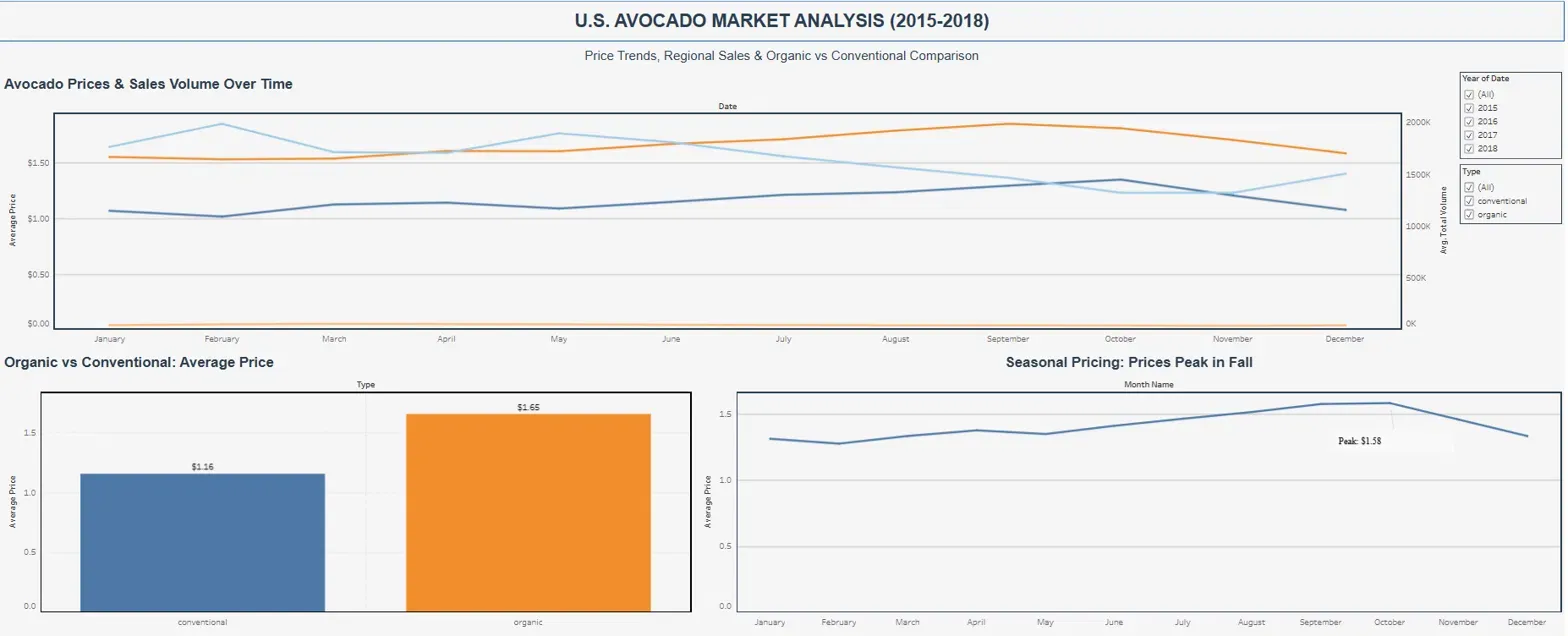
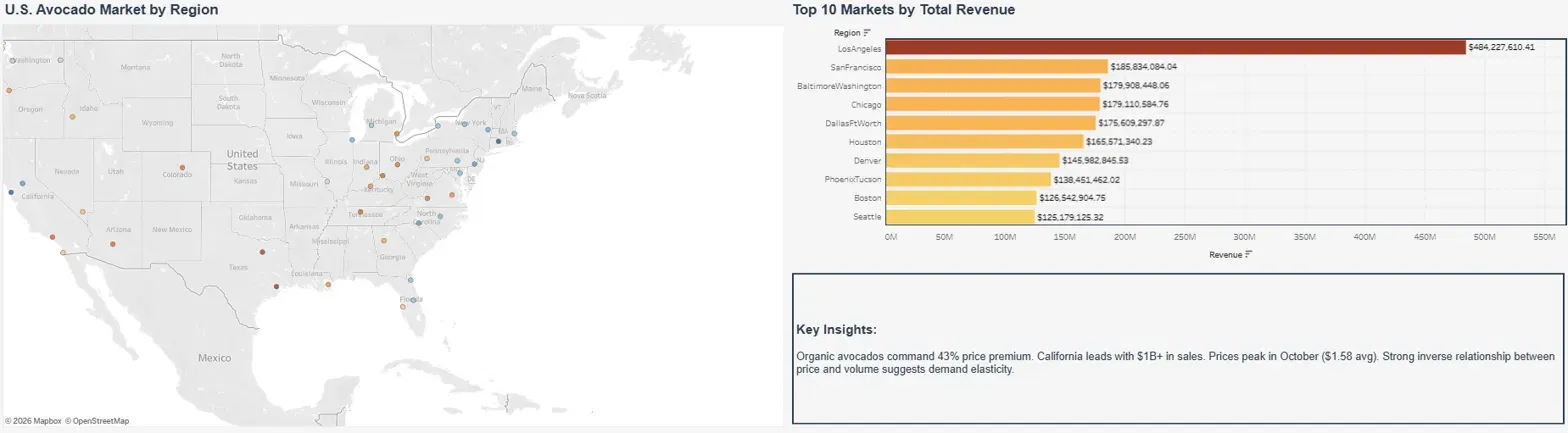
New visuals and technical cleanup
Once I had the story straight, I leaned on Serena Purslow's Visual Vocabulary for the chart types themselves. Serena is a coach at The Information Lab, and her Visual Vocabulary has become a go to reference for me whenever I'm picking a chart type.
The bump chart came straight from her ranking section, and it's what replaced my old Top 10 Markets bar chart. Tracking the top 5 markets by quarter turned a static leaderboard into something you can watch move. LA and San Francisco hold their spots all year, but underneath them, Baltimore/Washington, Chicago, and Dallas Fort Worth trade places twice, which a ranked bar chart could never have shown.
The combo line and column chart came from her section on showing change over time. I made volume the bars and revenue the line on a second axis instead of plotting them as two competing lines, and it turns out they don't move together. February has the highest volume, but July has the revenue peak.
Alongside the new chart types, I cleaned up a handful of things I'd let slide in the original build. I pulled the gridlines and chart borders so the dashboard reads cleaner without the extra visual noise competing with the data. I fixed a double encoding issue where color and position were both trying to communicate the same thing. And I moved legend information into the titles and axis labels themselves, so a viewer doesn't have to glance away from the chart to figure out what they're looking at.
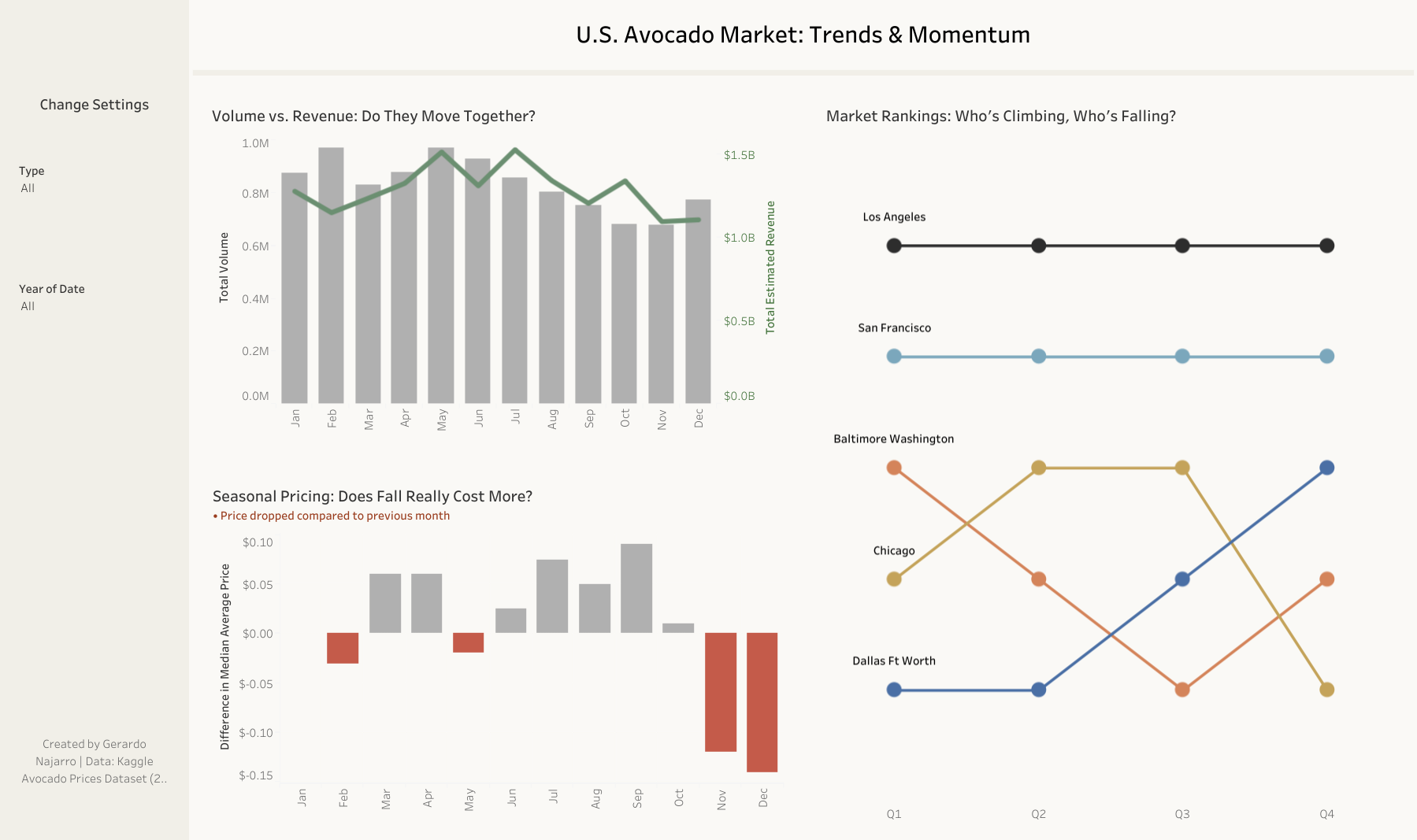
What I'd take from this
The technical stuff mattered, but the real shift was asking what each chart was actually for instead of just how to make it look better. Going from a sprawling six panel dashboard to three focused ones, each doing its part of the same story, made the result feel a lot more intentional than where I started. Looking back at that first version, that's the part I'm proudest of.