


Day 3 of dashboard week and we jumped straight into accessibility.
My task was to design a dashboard that promoted inclusive tourism in London. This dashboard was tailored to a client with dyslexia and dyscalculia, and who dislikes dashboards filled with icons, percentages, and where colors blur together.
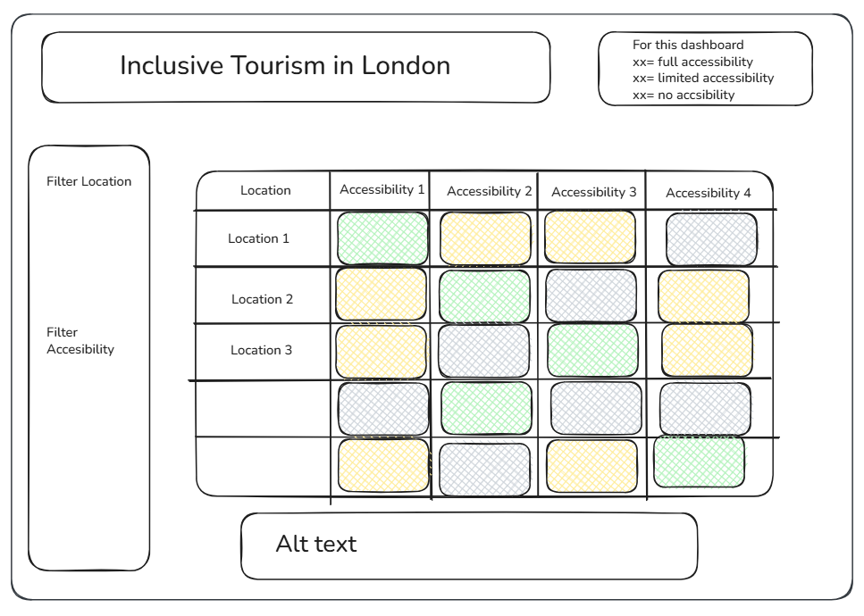
I built a heatmap showcasing accessibility features across different attractions and boroughs. This heatmap was paired with a filter for borough, attraction name, and accessibility type. To avoid cognitive overload, this dashboard features three main colors: green visualizing that an accessibility is available at that attraction, yellow for limited access, and grey for unavailable.
Initial Sketch:
Final Product:
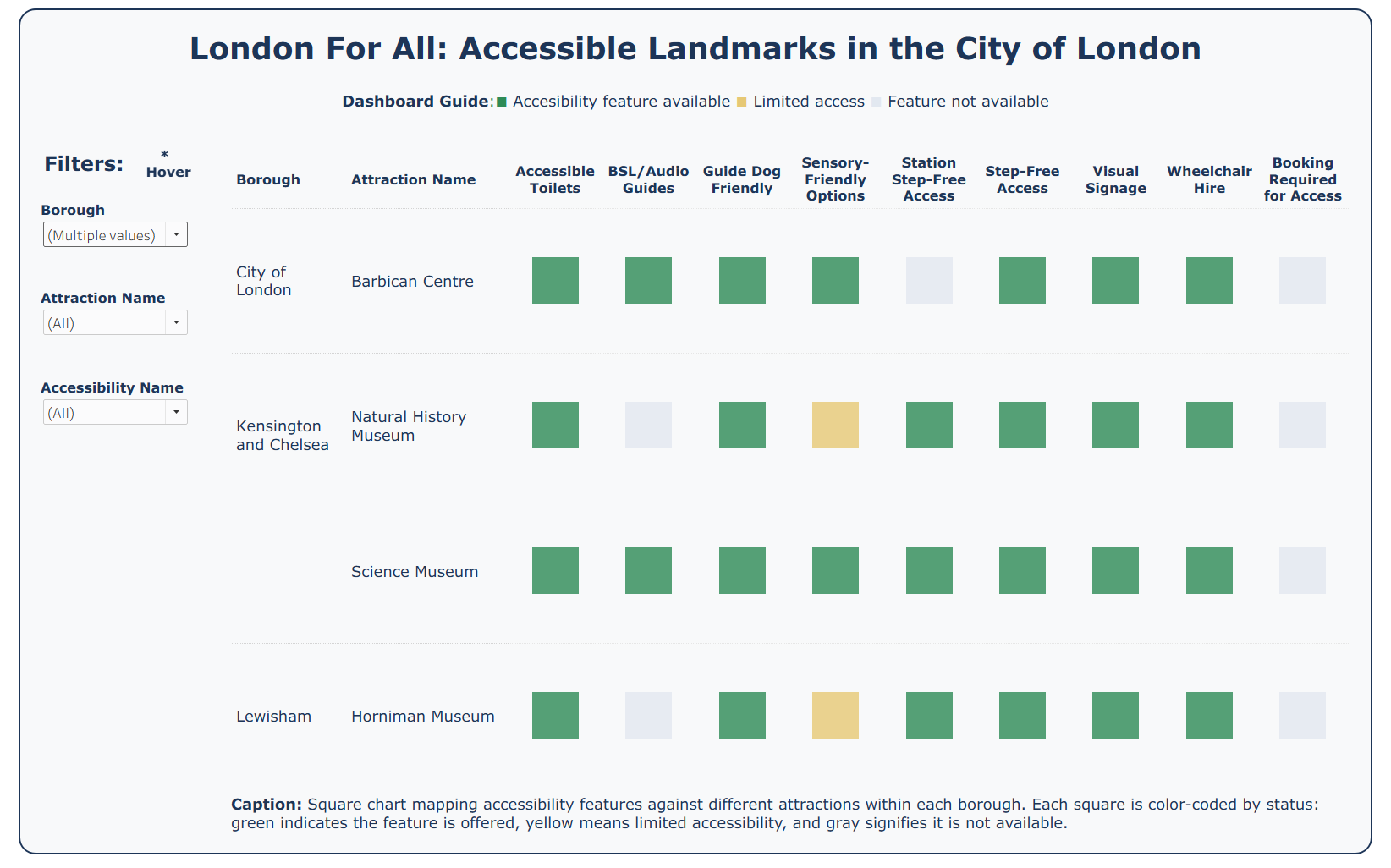
Feedback: Something to keep in mind next time is to not rely on just color. To cater to all users, I could consider using the combination of shape and color. Secondly, I acknowledge that selecting all filters can make the dashboard look too overwhelming. Figuring out how to visualize all these values and avoid cognitive overload is a goal for a future iteration.
Link:
https://public.tableau.com/app/profile/carla.villafana/viz/DashboardWeekDay3_17883750107600/AccessibilityDash