


Making a dashboard look appealing should be high in your priorities as a dashboard designer. Containers in Tableau make it easy to structure your work so you can present it in many different ways and also make it easy to resize and reorganise things.
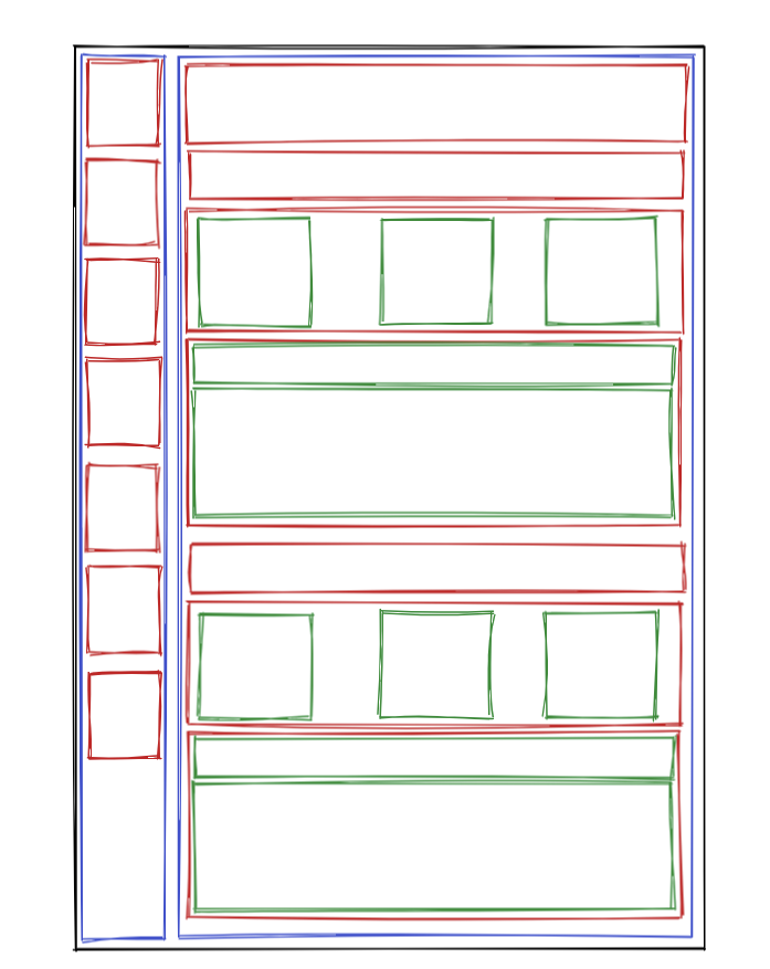
Before starting to pull containers onto a blank dashboard, it is beneficial to draw out your design to give a clear path to get to your end product. Personally, I use a website called excalidraw, which is a site to draw simple shapes. With this tool it is easy to draw out a dashboard and the containers that lie within it. It is especially helpful to use colours to distinguish containers within containers.
Firstly, set the dashboard to the correct size. The dashboard will readjust if the size is changed later but it is good practice to find a close size so there is less resizing at the end, which can potentially reformat things.
It is important to understand containers within containers. It is possible to drag containers on and make them fit, however this can cause sizing issues down the line.
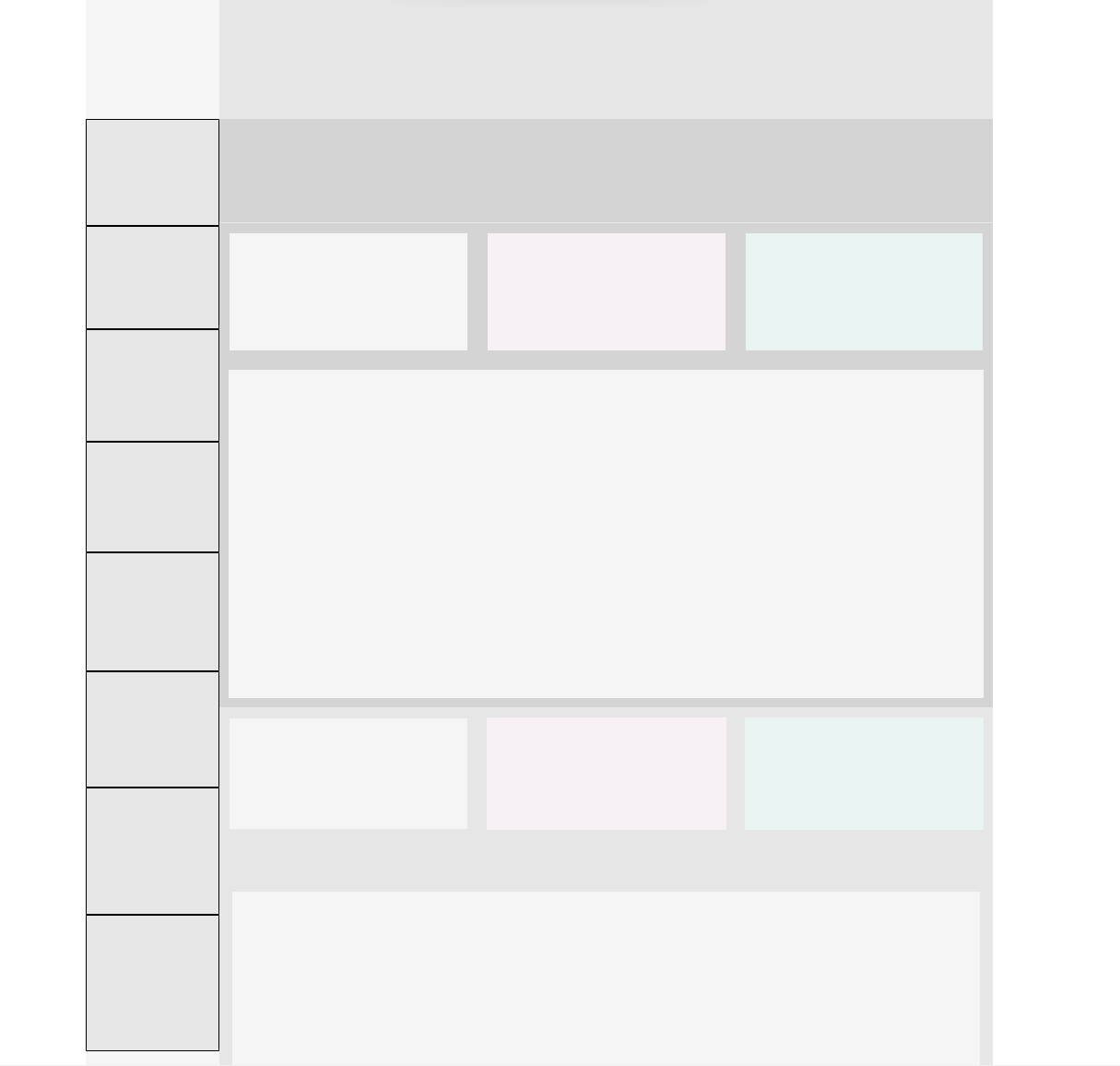
In this specific example, two horizontal containers were placed in the dashboard. One for the filter bar and one for the rest of the charts. Inside these containers, more containers are placed to hold the charts/buttons/text. When placing containers inside a container, it will make the parent container a 'tiled' container, which gives the option to distribute contents of the container equally.
Colouring containers in the layout pane in Tableau makes it again easy to distinguish between containers. To make these containers stand out, padding can be added, pushing the size of the container inwards. Inner and outer padding can be combined to create great looking visualisations.
In conclusion, it is important to spend time planning the design of your visualisation before starting to build it. It will save time in the creation process, give more flexibility when designing and will result in a cleaner, clearer visualisation. Getting these techniques right can really set your visualisations apart.