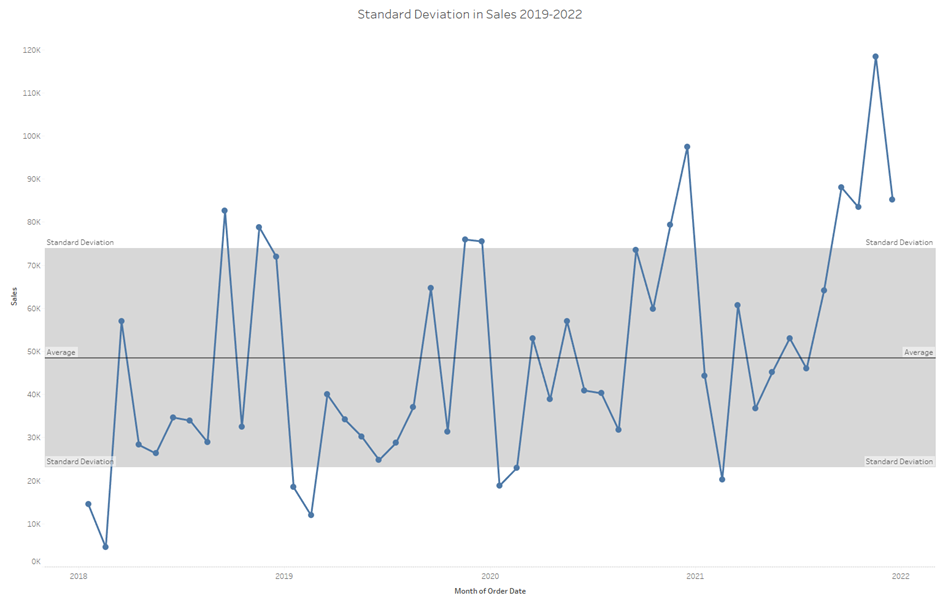
A control chart adds additional insight to a traditional line graph via the addition of a reference band – for example highlighting a target range of sales, standard deviation or the interquartile range. This blog will walk through building a simple control chart showing sales over time with an average line and a band for 1 standard deviation in sales.
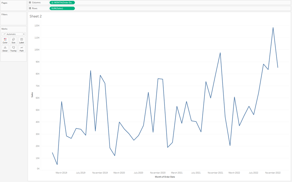
Build a line chart by dragging MONTH([Order Date]) onto columns and SUM([Sales]) onto rows.
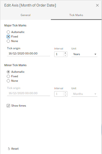
I formatted the axis so that only the years show as labels, with months indicated by tick marks. To do this, right-click on the Month of Order Date axis, select edit axis and configure as shown:
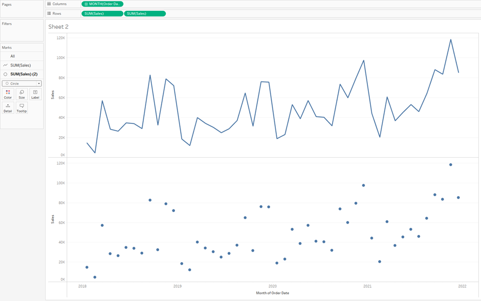
Duplicate SUM([Sales]) in rows by holding down control and dragging the SUM([Sales]) pill to the right of itself in rows.
In the marks card, navigate to SUM([Sales]) (2) and change the chart type to circle.
Right click on the Sales axis of the circle chart and click dual axis.
Right click on the Sales axis and click synchronise axis.
Go to the analytics pane on the far left.
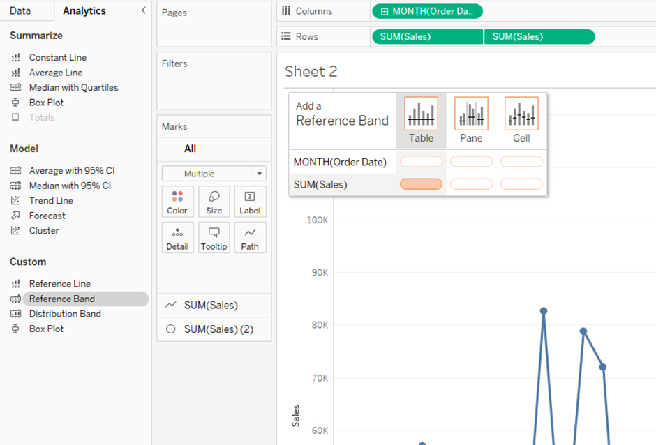
Left click and drag reference band to the view where there will be a pop up as shown. We want to drop this reference band pill onto SUM(Sales) under Table.
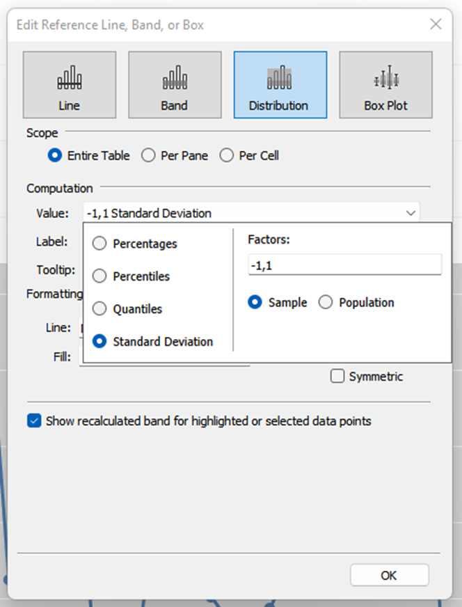
In the window that pops up as a result, click distribution along the top and then in the Value dropdown select Standard Deviation, as shown:
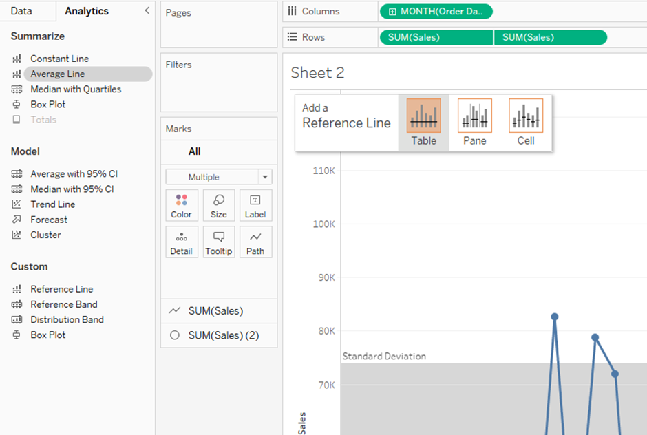
Add an average line by dragging the Average Line pill from the analytics pane to the view, and drop it on Table.
Here is how the control chart looks now:
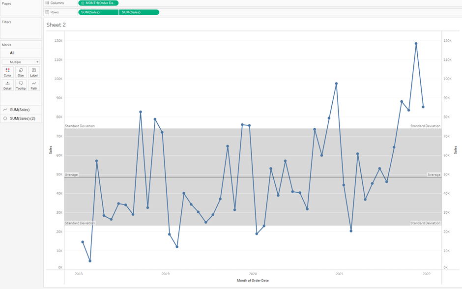
All that’s left to do is some formatting! Right-click on Average or on Standard Deviation to edit and format these lines (there is currently no line for standard deviation as it is set to Line: None within the edit menu, but this can be changed if desired). Right-click on the right Sales axis and untick Show Header so that we only have one y-axis. I also removed the grid lines and voila!
