In today’s training, we discussed many best practices for communicating with data. One of the interesting new concepts I learned is called “The Data-ink Ratio”, which was introduced by Edward Tufte. What he said was that “A large share of ink on a graphic should present data-information, the ink changing as the data change. Data-ink is the non-eraseable core of a graphic, the non-redundant ink arranged in response to variation in the numbers represented”.
The data-ink ratio =

To put it simple, the idea is that a visualization should use the minimum amount of ink necessary to convey the information effectively and avoid any non-informative elements. High data-ink ratio visualizations are characterized by simple, uncluttered designs that allow the data to speak for itself, while low data-ink ratio visualizations tend to be busy and cluttered, with a lot of extraneous elements that distract from the message.
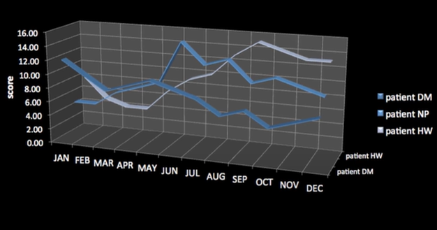
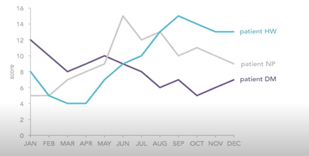
I would like to use an example to show how we can improve the data-ink ratio so that the visualization can be more effective.
Low Data-ink Ratio Visualization:

Data source: http://www.youtube.com/watch?v=bDbJBWvonVI
High Data-ink Ratio Visualization:

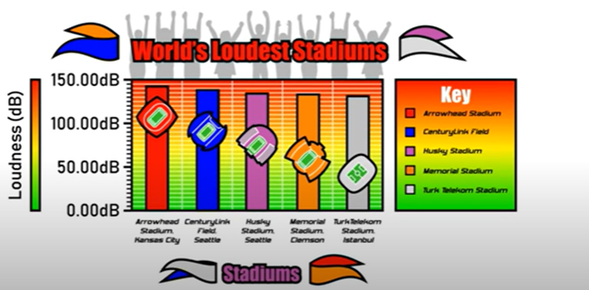
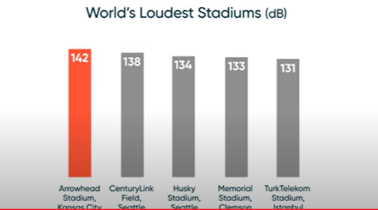
Here is another example:
Low Data-ink Ratio Visualization:

Data source: https://www.youtube.com/watch?v=pCp0a5_YIWE
High Data-ink Ratio Visualization:

So what did we do to improve the data-ink ratio? We removed
· Heavy Gridlines
· Unnecessary text
· Unnecessary color
· 3D effects
· Icons
· Pictures
· Axis ticks
· Redundant labels
· Redundant titles
· Shading & gradients
and simplified the visual design so that the information is easy to understand at a glance.
