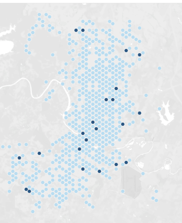
In this blog I will show you how to make a Hex Map. Hex map are a great way to visualise data when the actual location is not that relevant, or when there are some outliers, like Alaska and Hawaii in the USA for example or when the size of the locations do not matter. I will use a dataset with for the bike accidents in Austin, Texas.
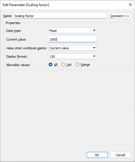
Step 1: Create a parameter for choosing the size of the shapes. Show the parameter.
Step 2: Create two calculated fields for X axis and Y axis
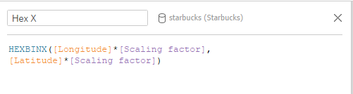
HEXBINX([Longitude][Scaling factor],
[Latitude][Scaling factor])
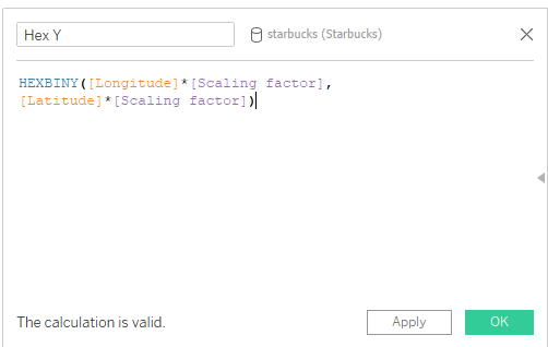
HEXBINY([Longitude][Scaling factor],
[Latitude][Scaling factor])
Step 3: Change the data type for the Hex X and Hex Y to dimensions and change the data type to Georgraphic Longitute for Hex X and Latitute for Hex Y.
Step 4: Drag and drop Hex Y on the columns shelf and Hex Y on the rows shelf
Step 5: Change the marks cards to shapes and choose a shape you want to use. I chose a diamond shape.
I increased the scale to 250 and here is what I ended up with:
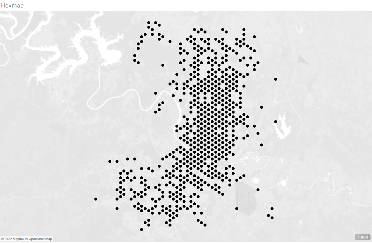
I will now replace the shape with a custom Hexagon shape and will adjust the size. I will also drag and drop Death onto color and my Hex map is ready!