


Building a dashboard is a great way to centralise the location of various types of visual data. They contain related pieces of information that help the intended users better understand the current challenges they are facing in their business. The ability to customise them in terms of formatting massively adds to the experience for the end user, so it is important to format them in a way that makes the information easy to understand at a glance, and create them in a way that allows users to quickly pick out key information. We will explore some of the key practices that facilitate this.
Z-Pattern
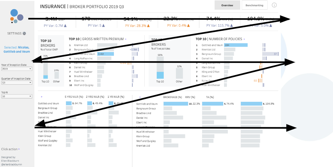
We tend to read things from a left-right, top-down format. By displaying the most important information according to this logic, it is much easier for users to quickly pick out the key information.
Colour
Colour should be used as sparingly as possible. It is important to avoid colours that are too dark/bright, and reserve these only for highlighting the most important information.
Consistency
In terms of text, the same elements should be formatted the same throughout. For example, all sub-headers should be equally sized. Colour should follow a consistent theme, and ensure your charts are nicely aligned!