


Polar Area Charts, first used by Florence Nightingale in 1856, are a popular way to present data in sports data environments. Whilst it could be argued that this visualisation is not best practice, the Polar Area Chart helps users to quickly compare players across multiple metrics and gives you a general sense of a players strengths or styles of play.
Many sports data providers generate multiple outputs for a range of metrics. These metric values can range from 2 decimal places to values in the thousands. This makes it tricky to compare values to one-another in a single visualisation, therefore it is advisable to utilise percentiles to normalise the comparisons between metrics.
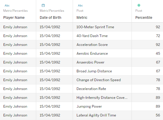
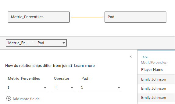
In this guide, we are using a fake dataset and you can download the original excel file below as well as view and download the Tableau Workbook here. One row of data represents one person and their percentile score for each of the 20 metrics. In Tableau Desktop, we bring in our Metric_Percentiles table into the data model and then pivot all of the metrics to create a ‘Metric’ field and a ‘Percentile’ field. Next we bring our ‘Pad’ excel sheet into the data model, creating a 1 = 1 relationship (under Create Relationship Calculation, add ‘1’ to each side of the relationship, and click OK). If you are using your own data, the two key things are to have a Metric field and a Value/Percentile field, plus a relationship with the Pad table, of which you can use the CSV below.
Step 1
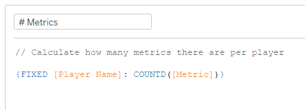
Now our data is ready we can begin to create our specific calculated fields. We will create them all before bringing them into the view. First we need to add up the number of metrics per player using an LOD.
Step 2
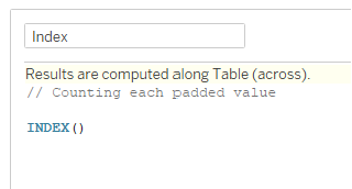
Create the ‘Index’ calculation.
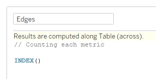
Step 3
Create the ‘Edges’ calculation.
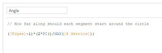
Step 4
Create the ‘Angle’ calculation.
([Edges]-1)(2PI()/MAX([# Metrics]))
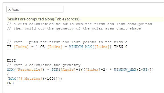
Step 5
Create the ‘X Axis’ calculation.
IF [Index] = 1 OR [Index] = WINDOW_MAX([Index]) THEN 0
ELSE
MAX([Percentile]) * SIN([Angle]+((([Index]-2) * WINDOW_MAX(2*PI())
/
(MAX([# Metrics])*100))))
END
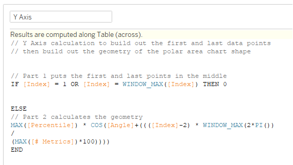
Step 6
Create the ‘Y Axis’ calculation.
IF [Index] = 1 OR [Index] = WINDOW_MAX([Index]) THEN 0
ELSE
MAX([Percentile]) * COS([Angle]+((([Index]-2) * WINDOW_MAX(2*PI())
/
(MAX([# Metrics])*100))))
END
Step 7
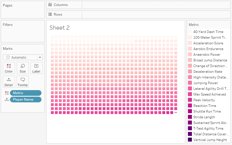
Add ‘Player Name’ to Detail and ‘Metric’ to Colour.
Step 8
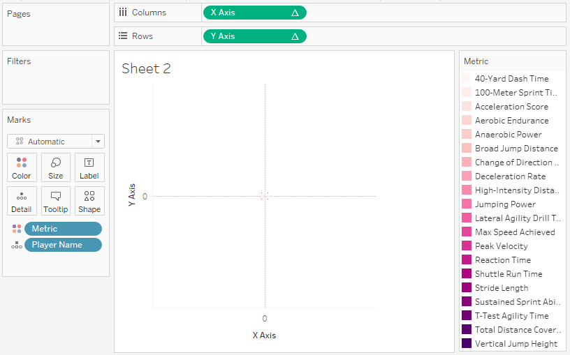
Add ‘X Axis’ to Columns and ‘Y Axis’ to Rows.
Step 9
Change the Marks chart type from Automatic to Polygon. Add ‘Pad’ to Path. Right-click Pad and change it to a Dimension.

Step 10
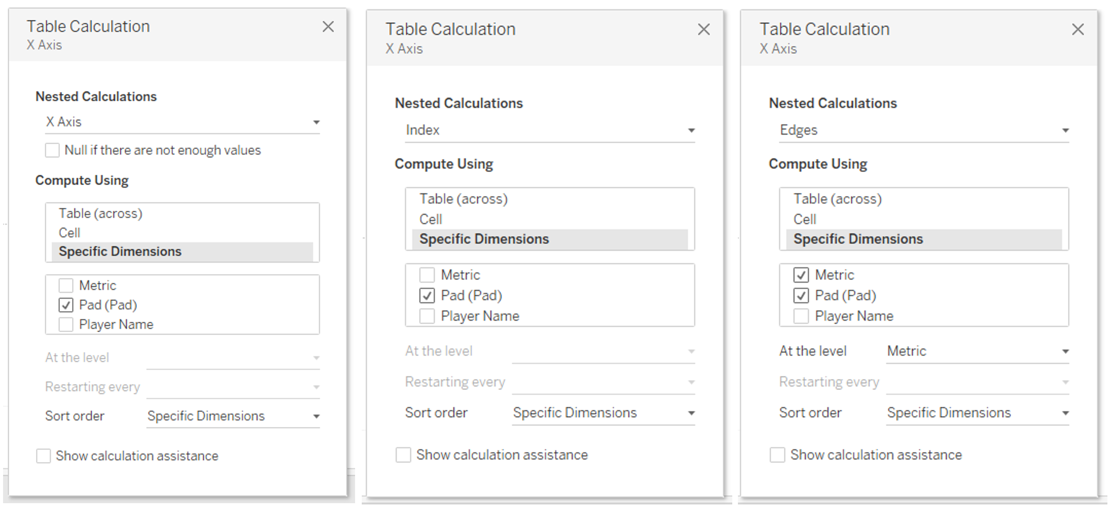
Right-click ‘X Axis’ and Edit Table Calculation. Here we have three nested calculations to edit. 1) On ‘X Axis’, select Specific Dimensions and tick Pad, 2) on ‘Index’, select Specific Dimensions and tick Pad, 3) on ‘Edges’ select Specific Dimensions and tick Metric and Pad. Metric should sit above Pad. Adjust the ‘At the level’ value to ‘Metric’.
Step 11
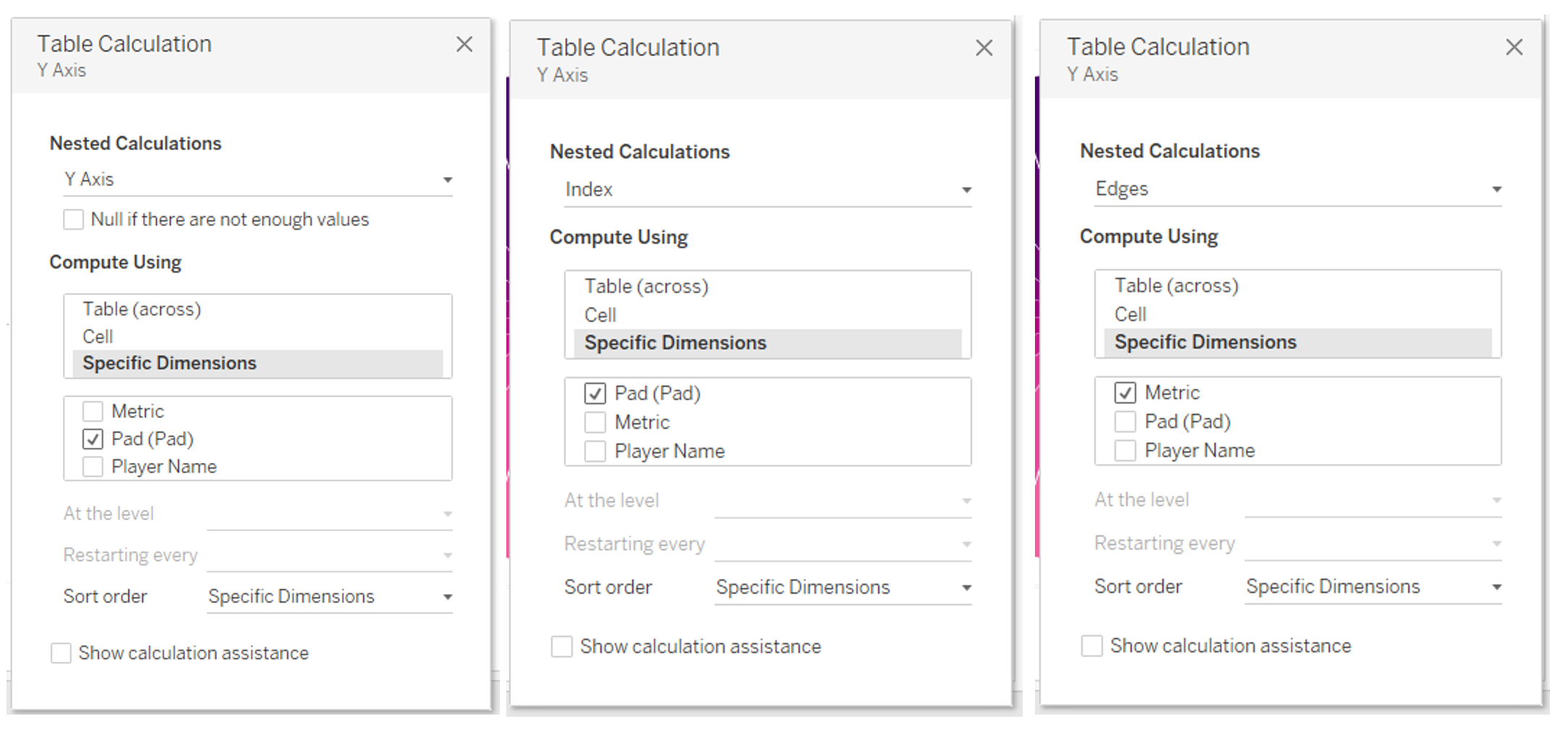
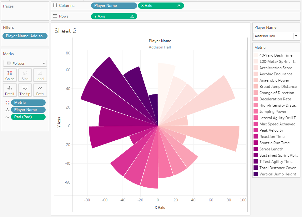
Right-click ‘Y Axis’ and Edit Table Calculation. Here we have three nested calculations to edit. 1) On ‘Y Axis’, select Specific Dimensions and tick Pad, 2) on ‘Index’, select Specific Dimensions and tick Pad, 3) on ‘Edges’ select Specific Dimensions and tick Metric. When you close this window, you will see the full shape of the Polar Area Chart.
Step 12
Finally, drag ‘Player Name’ to Columns. This will automatically give you a chart per player. Right-click ‘Player Name’ and Show Filter, then tick/untick how many names you want to see in the view. Format how you see fit and you’re done!
If you have any questions, reach out on LinkedIn!