Parameters in Tableau aren’t just for filtering — they can also switch entire measures in your visualizations.
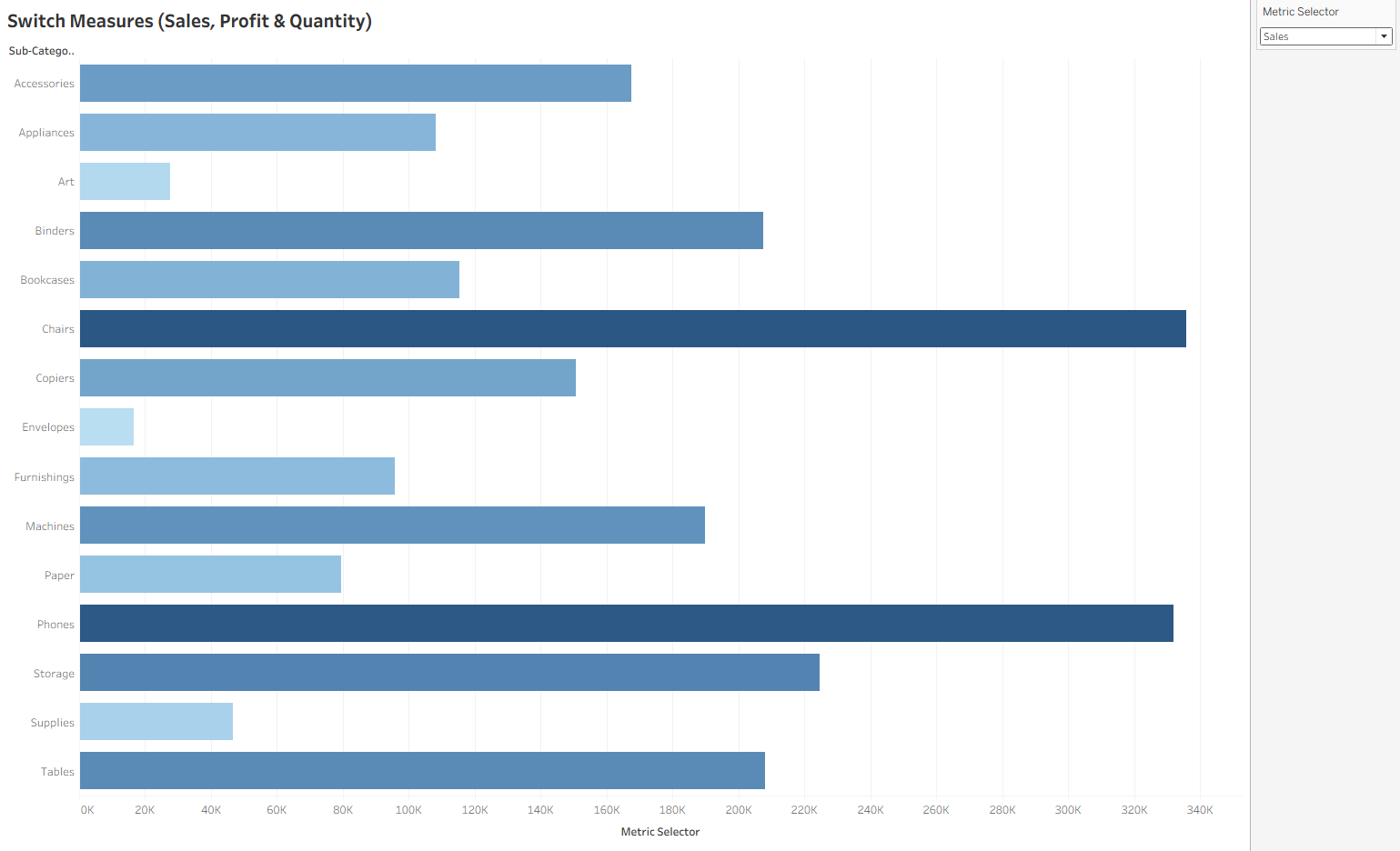
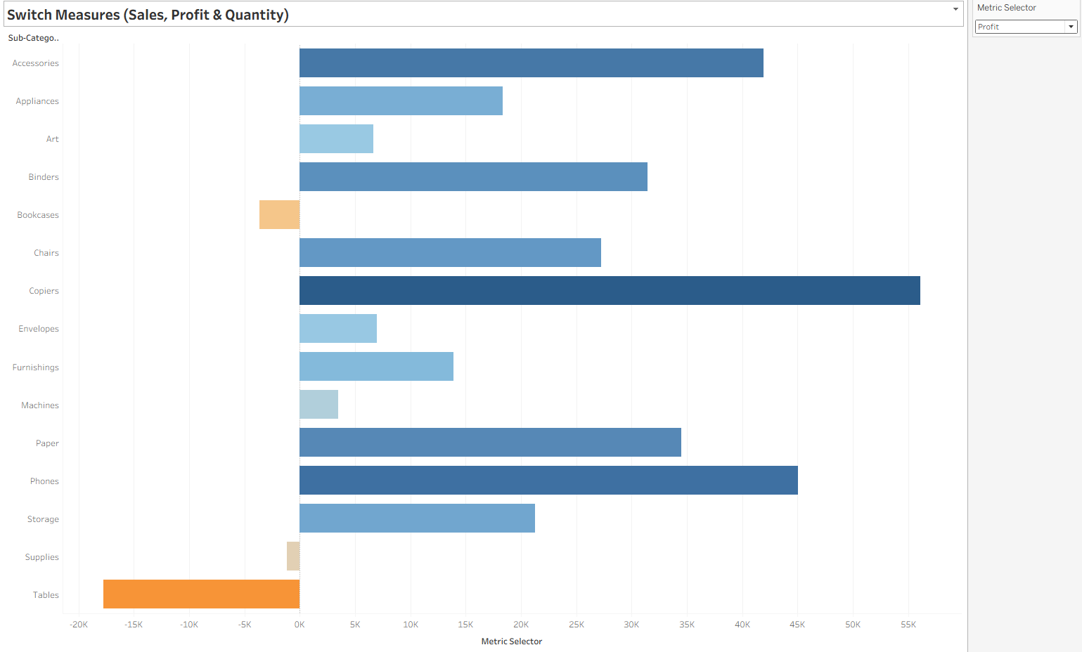
One of the most popular uses is a Metric Selector, which allows your audience to choose whether they want to see Sales, Profit, or Quantity (or any measure you define) without creating multiple charts.
This is perfect for dashboards where space is limited but flexibility is important.
When to Use a Metric Selector Parameter
- Let users toggle between KPIs (e.g., Sales vs Profit vs Quantity)
- Create a single chart that answers multiple questions
- Keep dashboards clean while still offering multiple perspectives
- Avoid duplicating the same chart layout for different metrics
Example: Building a Metric Selector in Tableau
We’ll create a parameter that allows users to switch between Sales, Profit, and Quantity in the Superstore dataset.
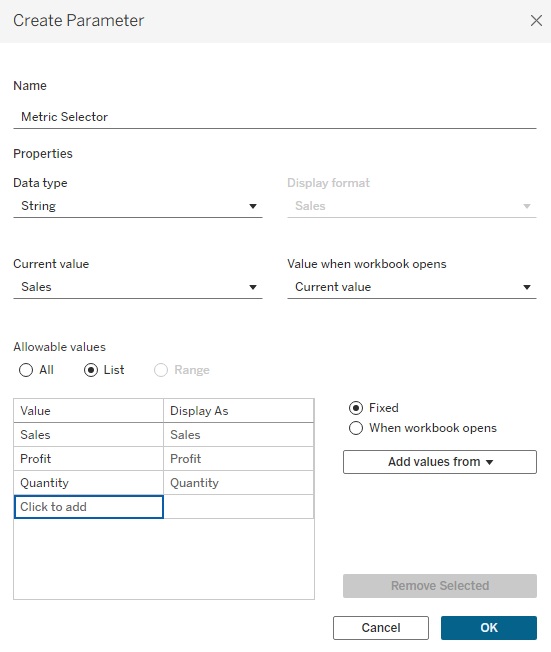
Step 1: Create the Parameter
- Right-click in the Data Pane → Create Parameter.
- Name: Metric Selector.
- Data Type: String.
- Allowable Values: List.
- Add:
"Sales","Profit","Quantity".
- Add:
- Set Current Value to
"Sales"(default starting view). - Right-click the parameter → Show Parameter.
Step 2: Create a Calculated Field
We need a field that changes its value based on the parameter selection.
Name: Metric Selector
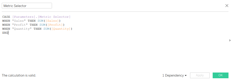
CASE [Metric Selector]
- This tells Tableau: “Look at the value of the Metric Selector parameter and decide what to return based on it.”
- The parameter’s value is a string (text) — either
"Sales","Profit", or"Quantity"— depending on what the user picks from the dropdown.
WHEN "Sales" THEN SUM([Sales])
- If the parameter equals
"Sales", Tableau will return the sum of the Sales measure.
WHEN "Profit" THEN SUM([Profit])
- If the parameter equals
"Profit", Tableau will return the sum of Profit.
WHEN "Quantity" THEN SUM([Quantity])
- If the parameter equals
"Quantity", Tableau will return the sum of Quantity.
END
- Marks the end of the CASE statement.
What This Does
- Think of it as one formula that can output three different measures depending on user choice.
- Instead of creating separate charts for Sales, Profit, and Quantity, you have one dynamic measure that swaps in and out.
Step 3: Build the View
- Place Category on Rows.
- Place Selected Metric on Columns.
- Sort in descending order.
- Add color encoding using Selected Metric for a richer look.