Using containers is something that's become somewhat inevitable when making Tableau dashboards. Applying to the Data School, I always found them annoying, rigid and just slightly frustrating to use. After being here for about 6 weeks now, I find them annoying, rigid and frustrating to use - but to a lesser degree. I now know why they annoy me and understand what I did wrong that made them annoying. More importantly however, I understand the benefits of using them and they really do make your dashboards look more neat and tidier overall.
We were tasked with replicating a fellow DS-ers dashboard, with containers just in mind and making it as alike to the original dashboard as possible. A good starting place when it comes to doing these types of tasks is using Excalidraw, which I used to create a rough draft of what the dashboard looked like and to help guide me in the replication process. To do it, it took both horizontal and vertical containers, as well as blanks.
A lot of blanks.
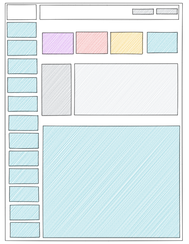
Starting off these dashboards, a safe bet to make is typically a vertical container with a blank inside it, as most dashboards have a strong vertical focus, with the analysis through views coming in a top-down style. To make this particular dashboard however, I but a horizontal container on the base first, before then placing two vertical containers within that horizontal. The left vertical allowed me to create the many buttons that were on the side of the particular dashboard, while the right vertical gave me the correct format to replicate the views and KPIs that were found on the right of the dashboard.
The four multi-coloured boxes on the top of the right represent the KPIs found in the particular dashboard, with the two containers underneath these representing a view (the righthand side box) and a couple other small charts to the left of it. This was made using a vertical container, with two horizontal containers stacked inside of it. Finally, the blue container at the bottom was a large table that was on its own, thus fitting in at the bottom of the vertical container that was there from the get-go.
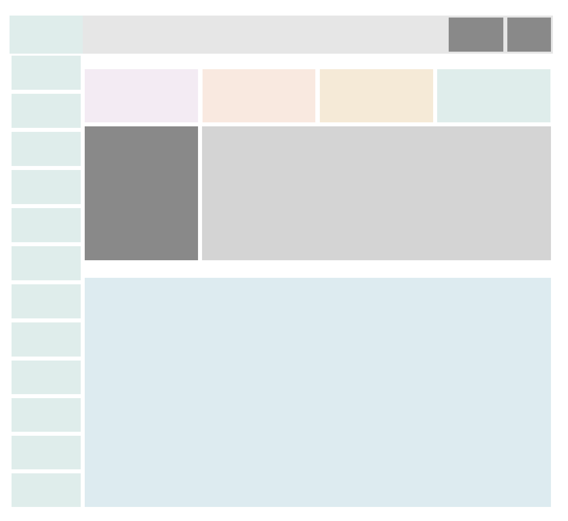
This was the finished product that I was able to make in Tableau. I was able to recreate the dashboard relatively well and kept up the same colour theme that featured throughout the dashboard, with the colours for the buttons on the left just being placeholders due to the fact that they were logos instead. In the future, I'd be happy to use this dashboard replicant as a sort of template (after making some changes to it, of course), it's by far and away the cleanest dashboard I've made so far!