Continuing DS33's dashboard week experience, day 2 wanted us to analyse data from the Wine Economics Research Centre in Adelaide. We all were given two different data sets, with only a maximum of 4 people allowed on each. I chose to look into the Annual Database of Wine Markets since 1835, looking into the economic performances of wines since then.
I chose to look at it in a different angle to help narrow down what I would be looking at, focusing on the countries that are importing wine within the last 100 years, and seeing just who in the world is the biggest 'Oenophile' (connoisseurs of wine), or realistically, are the biggest drunkards. Thankfully, the focus today was on analysis rather than design, which meant that we could happily put the thought of dashboards out of mind and focus more on nailing that analysis point.
Today reminded me of those terrible movie sequels where the first movie was such a success, and then they decide to release a second and you wish you never took the time to watch it (looking at you Independence Day: Resurgence). While yesterday was relatively a success with how the day went, today was a bit messier I'd say.
We started off with taking a look at the data, and selecting the tables that would help me best in my analysis of imports. Deselecting some null fields, adding in a field that could be used as a header title before then filtering and transposing to make the dataset more Tableau friendly, before then joining everything together and getting that complete dataset.
This was when I was most happy.
Then we got to Tableau and here I will say I can shift the blame solely onto myself (but of course if anyone wants to take it from me it's all yours). The best way I can put how my Tableau-ing went is that I tried to run before I could walk. I had a broad idea of what I was looking for and instead of fleshing those ideas out a bit more and narrowing down to specific questions, I chose to run with it and I got very lost in the end. Here's something that I will definitely try to not repeat throughout the rest of the week, especially if it lead to the outcome that happened today.
The principle questions that I was tackling with my analysis was seeing which countries had imported the most wine in the last 100 years, and cross that with the value of those wines that they importing, in hopes of getting an angle of analysis that sees if the mass amounts of wine that they're importing is more expensive or less than the amount that they're importing - AKA are they cheap wines they're bringing in or are they treating themselves to something more special. Alongside this, I wanted to look into those top 10 countries of importing wine and see what years did they bring in that amount of wine and why - what was happening in their respective countries that led to the need for wine.
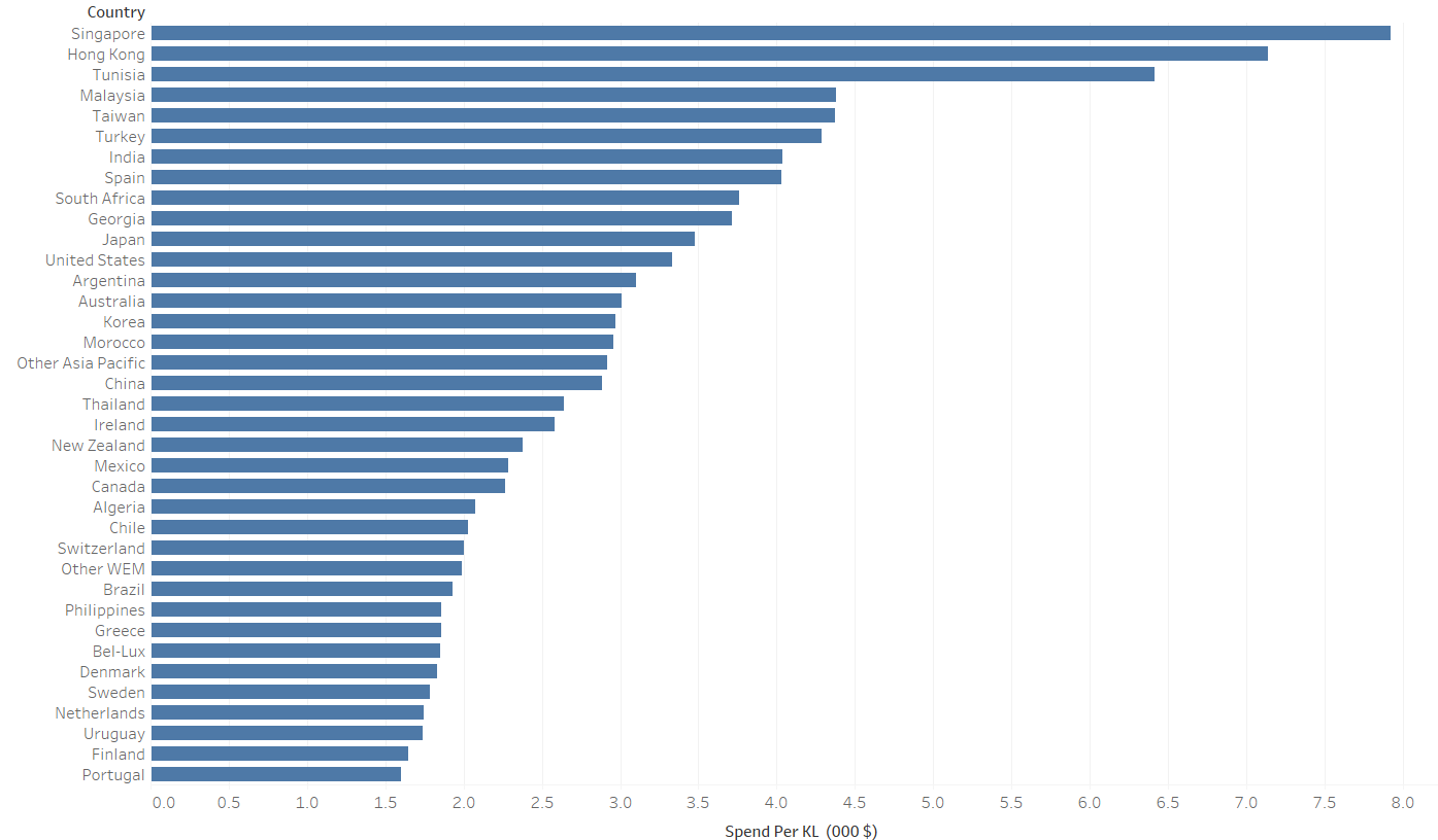
This was I think the most analytical chart that I had made. It looked at the spend per KL of wine imported - diving the value of the wines imported by the volume of those wines - giving us a look at just how much these nations were spending on their wines when importing. As you can see at the top, I can have some patriotic pride in my birthplace, with Singapore having the highest spend per KL where they're spending around 7000 USD per KL of wine that they're importing. Don't know if that is actually worth having pride about but I'll take it.
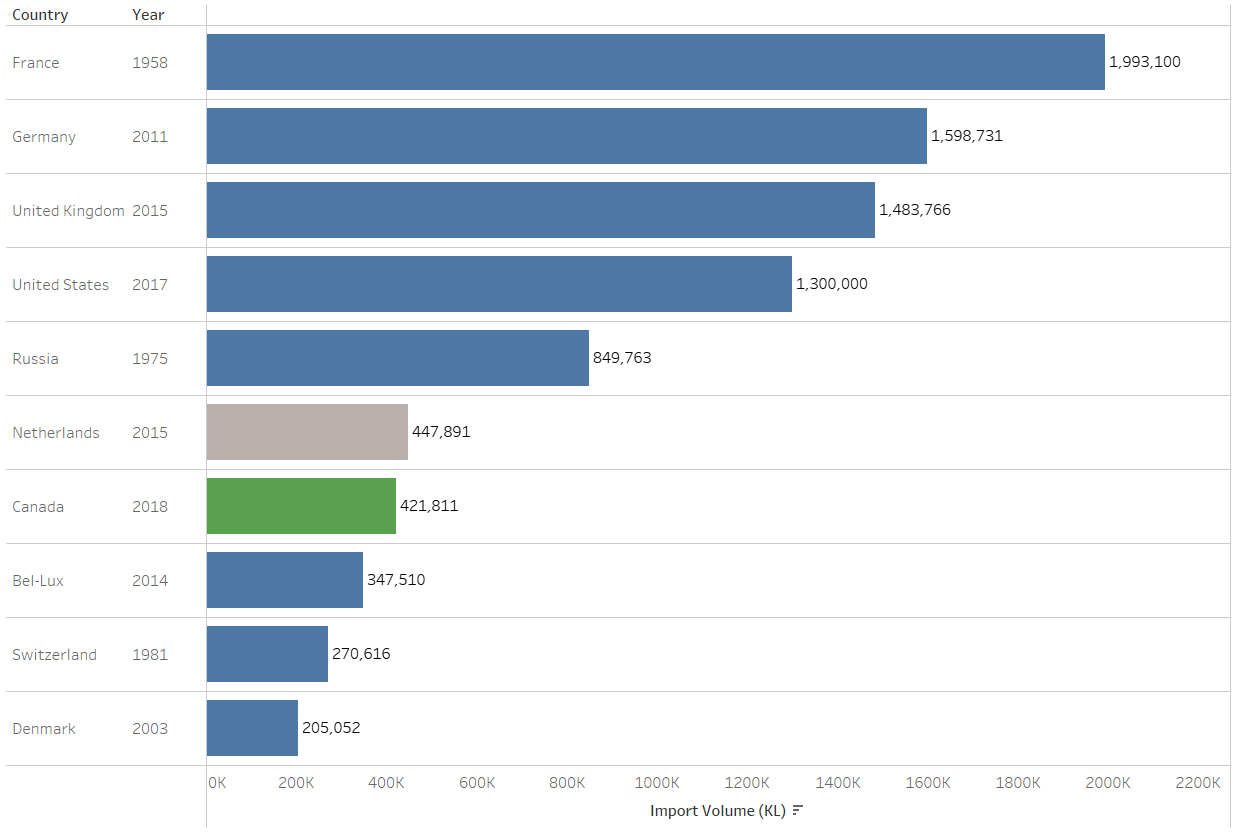
This chart covers that second part I talked about earlier - looking into those top 10 countries and seeing what years they imported the most wine and what were the reasonings behind it. I grouped them based on colours, with blue representing potentially political reasons that led to more imports of wine. UK in 2015 did just have a General Election and David Cameron got his second term in power, so that was definitely reason to drink, as well as the Prince Andrew allegations started appearing, so I'm sure the royal family are counted in those import amounts too. With the US, Donald Trump got sworn in as President, so that's pretty self explanatory too. Canada happens to be green due to the fact that they legalised recreational use of Cannabis in 2018, so it seems they've been enjoying some partying and life in general.
I feel these were the only two charts which had strong(ish) analysis and enough that I felt comfortable talking about and presenting to both Ruth and Andy. The feedback from them was clear and very helpful - set up that user story much earlier, get that clear and defined focus there and then and use that to strongly guide your analysis. I did it yesterday, didn't do it today, don't know why, but I'm very eager to not repeat that mistake for the next couple days we have of this.
That being said, bring on tomorrow - hope I won't regret saying that.