In the blink of an eye, it's already DS33's final week of training, and with it, comes the fabled dashboard week. It's like a solo client project, in a day, with much more tears and expletives too if we're being honest.
The task for today was to use 'FixMyStreet' data based in Glasgow, and make an accessible dashboard which 'enables users not well served by current interfaces' who want to learn more about their surroundings and the state of the roads in their areas.
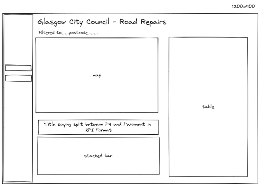
My initial plan for my dashboard looked like this. It focused on using a visual element in the map and having selected filters filter every single chart down to that specified area, so that the user can select their own area and see which particular roads to try and avoid.
In terms of accessibility, I was looking into making the dashboard screen reader friendly and have a neat and organised tabbing/focus order, which meant that those without trackpad or mouse access/usability will be able to still utilise the dashboard. In addition to this, larger text and contrast friendly colours would be an aim I'd try and incorporate into the final dashboard.
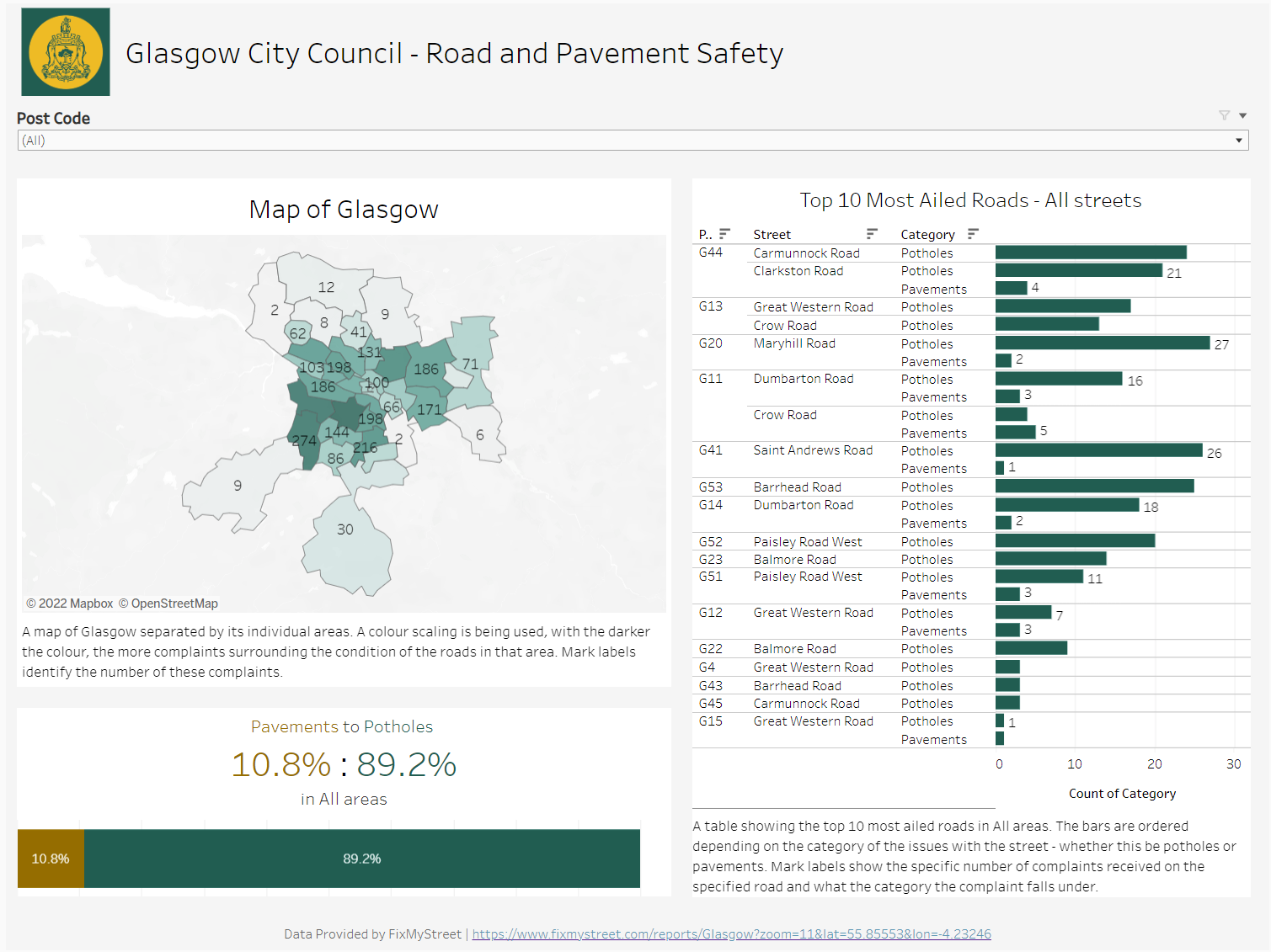
In the end, I came up with something like this. A majority of my planned dashboard remained, bar the large filter pane on the side. Since I only had one filter to interact with, it made sense to shift its positioning and make way for more of the charts to steal the focus. In addition to this, a majority of the charts have captions, which allows the screen reader to read off what is happening in those charts and allows those using these readers to understand the elements of analysis in the dashboard. Alongside this, the stacked bar in the bottom left corner has those KPI elements in its title, which will also be picked up by the screen reader.
Alongside this, the colours used share similarities with logo for Glasgow City Council, with a neat feature being that users can click on the logo in the top left corner and be redirected to the council's website where they can inform them of these issues in their local areas.
One of the other key focuses of my dashboard was to make it simplistic in style and format in hopes to make it as easy as possible to interact with and draw assumptions from, and also hopefully making it much easier to complain to the Glasgow council too!
Feedback:
- More detail needed on captions
- Labelling of map when filtered might help provide more context, rather than just a random floating number on a specific filtered point on the map
- Alt-text on the logo to let people know that the logo will act as a button as well