


For the first day of the infamous dashboard week, we were tasked with designing a dashboard for a visually impaired stakeholder.
This followed a talk with Louisa O'Brien which helped DS42 gain a different perspective on how others might be accessing data and how to help them gain insights with less friction.
A key insight gained from this was:
"Don’t look at this as a requirement, an obligation, another checkbox to tick off. Look at accessibility as an opportunity to hone your skills, to move beyond the ordinary, and to provide an intentional experience for your users"
- Doug Schepers, Director, Fizz Studio (accessible data viz startup)
This helped me see that designing with accessibility in mind is beneficial for all, as whether you are suffering from a disability or not, everyone would still find a well thought out and designed product useful. Similar to how though we may not be living with any hearing impairments, there are times that we all find using subtitles when watching television useful.
Our challenge was to make the below dashboard accessible to someone who was visually impaired. This involved getting to grips with using the narrator feature in windows (which can be enabled and disabled using ctrl+windows+enter).
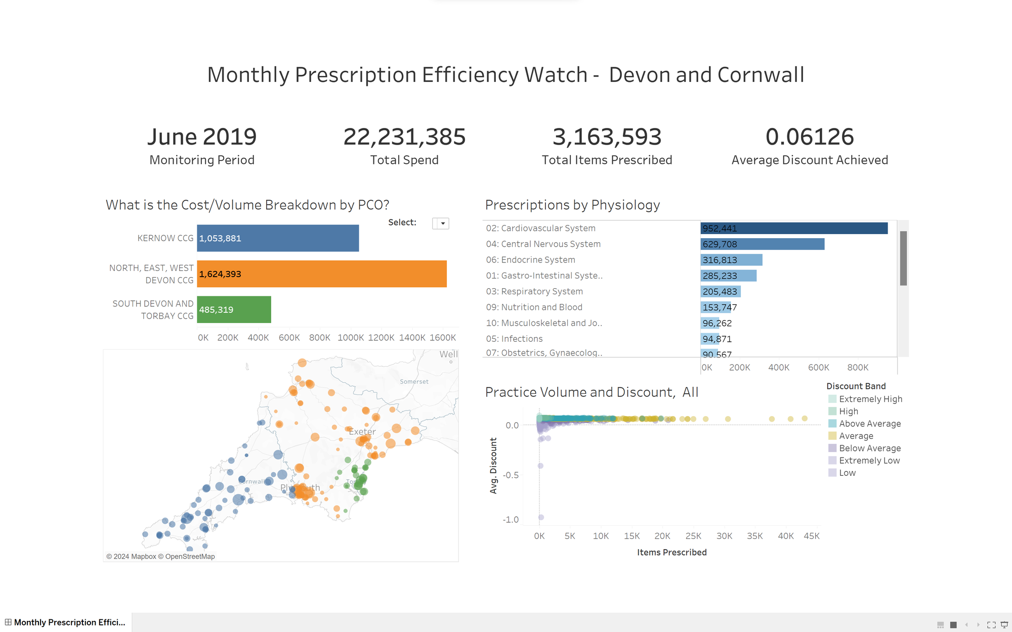
The narrator software in Microsoft dictates anything which you are interacting with on your screen. Unfortunately, as of today's date tableau does not provide any support with regards to reading out the findings in a visualization, (Marks, tooltips and other information rich features are not included in narration). Narrate can only read titles, and not text boxes or anything else you may find useful for catering for a differently abled user.
Therefore, the challenge consisted of finding a way to effectively get across the insights available in the charts. To achieve this, in the planning phase, a lot of time was set apart to understand the data first of all, and secondly what were the key insights that someone should take away from it in order to be able to participate in a conversation which could lead to effective action.
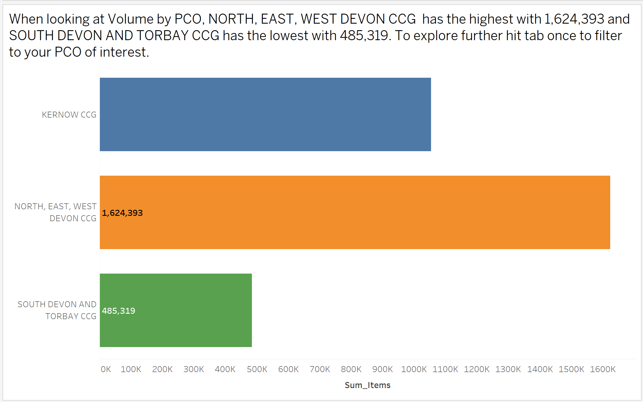
It was decided that as we only had 3 hours to produce an output the maximum and minimum values would be used to get across the context of the data. These were put into the title as this is one of the only places where the narrator software can dynamically read from.
The result as seen below is a very descriptive title which provides the stakeholder with enough information to be a part of the conversation.
There are a lot of places which this can be taken to. Providing the user with options on what they want to see or splitting the data in different ways can lead to many ways of helping someone interpret data.
As the first assignment of Dashboard Week, this was very enjoyable as well as eye opening, as we do not often take the time to think about what it could be like to live in other peoples shoes.