


(cross-posted here)
“average breach in 2015 affected 419,645 individuals a year” factoid actualy just statistical error. average breach in 2015 affected 126,085 individuals per year. Anthem Inc. Georg, who lives in cave & experienced a massive HIPAA breach affecting 78.8 million individuals, is an outlier adn should not have been counted
Hey everyone, I’m back! I took a break from my blog while I was on placement, but now I have some more time on my hands, so I’m working through my backlog of blog ideas, starting with how to include and exclude outliers in your data with the click of a button. (Well, the button part will come later, in its own dedicated blog; I’m only focusing on the outlier inclusion/exclusion bit for today.)
Meaning of an Outlier
First off, what’s an outlier? Put simply, it’s an extreme data point outside the range of the rest of your data. If temperatures in the winter tend to be ~20 degrees Fahrenheit, but one day it’s suddenly 80 degrees, that would be an outlier (and extremely concerning). Outliers can heavily impact your average or mean values (which was one reason for why I went with median when looking at the number of individuals affected by breaches per state to get a better understanding of a breach’s impact).
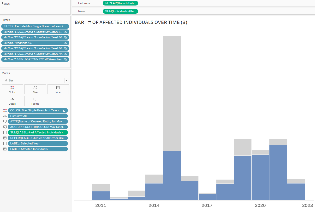
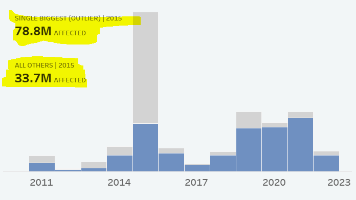
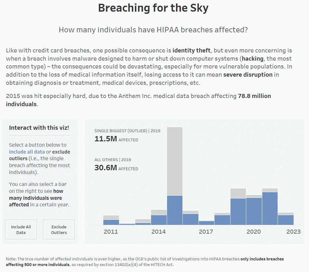
For example, below is the average number of individuals affected by HIPAA breaches in the U.S. overall per year. You can see that the average is drastically higher in 2015 vs. all other years in the data set (~420,000 in 2015, while the other years don’t hit six digits:
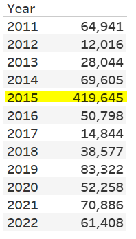
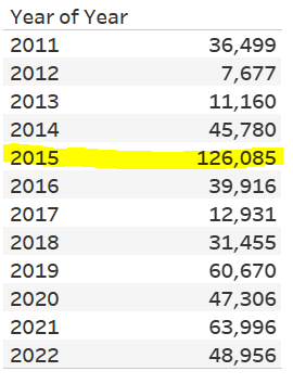
In 2015, Anthem Inc. was hit by a massive HIPAA breach affecting around 78.8 million breaches, which drove up the average by a lot. If we remove the single biggest breach from each year (which is how I’ve defined outliers for this particular dashboard), you can see that the average number of affected individuals drops drastically (from ~420,000 to ~126,000 for 2015). It’s still not great, as in a perfect world, this number would be 0, but it’s a little better:
To Show or Not to Show (Outliers)
For better or worse, outliers impact the average, but they’re still part of the data, even if the data captured is from a one-off event. Should you include them? Should you exclude them?
It depends. Are outliers indications of data errors? Are they useful to your analysis? There are a lot of considerations that go into deciding whether to show them. If it calls for it, you could consider building in functionality that allows you to toggle the visibility of outliers on and off, as the comparison of the data with and without outliers can be just as informative, whether it’s for your stakeholders to also see or just for yourself as you explore the data. That way, when the outliers are visible, you can represent the data accurately, and when they’re not, you can more easily discern the seasonality/cyclical nature of the data.
When I was first working on my HIPAA breaches dashboard and saw how many people were affected by HIPAA breaches in 2015, I initially thought that it was the end times and no one’s data was safe (well…). But when I realized that the high number of individuals affected was due to one single breach and drew a line to see what the data was without that outlier (you may remember how I just drew a line in MS Paint at the time because I didn’t know how to show it better yet), I felt (marginally) better that it would’ve been kind of a run-of-the-mill year if the Anthem Inc. breach hadn’t happened.
Thus when remaking my dashboard, I knew making it easier to compare the shape of the data with and without outliers was imperative for helping others see it, too.
NOTE: Before I get into the tutorial, I do want to note that my “definition” of an outlier wasn’t well thought out because at the time, I just really wanted to exclude the 2015 Anthem Inc. breach from the data. The way I went about it was to identify the single worst breach of each year, when there are other more empirically sound ways to identify/define outliers, like calculating 1.5 times the interquartile range or using statistical tests involving Z-scores, for example. So when I describe the “outlier” calculation for this particular dashboard, just keep in mind that I did it this way for a specific reason, and it’s not a reason that’ll hold up in court for a higher-stakes analysis.
The Process
#1: Build the Visualization
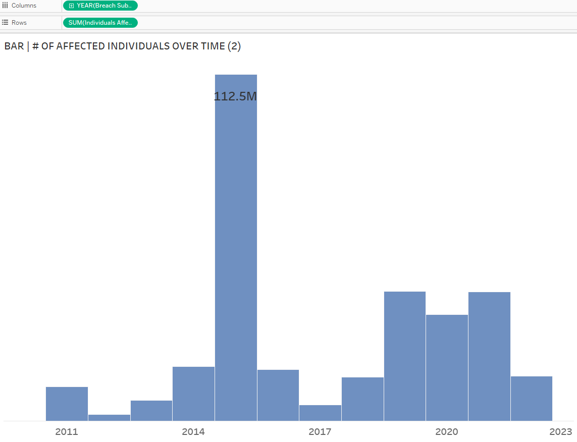
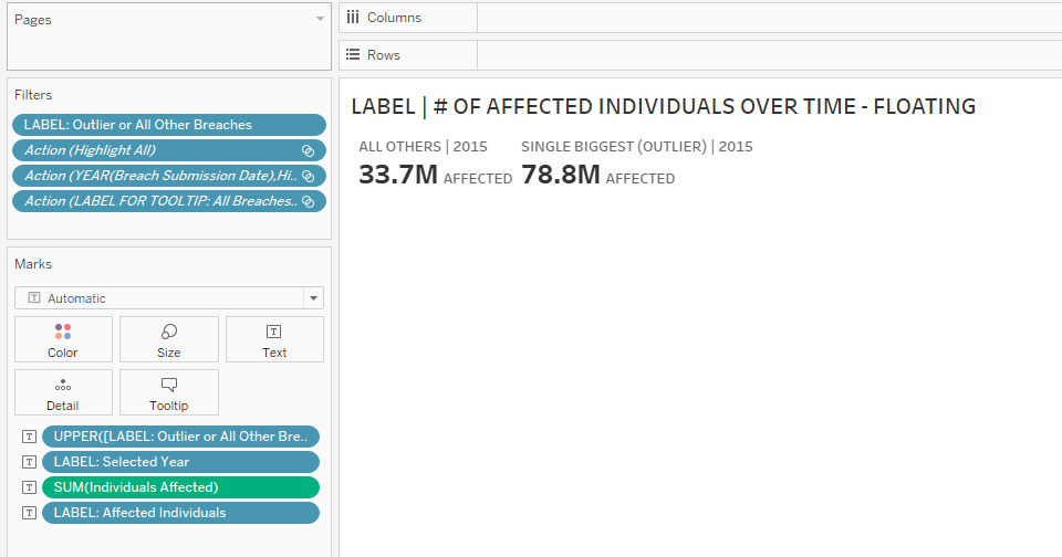
As always, let’s start simple, by building the static bar chart depicting the number of affected individuals by year. Drag YEAR([Breach Submission Date)] to Columns and SUM([Individuals Affected]) to Rows.
I’ve also dragged SUM([Individuals Affected]) to Text on the Marks Card; the 112.5M denotes the Anthem Inc. breach affecting 78.8M individuals and all the other breaches affecting 33.7M individuals.
#2: Identify the Outliers
1. The way you identify outliers will be different (please read the caveat regarding how I defined outliers for this dashboard that I mentioned above), so your calculated field(s) will look different. As my aim was to enable the user to view the data without the 2015 Anthem Inc. breach, I wrote a calculated field LOD: Max Single Breach of Year that identified not only that breach but the breach affecting the most individuals of each year in the data set:
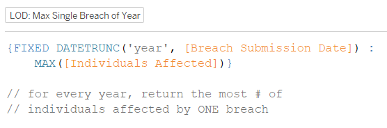
{FIXED DATETRUNC(‘year’, [Breach Submission Date]): MAX([Individuals Affected])}
You can also see the note that I included under the calculated field that translates the LOD into plain English. For a lengthier breakdown of the calculated field, refer to A Whole LOD-ta Love.
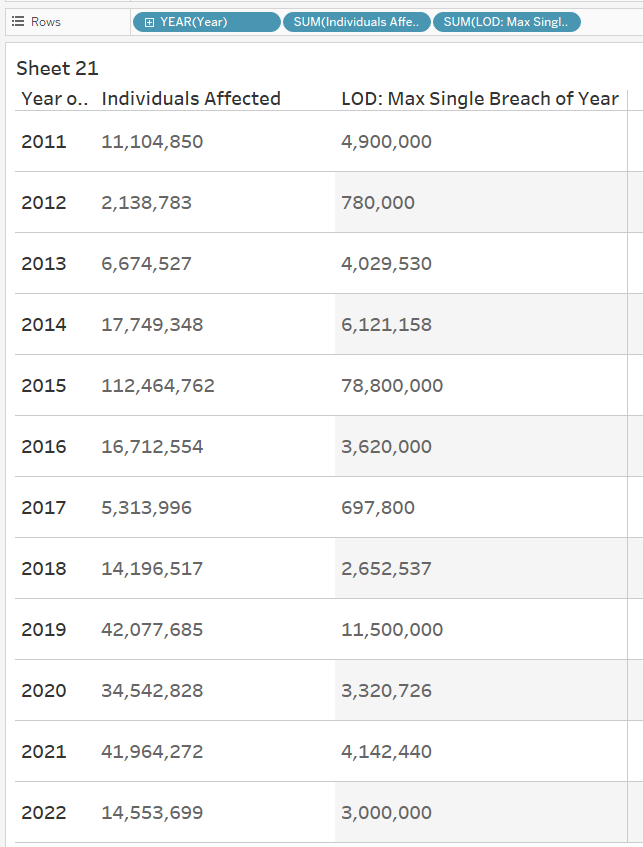
For complex calculated fields (honestly, any calculated fields in general), I find it super helpful to build out a table while building calculations step-by-step. You can see below that I’ve done that by dragging each pill into the view, right-clicking it, and selecting Discrete to show the value as text rather than as part of a visualization.
2. To double-check my work, I also retrieved the names of the covered entities that were breached with this calculated field Name of Entity for Max Single Breach of Year:
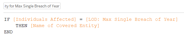
IF [Individuals Affected] = [LOD: Max Single Breach of Year]
THEN [Name of Covered Entity]
END
This calculated field says that if the number of affected individuals for a breach matches the number of affected individuals for the worst breach affecting the most affected individuals, then and only then give us the name of the covered entity.
3. Now that we’ve preliminarily identified the breach affecting the most individuals for every year, let’s indicate it visually, via color. We’ll need a calculated field that creates two categories, separating the one breach from all the others:
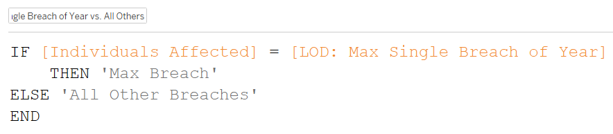
IF [Individuals Affected] = [LOD: Max Single Breach of Year]
THEN ‘Max Breach’
ELSE ‘All Other Breaches’
END
You’ll notice that the logic/condition for this calculated field is identical to the one that returns the name of the covered entity, where we’re looking only for the data point that matches the breach with the highest number of affected individuals before categorizing the rest elsewhere.
4. Drag COLOR: Max Single Breach of Year to Color on the Marks Card. I grayed out the outliers and chose blue for all the other breaches, as the latter is what I want to highlight. When the color legend pops up, place the max breach on top/as the first item on the list, so that it makes it easier to compare the sum of all the others at the bottom. With all the other breaches at the bottom of each bar, it’s easier to compare the number of affected individuals affected by breaches every year. You could put the outliers on the bottom to compare the outliers, but I don’t think that’s as useful (you’d be comparing just one anomalous data point over the years, and it wouldn’t be the same covered entity each year, either).
#3: Create the Toggle (i.e., the Include/Exclude Outliers parameter)
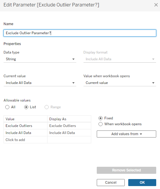
1. Create the Exclude Outlier Parameter? We want only two values in the parameter, Exclude Outliers and Include All Data, so that when we press a button (or select it from a dropdown), one option will hide the outliers and the other will show them with the rest of the data. Thus the data type is String, and we need a list of allowable values.
2. We want to be able to include or exclude data points – that means using a filter. However, we can’t just drag and drop the parameter onto Filters as it is right now; it wouldn’t make sense anyway, as we’ve only just created the parameter (or TV remote, if you remember my parametaphor) but not connected the parameter to the visualization itself yet. Choosing an option from the dropdown (or pressing a button on the TV remote) isn’t going to do anything presently.
In order to use the parameter as a filter, we need to bring it into a calculated field Include Max Single Breach of Year? All we really need it to do is let the outlier in sometimes and sometimes not:
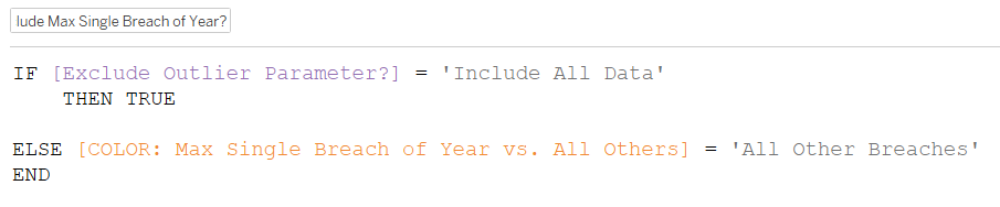
IF [Exclude Outlier Parameter?] = ‘Include All Data’
THEN TRUE
ELSE [COLOR: Max Single Breach of Year vs. All Others] = ‘All Other Breaches’
END
3. Drop the calculated field into Filters and select True.
But what is this calculated field saying? Let’s break it down.
The first half is saying if the ‘Include All Data’ option is selected from the parameter’s dropdown, then that data is true. Since we selected True for the filter, only data that gets tagged as true will be allowed to flow in.
We haven’t written any criteria for separating out the data here; we just want all the data, so that’s why we only need the parameter to equal a value from the list of allowable values, instead of connecting the parameter to a field in the visualization. This part of the calculation will then tag everything as true, allowing us to, well, include all data.
The second half is a little trickier to understand. As you’ll remember, the COLOR: Max Single Breach of Year vs. All Others field was used to categorize the data points as 1) the max breach of the year/outlier or 2) all the other breaches:
It’s this field that identifies the outliers by going off the number of individuals affected. In our final visualization, we don’t want to show only the outliers because that comparison is not valuable to the analysis; we want to show everything else. Thus we want the ELSE ‘All Other Breaches’ part only, so now we assign the COLOR field’s ‘All Other Breaches’ value to the Exclude Outliers Parameter?’s value of ‘All Other Breaches’, thus connecting the parameter value (which did nothing before) to an actual value in an actual field.
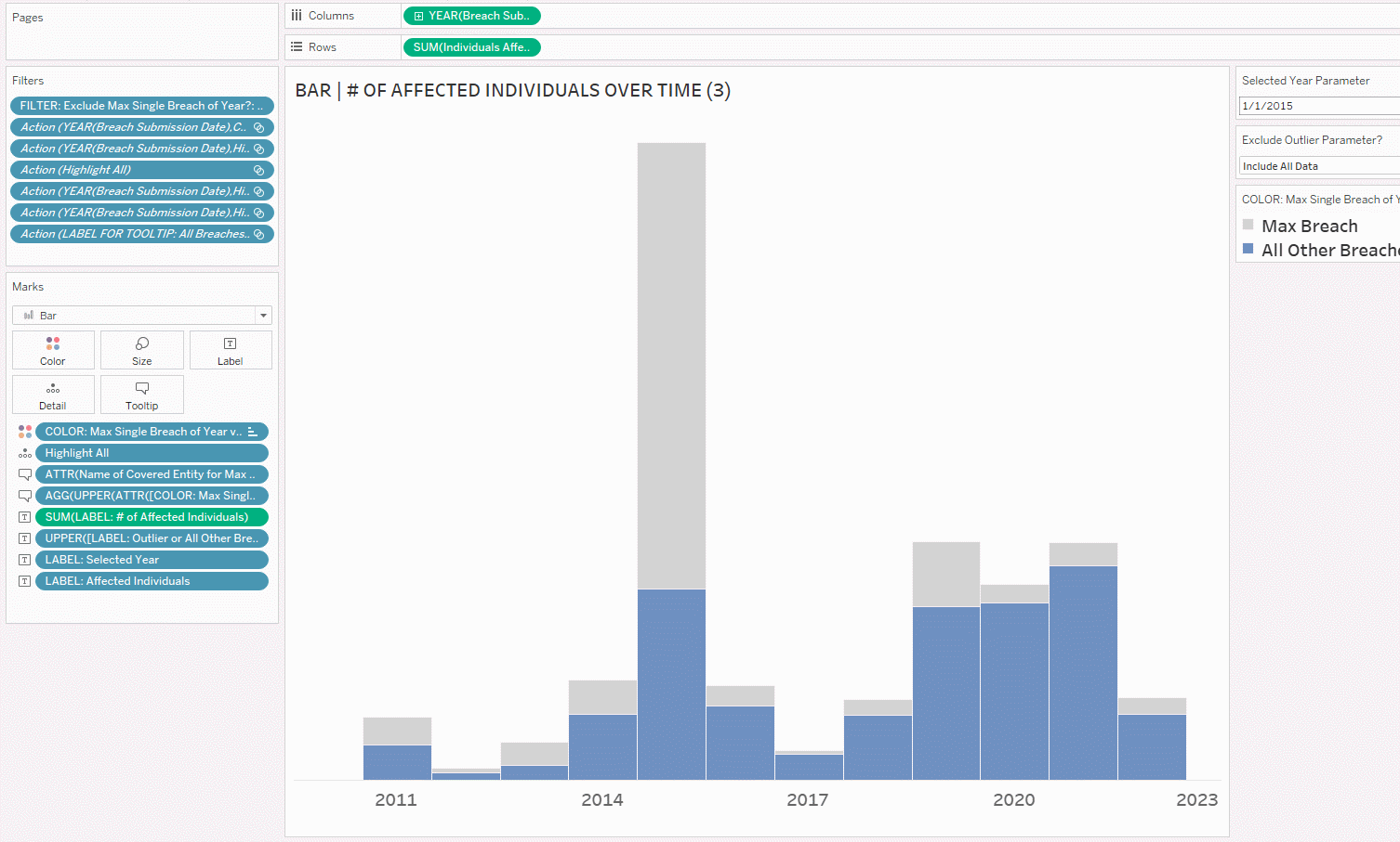
4. After putting in the filter, let’s show it on the right side of the view and test!
If you’re happy with the dropdown as the way to show/hide the outliers, you can stop here. If you would like to change up the user experience, you can create buttons, which is an upcoming tutorial I’ll write, once I’ve covered all the basics of the visualizations.
#4: Create Labels for the Outliers and All Other Breaches
At the moment, to see the magnitude of the breaches, you have to mouse over each of the bars, remember the numbers, and then mentally compare the two. That can be mentally taxing and block the user from gleaning insights, either increasing the time to insight or blocking them completely due to the mental comparison of the values being so cognitively taxing, so let’s add a label. We don’t want the label to appear on every mark in the view due to visual clutter/chartjunk, so let’s only have the label contain information for the year of the bar that the user clicked on.
NOTE: In this case, I kind of cheated by making a floating worksheet that I placed on top of the chart itself, which I wouldn’t ordinarily suggest, especially for a business dashboard. Users may be viewing the dashboard on a variety of different screen sizes, and floating objects could be positioned weirdly on those screens as a result. However, I didn’t have a lot of space to work with, which is why I made the worksheet floating this time.
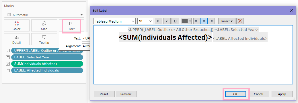
1. Create a text label LABEL: Outlier or All Other Breaches for the single biggest breach/outlier and all the other breaches.
IF [Selected Year Parameter] = DATETRUNC('year', [Breach Submission Date])
AND [Exclude Outlier Parameter?] = 'Include All Data'
AND [COLOR: Max Single Breach of Year vs. All Others] = 'Max Breach'
THEN 'Single Biggest (Outlier)'
ELSEIF [Selected Year Parameter] = DATETRUNC('year', [Breach Submission Date])
AND [COLOR: Max Single Breach of Year vs. All Others] = 'All Other Breaches'
THEN 'All Others'
END
The first half of this calculated field says, if the year the user clicks on matches the year in the data set, and all data is included, and it’s the outlier data point, then label it “Single Biggest (Outlier).”
The second half says, if the year the user clicks on matches the year in the data set, and it’s all the non-outlier data points, then label it “All Others.”
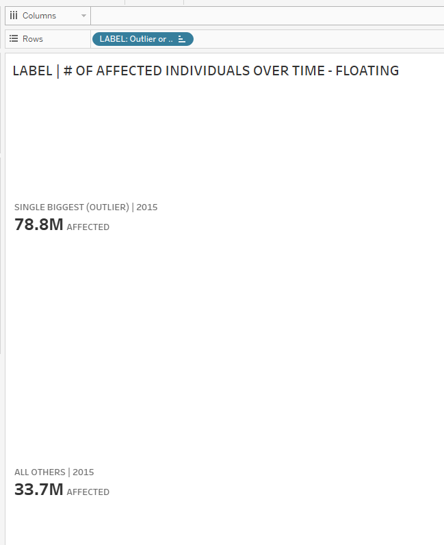
2. Next, drag the LABEL: Outlier or All Other Breaches field to Text on the Marks Card.
Observe that if you just drag it in like this, the two labels are scrunched up:
3. The trick to separating them out nicely? Bring a duplicate of the field (press CTRL while dragging the field from the Marks Card) to Rows.
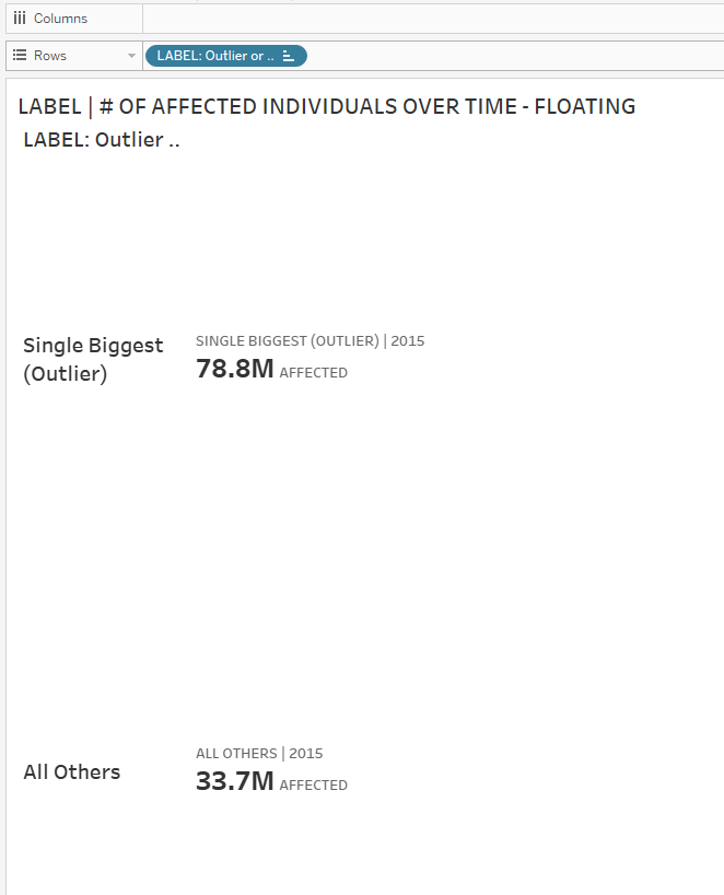
4. Then, right-click the field and uncheck Show Header. Now they’re spaced out nicely instead of being scrunched up together!
5. Do some formatting for the label…
6. Float the worksheet on the dashboard and position it where desired…
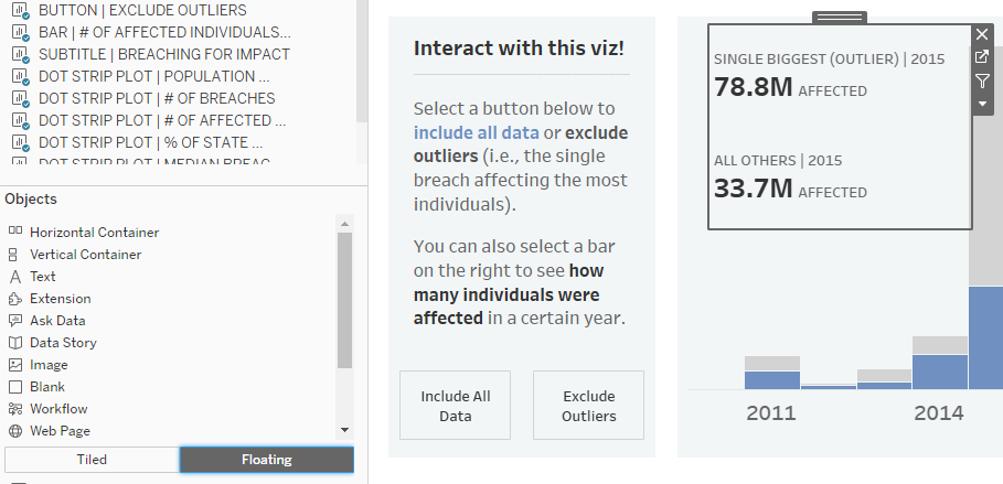
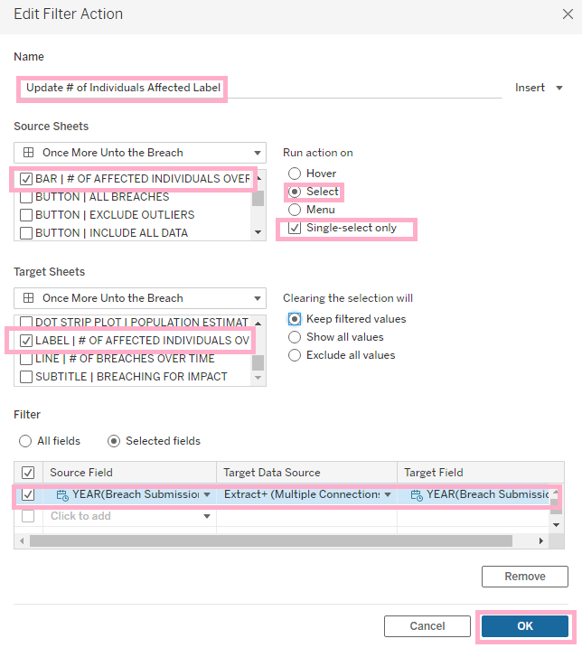
7. And finally, add a filter action. Name it appropriately, select the Source Sheet (the bar chart), the Target Sheet (the floating worksheet with the labels), make the filtering happen when a user Selects a mark (a bar on the barchart, in this case), and force the user to only be able to select one bar at a time. Otherwise, when multiple bars are selected, you’ll end up with a very messy label, when the label is supposed to improve the user experience, not muddy it.
8. Once you’ve set that all up, you’re ready to test! Below, you can see that when you click on a bar, the label updates with the information for both the single biggest breach/outlier and all other breaches for only the year that was clicked on.
I hope you found this useful. Until next time 😄