


Note: I wrote this entry before learning how to create a measure switch, which is what I used instead when re-vizzing my application viz, so please be aware that while this blog is showing you how to do the chart switch, it’s not necessarily the best use case for it.
Today, we’ll be going into… CHARTED TERRITORY!!! 🥁
(Sorry. I love all puns, but especially love this one.)
For this entry (and the next), I’ll be talking about how to swap between different visualizations on a dashboard (and how to make the title change with it), which is what I did for the Breaching for America section, with the maps:
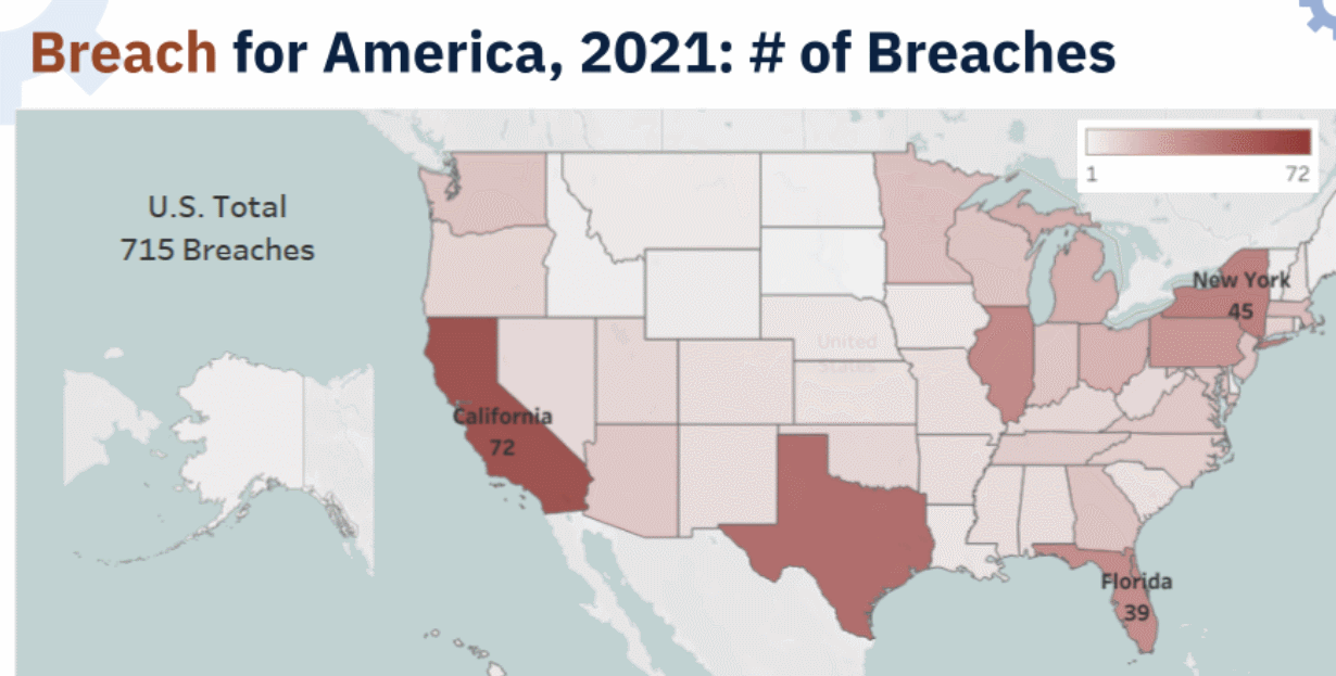
As you can see in the GIF above, I made it so that when I selected # of Breaches from the drop-down, all four maps changed to show the number of breaches.
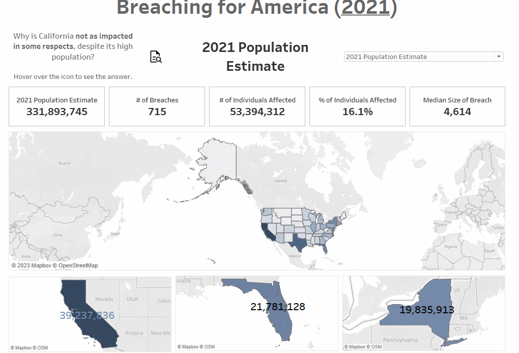
I did my Fullstack Academy capstone presentation on HIPAA breaches, so making this dashboard was just a matter of translating how I’d done it in Google Slides to another medium (i.e., Tableau); I wanted to show how California keeps getting lighter and lighter – and is thus less impacted by HIPAA breaches, depending on how you gauge impact – as you go through the maps in order. Another reason to do a chart swap is to keep the length of the dashboard manageable, while keeping related visualizations together.
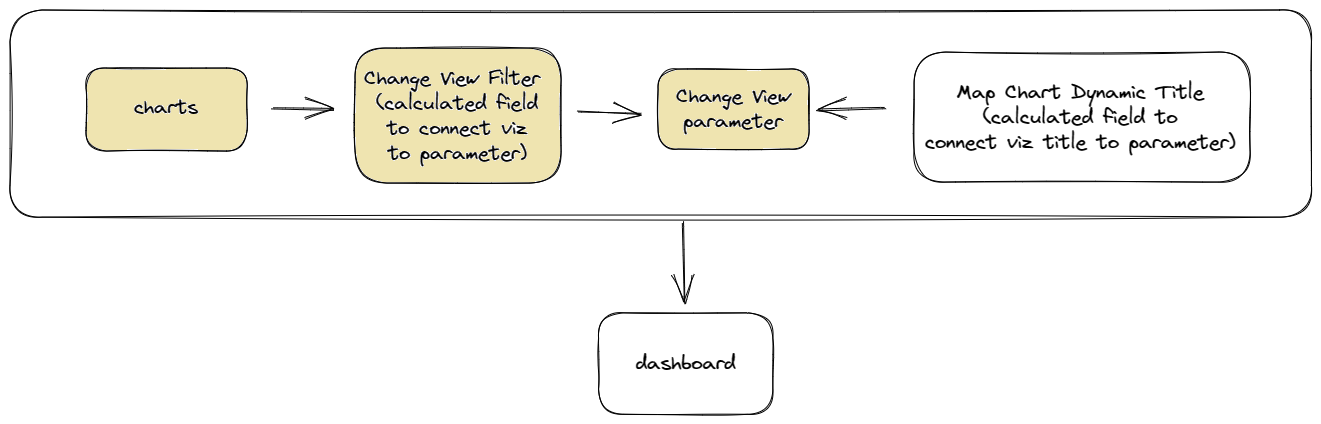
I broke up the process into five components: planning/setting up, creating the controls the user will use to interact with the dashboard, connecting the controls to the visualizations, making the title change with the visualizations, and putting them onto the dashboard. There’s quite a bit that goes into making the chart swap (and I’m still wrapping my head around how it works), so I’m separating this topic into two posts, with this one focusing on the first three.
Here's a diagram of how all the components are connected, with the components we’re working on today colored in (I am unfortunately not an artist):
The Process (#1-3)
#1: Planning/Setting Up
1. Figure out what you want to show and how you want to show it.
I’m more familiar with making presentations than making dashboards, so it helped me to have done it for my capstone project’s slide deck first, partly because I needed to visualize what I wanted to accomplish, in order to figure out whether it’d be the best way to make my point, and it was easier to do that in Google Slides.
As I mentioned earlier, I wanted to show that even though California was the most populated state in 2021, California’s actually doing really well in terms of impact. The GIF below (from my slide deck) got a little cut off, but just focus on California.
See how it gets lighter and lighter? That’s all build-up for introducing the additional protections that California’s medical privacy laws grant their residents on top of HIPAA.
2. Set up the charts you need.
I needed to show five numbers (estimated population sizes, and the four ways I quantified the impact of HIPAA breaches) for each of the four locations I wanted to compare: the U.S. as a whole, California, Florida, and New York. That’s twenty different charts!
(The U.S. was to provide overall context; California is the most populated state; Florida and New York have similar populations, and both conveniently have about half the population of California. Moreover, Florida and New York may have similar populations, but the sometimes-drastic difference in impact [e.g., compare number of individuals affected or median size of HIPAA breach] shows that population isn’t the most reliable way to gauge impact.
Not only that, as we saw above, California’s doing pretty well in some respects – compared to the national median size of a HIPAA breach, California’s is even lower than that, and its population is double Florida’s and New York’s! Sorry for the tangent, but the West Coast is sometimes actually the best coast, I guess – and this further reinforces the point that population size isn’t a reliable indicator for gauging state impact.)
In hindsight, while I just made close-ups of the three states for the three maps under the big U.S. one, as a way to translate how California was visually becoming lighter in my presentation, I shouldn’t have gotten so hung up on trying to make my dashboard a carbon copy of my slide deck.
I initially approached the dashboard by thinking of it as just a different medium for telling the same story, but the stories ended up being slightly different. My slide deck went into hacking a bit more than my dashboard, which eventually became narrower in focus as I was working on it. If I were to rework the dashboard, I’d change the state maps under the big one to visualize state impact differently, rather than just do close-ups/repeats of the big map.
#2: Creating the Controls (i.e., the Parameter)
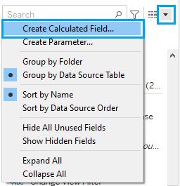
1. Now, it’s time to create a parameter, which is a variable that the user can interact with to change a visualization. In this case, the parameter will give the user visualization options to swap to.
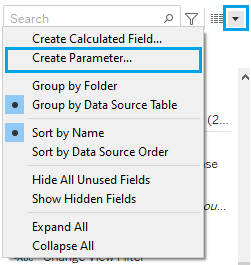
Give the parameter an appropriate name. I named mine Change View.
Yours will be different depending on how you go about it, but here are the options I selected:
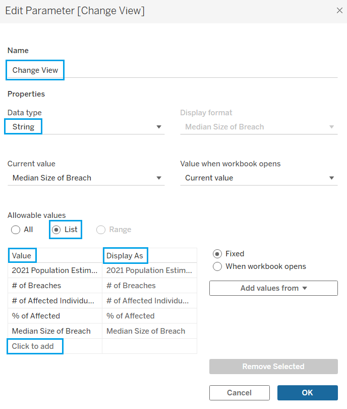
I knew the specific values I wanted to use (i.e., the different ways to gauge the impact of HIPAA breaches), which is why I selected List, then Click to add to input the values.
To be clear, all we’ve basically created here is what the user will use to control that part of the dashboard (in this case, a drop-down menu).
2. Format the parameter. (You can also leave this part for later, when you’re making the dashboard.)
To access the formatting menu, click the upside-down triangle to the right of the parameter.
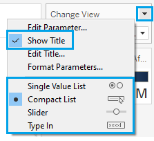
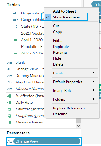
3. Select Show Parameter to make it appear to the right of the view.
#3: Connecting the Controls to the Visualizations
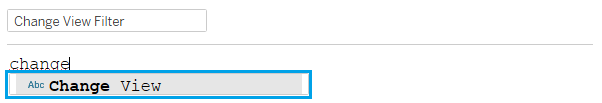
1. This is where we’ll be assigning a value from the parameter’s list to the actual object/worksheet, i.e. connecting the parameter to the visualizations. Start by creating a calculated field with just the parameter inside. I named it Change View Filter because we’ll be placing this calculated field on Filters later.
There are two ways to put the parameter into the calculated field. You can start typing in the window (where it’ll auto-fill) and then you can just click on it:
Or, you can just drag the parameter to the window.
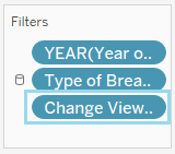
2. Filter time – drag the calculated field (Change View Filter, in this case) to Filters.
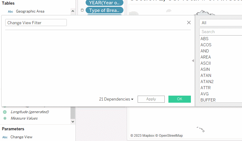
3. Next, right-click on the calculated field and select Edit Filter… This is where we’re going to explicitly connect the values from the parameter to the visualization/worksheet.
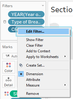
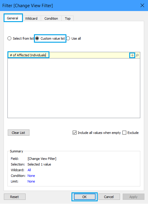
In General, select Custom value list. Then, type in the exact value as you’d entered them in when you were creating the parameter. Make sure to click the + on the right to actually add what you typed in to the list.
I want this particular visualization to show up when the user selects # of Affected Individuals from the drop-down (i.e., the parameter), which is why the custom value I put in was # of Affected Individuals (and nothing else!).
4. Congratulations, you’ve now connected one visualization to a value from the list in your parameter! Time to do the same for the rest of the charts (in my case, 19 more…) – add the calculated field with the parameter (in my case, the Change View Filter) to Filters, select Edit Filter…, and add the custom value from your parameter that corresponds to the particular worksheet/visualization you’re on.
5. Also, try it out! When you select the value corresponding to the worksheet you’re on, the chart should appear. When you select a different value, it should disappear (though now the corresponding charts on other worksheets will also appear at the same time).
How are the charts able to disappear and reappear like this? Don’t forget – the calculated field with the parameter is still in Filters. When the value selected via the Change View parameter matches the custom value you added to the Change View Filter calculated field, the chart on the worksheet will appear. When the values don’t match, the filter will act just as any other field placed in Filters will act, returning no data (i.e., a blank view).
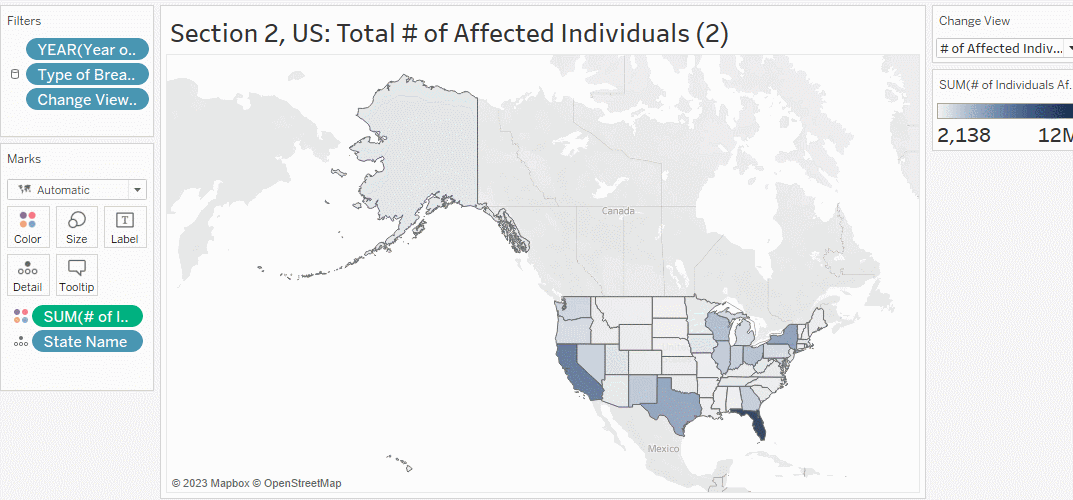
The GIF got cut off a bit, but see how the chart only appears when I select # of Affected Individuals? It disappeared when I selected something else (e.g., # of Breaches), but at the same time, another worksheet with the number of breaches appeared. We’ll be taking advantage of this disappearing act when we get to the dashboard in the next post.
At the end of all this, each of the five values in the list from the Change View parameter has four charts connected to it. That means that when I select # of Breaches from the drop-down/parameter, four charts/maps/worksheets showing the number of breaches – for the whole U.S., California, Florida, and New York – should be visible, and the other sixteen sheets should be blank.
That’s enough for this time, I think. Stay tuned for how to finish it up in a little bit!