


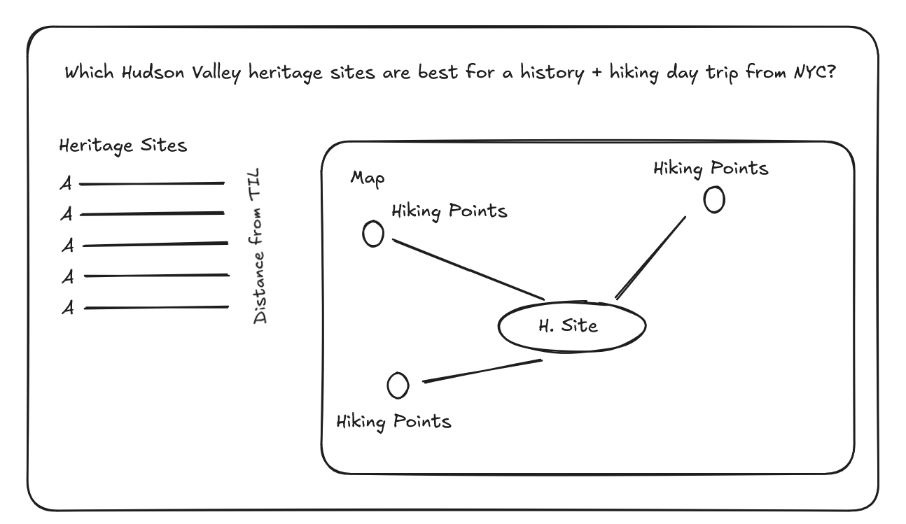
For the last part of Dashboard Week, the goal was to use Hudson Valley Heritage Sites data to see which locations are within a two-hour drive of The Information Lab office. From there, I expanded the idea by bringing in trail data to answer a simple question:
Which heritage sites could also work as a history and hiking day trip?
Data Preparation
The heritage sites dataset initially only included site names and cities, so the first step was to make it usable for mapping. I used Python with Geopy to geocode each site, generating latitude and longitude coordinates. To improve accuracy, I added fallback logic that tried multiple search formats when the first query did not return a result. I also cleaned the text to handle inconsistencies such as special characters, extra spaces, and punctuation.
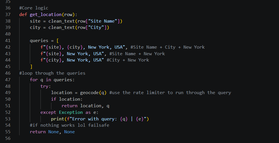
I originally extracted county information from the geocoder response as a possible way to connect the heritage sites to the trail dataset. However, I later realized that joining by county would limit the analysis because I wanted users to explore trails within a chosen distance from a selected heritage site, not just trails in the same county.
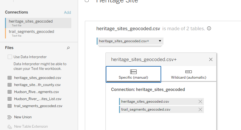
The trail dataset also needed to be aligned with the heritage site data so both could be used together in Tableau. To do this, I standardized both datasets so they shared the same core fields:
- Name
- Latitude
- Longitude
- Type
I then combined the heritage sites and trails into a single dataset using a union. This made it much easier to plot both types of locations in the same spatial view and build a more flexible radius-based analysis.
Building the Interactive Map
I wasn’t able to get as far with the final map build as I originally planned, because most of my time went into preparing the data and making sure both datasets had usable coordinates for visualization.
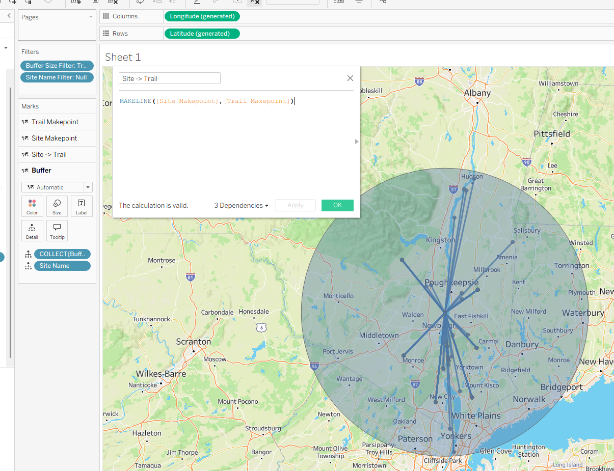
However, I was able to build the key spatial calculations needed for the analysis. I created makepoints for the heritage sites and trail locations, then used a buffer calculation to create a radius around a selected heritage site. The idea was to let users choose how far they would be willing to travel after visiting a heritage site to find nearby hiking options.
My original goal was to use dynamic zone visibility so users could switch between two trip-planning views: heritage site to nearby trails, or trail to nearby heritage sites. Due to time constraints, I was only able to get the first version working: selecting a heritage site, showing nearby trails, and displaying a buffer around that site.
Overall, this project showed me how much work can sit behind a “simple” map. Before I could even start visualizing, I had to enrich the data, create coordinates, test geocoding results, and restructure the datasets so Tableau could use them properly.
Even though I didn’t fully finish the interactive trip-planning map, I was able to build the foundation for it. The next step would be to finish the dynamic view that lets users switch between finding trails near heritage sites and finding heritage sites near trails. This would turn the dashboard into a more useful planning tool for exploring the Hudson Valley.
After a week of messy data, confusing APIs, broken ideas, and somehow getting dashboards out at the end, most of us are now heading into placements next week to put all of this chaos/learning into practice.