


For Dashboard Week Day 1, we worked with publicly available data from Information is Beautiful’s data library. The dataset focused on COVID-19 vaccine efficacy across different variants, making it a great source for practicing both data preparation and dashboard design.
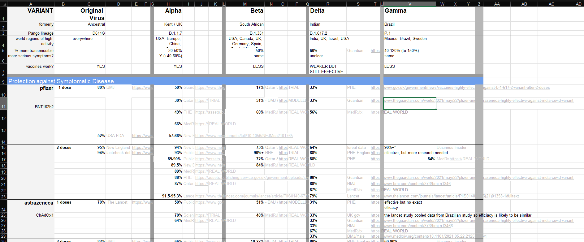
The original Excel sheet was more report-like than analysis-ready. It was easy enough to read visually, but the structure was not ideal for Tableau because some information was spread across columns, sections, and merged layouts. This gave me the chance to clean and reshape the data while thinking about how the final structure would support the dashboard and the story I wanted to tell.
The first step was cleaning the fields in Tableau Prep. Some columns came in with unclear names like F2, F4, and F9, so I renamed them into more useful fields such as Vaccine, Dose, and the different variant efficacy columns. I also filtered the data down to the two main sections I wanted to analyze: protection against symptomatic disease and protection against severe outcomes.
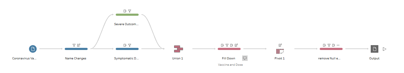
To make these sections easier to compare, I created a new field called Protection Type. This allowed each record to be labeled as either symptomatic disease or severe outcomes. I also used Fill Down for fields like Vaccine and Dose because the original spreadsheet merged cells where one label applied to multiple rows. Tableau needs each row to have its own values, so filling down made the data much more usable.
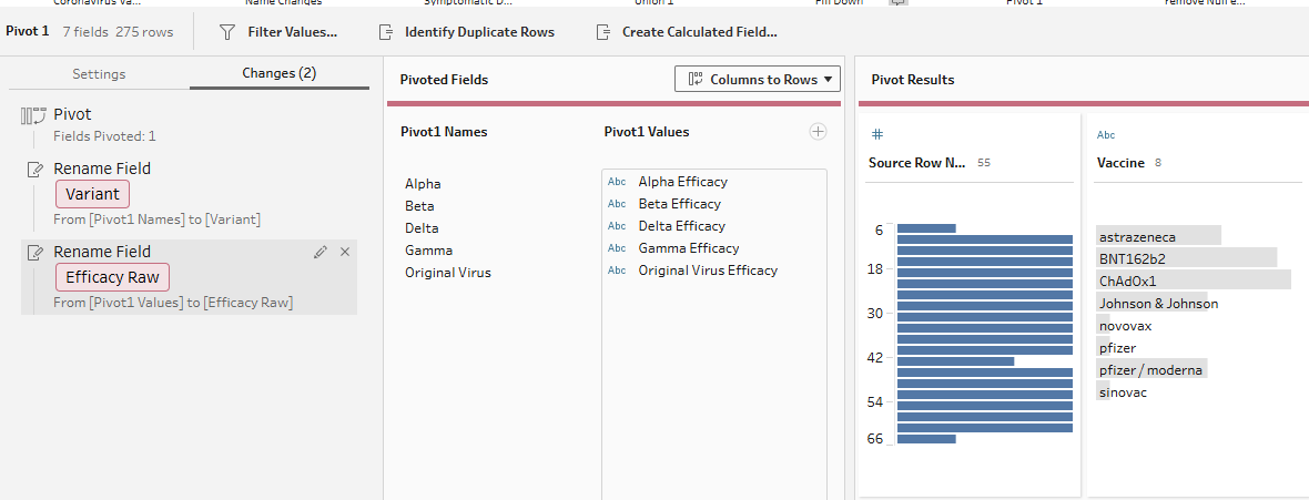
The biggest transformation was pivoting the variant columns. In the original dataset, variants like Original Virus, Alpha, Beta, Delta, and Gamma were stored as separate columns. I pivoted these into rows, creating one Variant field and one Efficacy Raw field. This made it easier to compare vaccine efficacy across variants in Tableau.
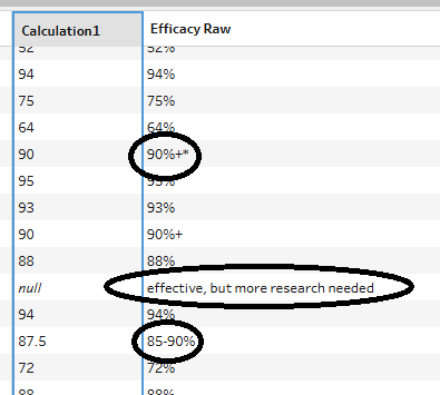
I also created an Efficacy Numeric field so the values could be used in charts. Some efficacy values were written as percentages, decimals, ranges, or included extra symbols. The calculation converted usable values into numbers, such as turning 0.88 into 88 or using the midpoint of a range like 73%-81%. Values that were not valid efficacy percentages were left as null.
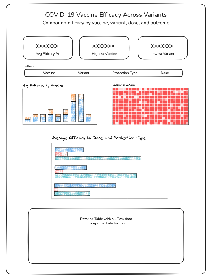
After the data was cleaned, I planned the dashboard around a simple user story: As a public health analyst, I want to compare COVID-19 vaccine efficacy across variants, protection types, and dose levels, so that I can identify where vaccine protection appears stronger or weaker. The dashboard was designed to stay simple, with charts showing average efficacy by vaccine, vaccine-by-variant comparisons, and differences between 1 dose and 2 doses by protection type.
Overall, this project showed me that data preparation is not just about fixing messy values. It is about reshaping the data so it can properly support the final analysis and dashboard. The data can definitely drive you a little crazy at times, but working through those challenges and seeing the final dashboard come together made the process really rewarding and fun.
Here’s a link to the dashboard if you want to see how everything came together after the data preparation and design process!