


Box plots are powerful tools in data analysis, however tend to be misunderstood as on face value, they look very difficult to understand. However, they actually provide a clear and concise visualization of data distribution, making them an invaluable tool for statistical analysis.
So what are Box Plots?
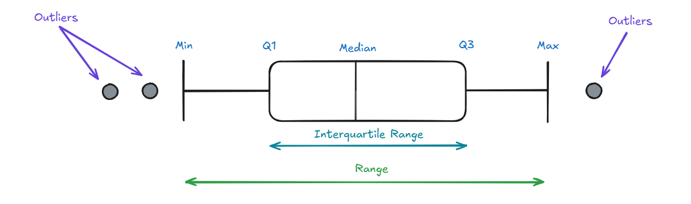
A box plot (also known as a box and whisker plot) shows the distribution of a dataset by summarizing its key statistics: the minimum, first quartile (Q1), median (Q2), third quartile (Q3), and maximum, with each data point represented in the box plot corresponding to an individual observation within the dataset.
The "box" in the plot spans from the first and third quartile, highlighting the interquartile range (IQR), which contains the middle 50% of the data. The whiskers extend to the smallest and largest values within 1.5 times the IQR from the quartiles, with any data points beyond this range considered as potential outliers.
But what do they actually tell us?
As previously mentioned, box plots are extremely useful for analysing the distribution of data as they reveal patterns and trends across different categories. By providing a clear summary of key statistical measures (e.g. IQR and Median) box plots help analysts quickly understand the spread and shape of the data.
One of the biggest advantages of box plots is their ability to identify anomalies (outliers) in a dataset. Any data points that fall significantly above or below the main distribution are easy to spot, making box plots an essential tool for detecting irregularities in our data. Additionally, box plots help in assessing skewness, or whether the data is symmetrically distributed or leans towards higher or lower values.
Another key benefit is their effectiveness in comparing distributions across multiple categories. Unlike histograms or scatter plots, box plots allow for side-by-side comparisons of the different groups, making it easier to identify differences in trends, variability, and overall distribution patterns.
Example use in practice
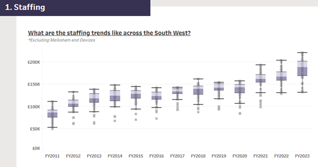
This is an example of a boxplot I used during my final interview for the Data School. This boxplot analysed MP’s staffing budgets, with each plot represents a constituency for that year, illustrating the overall movement from 2011 to 2023. There were 3 key insights which I drew out from this graph:
Median growing Year on Year
● The steady increase in the median staffing budget indicates that, on average, staffing costs have risen annually.
Stable Interquartile Range between £15-20k
● Despite the increasing median, the interquartile range (IQR) has remained consistently between £15-20k each year. This suggests that staffing costs are rising uniformly across constituencies.
More Bottom Outliers, No Top Outliers
● A higher number of bottom outliers compare to top outliers could suggest better cost efficiency in some constituencies, providing flexibility and stability to handle unforeseen circumstances. Despite this, this could also indicate underutilization of the budget as a result of underspending, potentially reflecting lower service quality.
Thanks for reading!😊
Victor