


Why make a dynamic stacked bar chart?
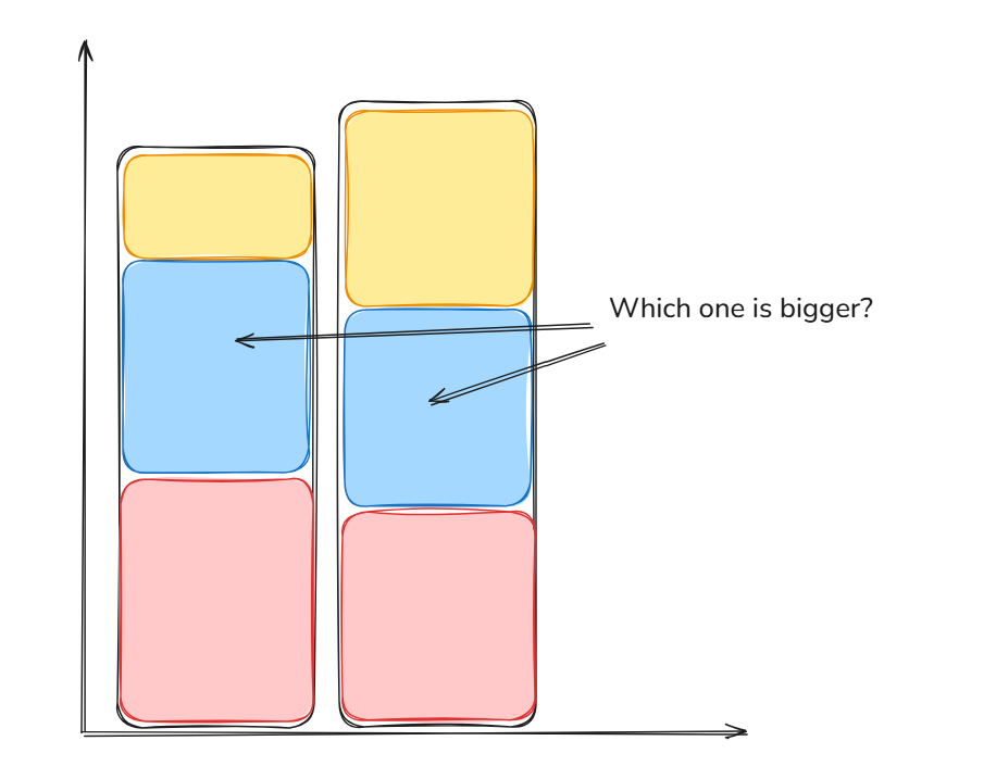
A stacked bar chart is great for showing part-to-whole relationships across categories. However, smaller segments can be hard to compare and important categories may get lost in the stack.
Exhibit A:
A dynamic stacked bar chart solves this by:
- Letting users select a category and automatically moving that category to the bottom
- This makes it easier to compare values across bars
- Adding interactivity also allows users control what they want to focus on
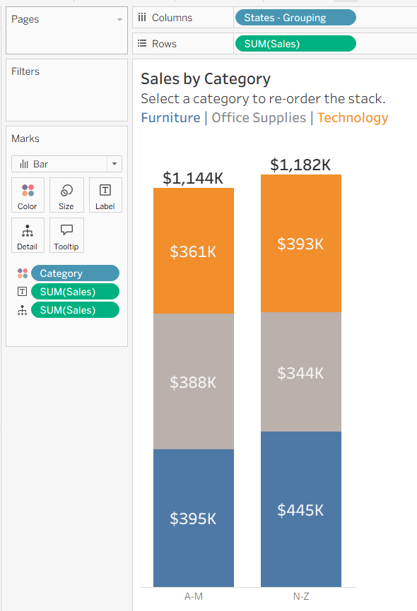
(embed tableau public)

Step-by-Step Guide
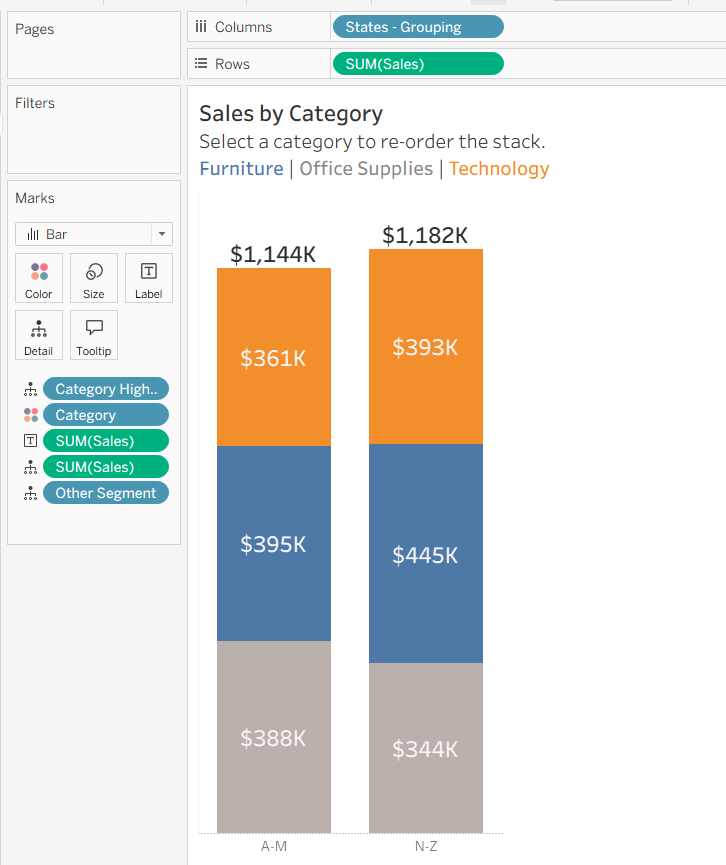
1. Create the basic stacked bar chart
- Drag State Group (A–M / N–Z) → Columns
- Drag Sales → Rows (set to SUM)
- Drag Category → Color
- Turn on/Customise labels and format as desired
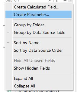
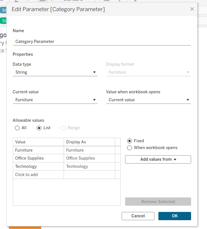
2. Create a Category Parameter
Create a Parameter called: Category Parameter
- Add the 3 Category values (Furniture, Technology, Office Supplies)
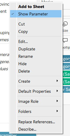
3. Show the parameter
- Right-click the parameter on data field → Show Parameter (This allows users to interact with the chart)
4. Create a Boolean calculated field
Create a calculated field (e.g., Category Highlight) and drag it to Detail on the Marks Card
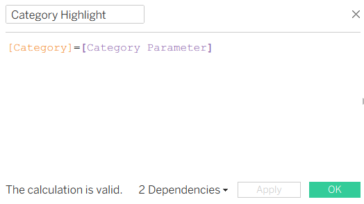
This returns:
- TRUE → selected category
- FALSE → everything else
Which helps Tableau identify which category should be highlighted later.
5. Create “Other Segment” field
Create another calculated field called Other Segment and drag it to Detail on the Marks Card
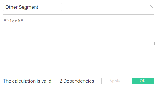
Purpose:
- Helps control highlighting across the entire bar
- Ensures both bars highlight correctly when a category is selected
- Allows non-selected categories to appear greyed out
How/why it works:
- Every row has the same value (blank), so Tableau treats everything as part of one shared group (when we create a highlight action later, this will enable the bars to highlight and others to grey out based on this shared grouping).
6. Check your worksheet setup
At this point, your Marks card should include:
- Color → Category
- Detail → Category Highlight
- Detail → Other Segment
7. Build your dashboard
- Add your chart to a dashboard
- This is where interactivity (actions) will be applied
8. Add Highlight Action
Go to: Dashboard → Actions → Add Action → Highlight
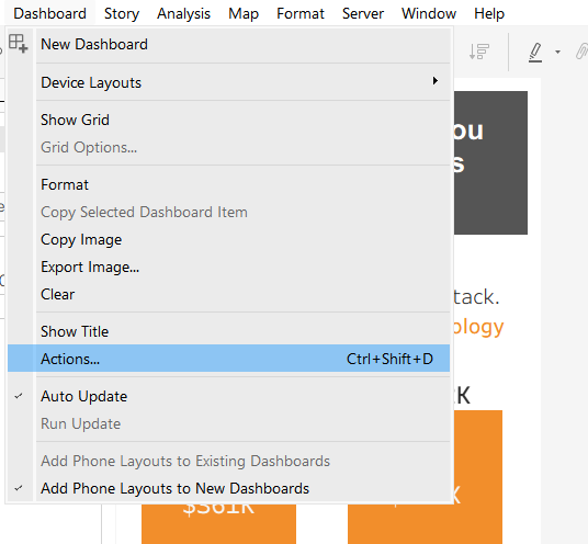
Set:
- Source sheet = your chart
- Target sheet = same chart
- Target highlighting = Other Segment
- Run action on = Select (not Hover)
What this does:
- When you click a bar, it highlights the selected category
- Other categories become greyed out
- Makes comparisons much clearer
9. Add Parameter Action
Go to: Dashboard → Actions → Add Action → Change Parameter
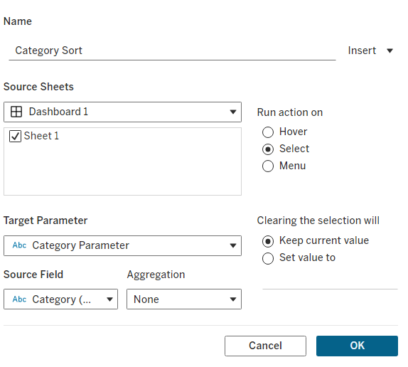
Set:
- Target Parameter = Category Parameter
- Source Field = Category
What this does:
- When a user clicks a category (e.g., Furniture):
- The parameter updates
- That category moves to the bottom of the stack
You now have a chart that highlights selected categories and dynamically reorders the stack!!
Try this with your own data, or use the Sample Superstore dataset in Tableau, with Segment instead of Category.