


For my DS applications, I built two dashboards, both of which were a faff to lay out. They were a mix of tiled worksheets, floating legends and dragging things wherever they fit. Basically, a bit of a mix-and-match work of art.
The problem?
There were no rules. No structure. No consistency.
That’s fine for a one-off application, but most business dashboards need to have some level of longevity. With that comes the need for good quality design, something that can handle updated data, new metrics and small changes without completely breaking. Having a basic template or structure in place makes a huge difference in building a dashboard that can last. It needs to be easy to read, easy to update and usable by other people.
Enter containers
This week I discovered the magical fairyland of containers.
What is a container?
A container is basically a layout tool that groups elements together.
There are two types:
- Horizontal container places charts side by side
- Vertical container stacks charts on top of each other
Let’s look at a bad dashboard
Here’s an example I built (inspired by Jahid Hasan on Tableau Public).
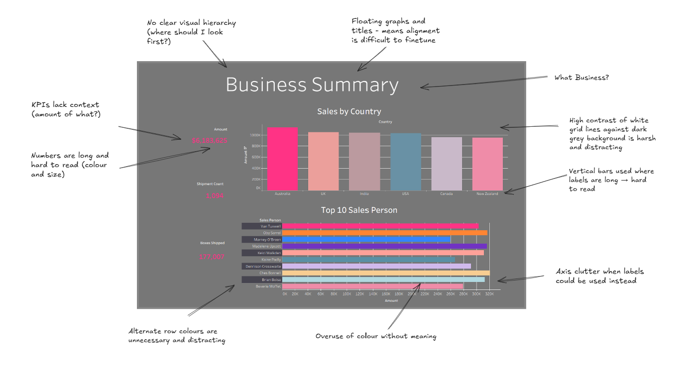
What’s going wrong here?
- No clear layout structure
- Charts feel randomly placed
- KPIs are not clearly grouped
- Hard to scan quickly
- Too much going on visually
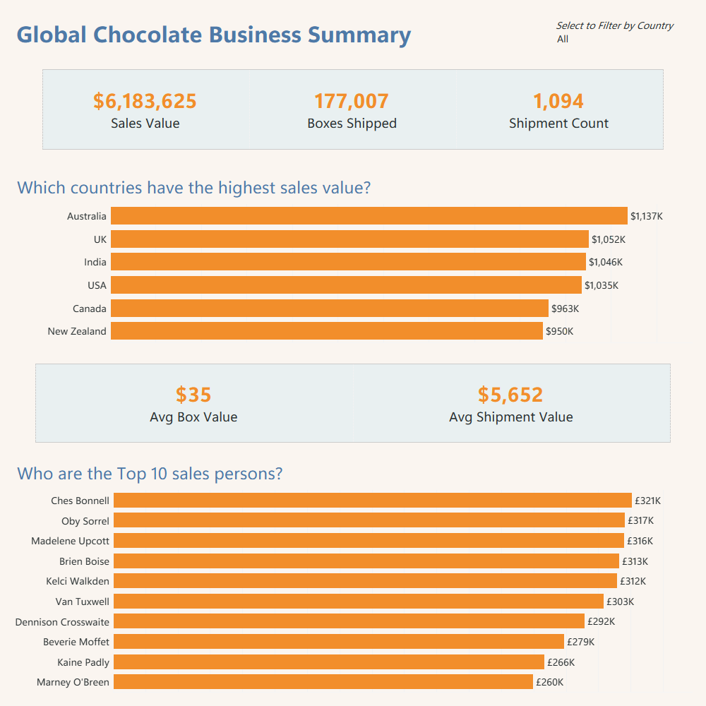
How I’d improve it using containers
- Top section using a horizontal container for KPIs
- Keep them aligned, evenly spaced and clearly labelled
- Use a vertical container for main charts in middle section
- Sales by Country and Top 10 Salespeople as a horizontal bar chart
- Bottom section for a horizontal container with supporting KPIs
- Add in Avg Box Value and Avg Shipment Value
Other design choices
- Horizontal bar charts instead of vertical - Country names are easier to read and it uses the space better
- Sorted data - Top values at the top gives instant insights
- Labels on bars instead of relying on axes = cleaner look and quicker understanding
- Consistent number formatting - Use K for thousands or M for millions. Avoid long unreadable numbers
- Clear KPI context - Instead of just showing 6,183,625 - make it clear by labelling it as Total Chocolate Sales in dollars
Final thoughts
The biggest shift for me was not just design. It was thinking about structure first and visuals second. Containers are not just layout tools. They are what turn a dashboard from chaotic but functional into something clean, scalable and actually professional.
Here’s a link to my Tableau dashboard which you can play around with! - https://public.tableau.com/app/profile/vaishnavi.shankar2148/viz/ChocolateSalesDashboard-ContainersImprovement/Dashboard