


By far, this has been the hardest day of dashboard week.
I think because I'd been so switched on over the previous few days, I didn't come into today with the same energy. That said, I really enjoyed the SQL aspect of today's challenge, and the dataset itself was genuinely interesting.
I do feel like I ended up throwing a few charts onto the dashboard without them really telling a story or providing meaningful insights. It's definitely one I'll be coming back to, without a doubt, because I know there's much more value that can be extracted from the data.
The Brief
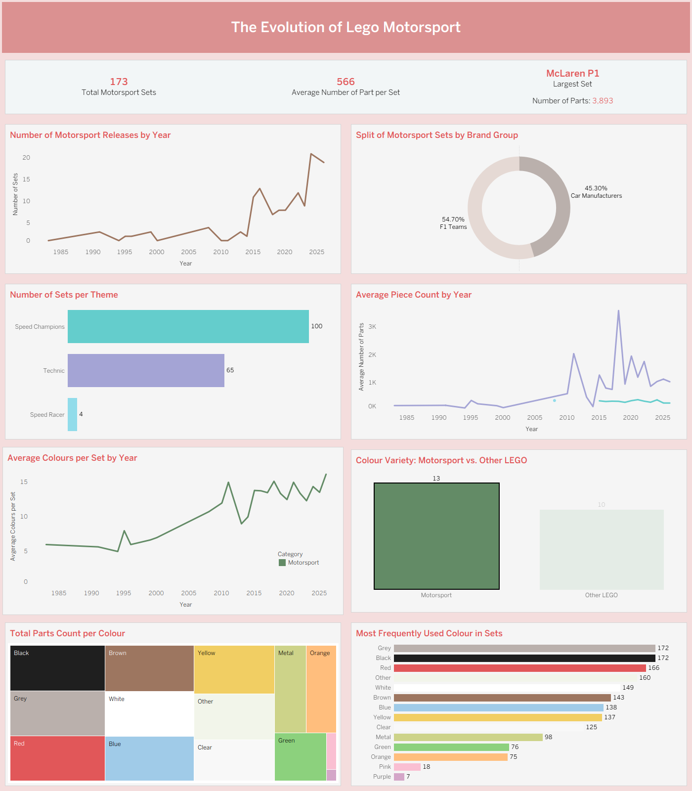
The LEGO universe is packed with sporting themes, but how it represents athletic movement, motorsport and competition tells an interesting story of product design. I chose to focus on Motorsports.
The task was to isolate and analyse dedicated racing themes such as Speed Champions, Speed Racer and motorsport-related Technic supercars. I explored questions including:
- How has the complexity of motorsport sets changed over time?
- Are modern sets becoming significantly larger and more intricate than those released in the late 90s and early 2000s?
- Do motorsport sets have a distinct colour palette compared to the rest of the LEGO catalogue?
Working as a Team
I partnered with Kate and we focused heavily on understanding the granularity of the dataset before uploading the relevant tables into Snowflake.
A huge lesson from today was appreciating how much AI can accelerate the preparation stage (but also understanding its sense-checking gaps). Without Gemini, creating the scripts needed to separate the tables and prepare the data would have taken me days. Knowing what information I needed first meant I could write much better prompts, then refine and edit the generated SQL afterwards rather than starting from scratch.
That said, AI isn't perfect. We initially interpreted the motorsport data as being entirely car-focused, but later realised motorcycles were also a key part of the brief (as Lorna mentioned in the presentation). That means another table will need to be incorporated before the analysis is truly complete.
What Didn't Go So Well
Because I spent so much time planning the SQL and understanding the data structure, I didn't leave myself enough time to properly plan the dashboard (and consequently the story) itself, and that definitely shows.
Another challenge was switching back to Tableau after spending the last few days working almost exclusively in Power BI. It took a little while for everything to click back into place, and that slowed me down more than I expected (with the filtering and highlighting).
Final Thoughts
This definitely isn't the dashboard I'm most proud of.
But that's part of learning.
Not every project ends with something portfolio-ready on the first attempt. Sometimes the biggest takeaway is recognising what didn't work, why it didn't work, and knowing exactly how you'd improve it next time.
The positive is that I now have a solid starting point. The SQL is there, I understand the data much better than I did this morning, and I already know where the dashboard could be improved with stronger storytelling and more meaningful insights.
This is one I'll absolutely be revisiting, and hopefully turning into something I'm much happier to share.