


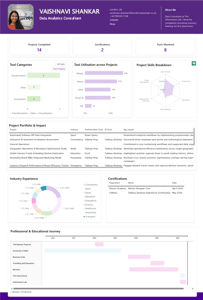
For Day 4, the challenge was to create a visual CV in Power BI. I interpreted the brief as pitching myself to the placement team and potential employers, so I focused heavily on showcasing my Data School experience, technical skills, projects and training rather than creating a traditional CV layout, outlining experience that was no longer adept to my role and future aspirations.
I started by sketching the design in Excalidraw. Unfortunately, the file deleted itself, which wasn't ideal given the time pressure. Thankfully, the sketch was detailed enough that I could still remember the structure and key elements I wanted to include.
Building the dashboard itself was relatively straightforward. Power BI makes it quite easy to create visually appealing reports, especially when drawing inspiration from existing templates and layouts. The bigger challenge was creating and structuring the data. I didn't start with an existing CV, so I had to manually gather, fact-check, and enter much of the information myself. I used Gemini to help extract and organise headers, which sped up part of the process.
As the report developed, I realised that some of my datasets were at different levels of granularity. To make everything work together, I ended up creating additional tables and restructuring some data through pivots. If I were starting again, I would spend more time planning the data model upfront and separate the information into three or four distinct datasets based on how I wanted it displayed and analysed.
The final dashboard achieved much of what I intended. I placed my projects, technical skills and Data School learning front and centre, while employment and education history sat lower on the page as supporting information rather than the main focus.
Next Steps
There are still several areas I'd like to develop further. The biggest is visual design. I wanted to incorporate more logos, icons, social media links, and tool branding to make the dashboard feel more polished and engaging.
I'd also like to include screenshots of dashboards that link directly to Tableau Public, Power BI and GitHub. Another interesting enhancement would be to make the portfolio section dynamic, changing the projects displayed based on categories such as Makeover Monday, Workout Wednesday or other project types.
For the achievements section, I'd like to move beyond descriptive summaries and quantify project impact wherever possible using real metrics and outcomes.
Adding blog content to the dataset could also create a more complete picture of my learning journey and portfolio.
Finally, I'd like to improve the accuracy of the data behind the dashboard, particularly around project effort and time spent using different tools. That would make the visualisation more meaningful and provide a clearer representation of my development over time.