


Training is almost over…and somehow 4 months have flown by so quickly. Who would have thought?
That said, it's definitely not over yet - because it's Dashboard Week, which means one dashboard a day (across 2 days)! To kick it off, we have PitchSide Pro.
About the Project
For this project, I acted as a corporate analyst for PitchSide Pro, a retailer specialising in football kits, national team merchandise, boots and fan culture collectibles.
The business challenge was to understand what has been driving changes in revenue performance over the last five years and identify where the business should focus next to sustain growth. The final solution needed to provide executive-level clarity at a glance while also allowing stakeholders to drill down into the underlying drivers of performance.
To answer this challenge, I developed three dashboards:
- Executive Overview
- Revenue Key Drivers
- Marketing & Audience Profiles
Initial Thoughts
When I first heard that this project would be completed in Power BI, I was not surprised because our cohort has had relatively limited opportunities to deliver client projects with the tool…and I very much needed to exposure and opportunity to see what I could build on there.
Following a recent refresher session with Robbin Vernooij last week, I felt more confident that I could apply what I had learned and build a meaningful dashboard solution.
Understanding the Data
The first step was understanding the business problem and exploring the available data.
The dataset consisted of two fact tables:
- FactSales
- FactTraffic
And five dimension tables:
- Date
- Product
- Customer
- Region
- Channel
Working collaboratively with my cohort to understand the data model was extremely helpful. Fortunately, the data was already clean, meaning very little transformation was required.
Power BI also made it relatively straightforward to understand the relationships between tables.
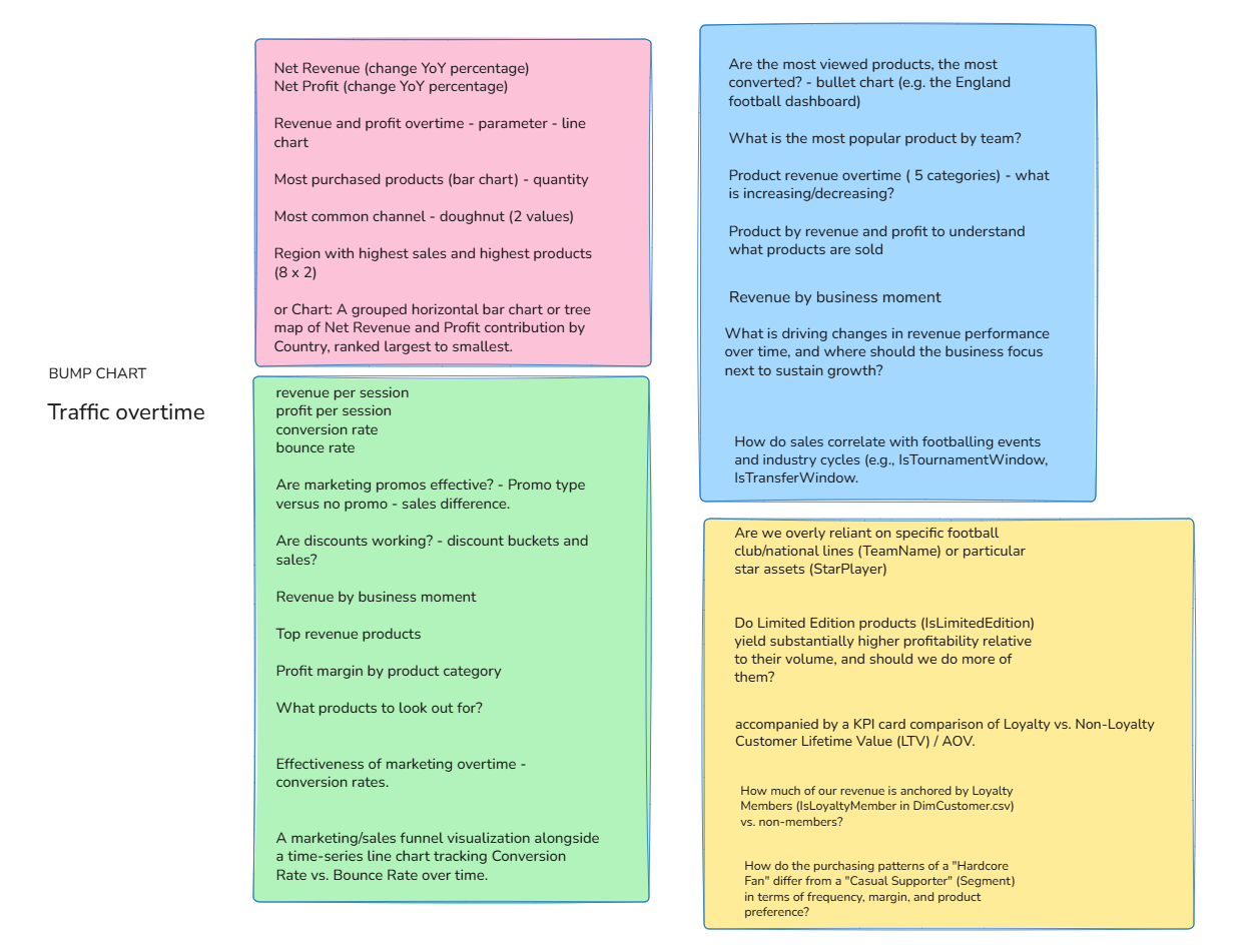
After reviewing the data model, I spent time analysing each table and identifying the types of questions an executive audience would likely want answered.
My Questions:
Design and Development Process
Before building any dashboards, I sketched ideas by hand.
This is a process I personally find valuable because it allows me to think more freely than designing directly on a computer. Drawing helped me explore layouts, relationships between visuals, and possible user journeys before committing to dashboard development.
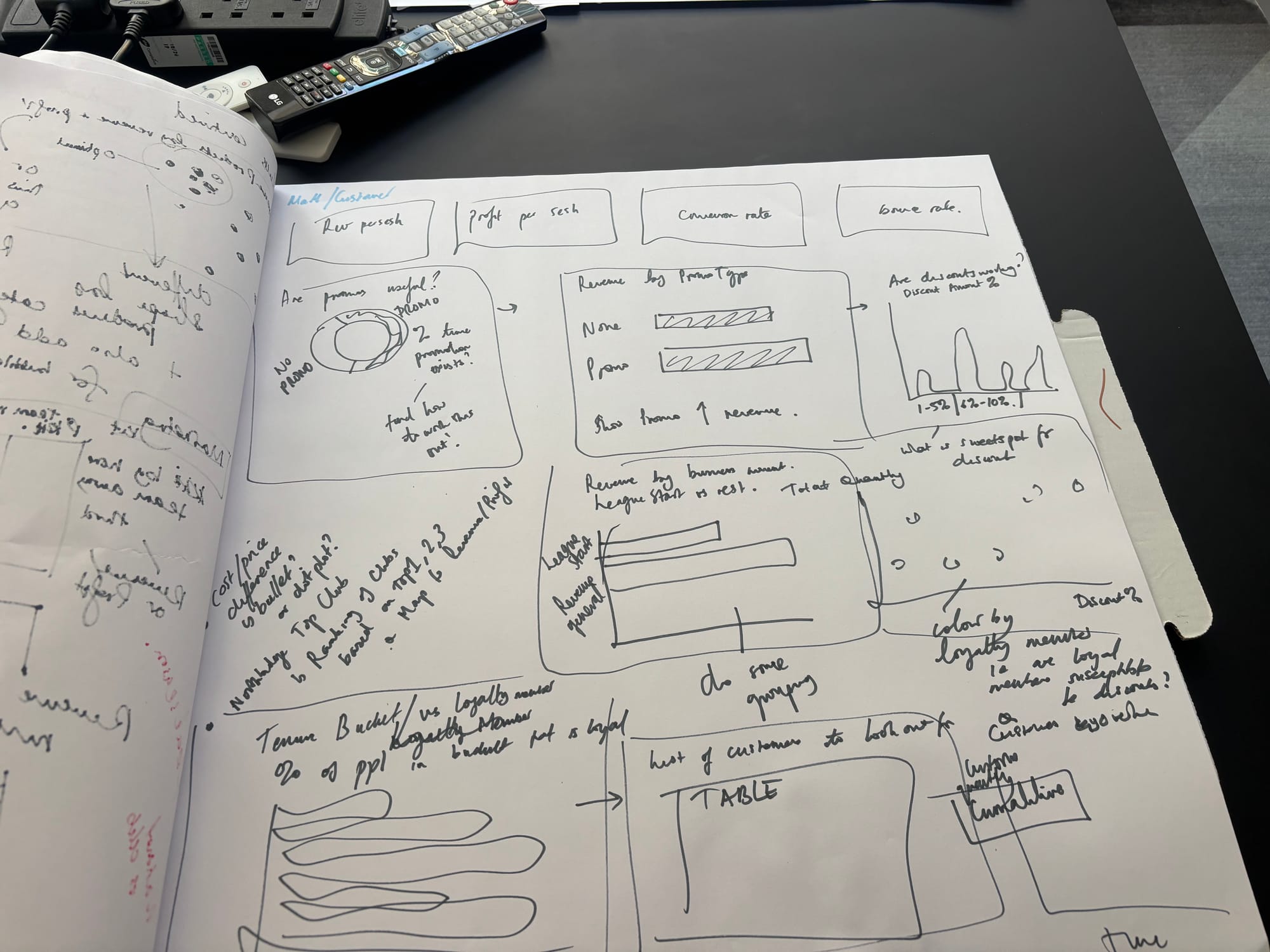
Rather than building one dashboard at a time, I initially created multiple charts and visualisations to understand what insights the data could provide. Once I had explored the available analyses, I began grouping visuals into themes that ultimately became the three dashboards.
My Report / Dashboards
What Went Well
I am particularly pleased with several aspects of the project:
- Successfully building my first end-to-end Power BI dashboard solution.
- Applying recently learned Power BI techniques and DAX date calculations in a practical business scenario.
- Creating dashboards that provide both high-level summaries and detailed drill-down capabilities.
The project gave me valuable hands-on experience and demonstrated how Power BI can be used to support strategic decision-making.
Challenges and Lessons Learned
The biggest challenge was creating a clear narrative across the dashboards.
While I was able to generate many useful charts, I sometimes found it difficult to determine which visuals best complemented one another and how insights should flow from one page to the next.
Looking back, there were instances where I focused heavily on individual visualisations before fully defining the overall story I wanted to tell, despite the concept sketches and plans.
This highlighted an important lesson: dashboard development is less about creating charts but more about guiding users through a logical decision-making journey… which I want to focus on for the rest of this week.
Another area for improvement is visual design, particularly colour usage.When working with many different categorical fields, I find it challenging to balance clarity with visual simplicity. Going forward, I would like to strengthen my understanding of colour theory and dashboard design best practices. That will most definitely be a near-future blog.
Also an already existing table can be converted into THE DATE TABLE, instead of creating a new one like I did!
Next Steps
If I revisit this project in the future, I would focus on:
- Refining the narrative structure across dashboards.
- Improving the flow between insights and recommendations.
- Simplifying visuals where appropriate.
- Optimising colour usage and visual hierarchy.
Overall, I am proud of the final product and the progress I have made. This project has given me a strong foundation in Power BI and is actually the first complete Power BI dashboard project I have built, which makes me particularly proud of the final outcome, and excited to see what I can build next!