


Show/Hide buttons in Tableau let you add interactivity without overloading your dashboards. Instead of forcing all charts, filters and text to be visible at once (which can be overwhelming for users, especially those with cognitive disabilities), you can reveal additional context or controls only when the user chooses. This makes dashboards cleaner, more accessible, and more user-friendly.
1. What Are Show/Hide Buttons?
A Show/Hide button is a toggle icon linked to a container in a Tableau dashboard. When the user clicks the button, the container and its contents appear or disappear.
Why is this useful?
- Declutters dashboards: Hide optional charts, legends, or filters until needed.
- Improves usability: Reduces cognitive load by surfacing only relevant information.
- Adds interactivity: Lets users focus on key KPIs while exploring more detail on demand.
- Supports accessibility: Users who prefer simpler layouts can toggle advanced panels off.
2. How to Create a Show/Hide Button
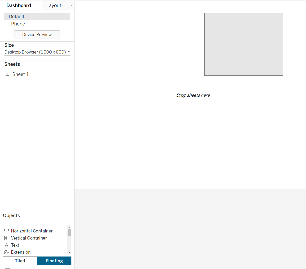
a) Start with a Vertical or Horizontal Container
Show/Hide buttons are tied to layout containers.
- In your dashboard, drag a horizontal or vertical container onto the canvas.
- Place any sheets, filters, or text you want to toggle inside the container.
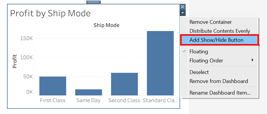
b) Enable the Show/Hide Button
- In the Layout pane, select the container.
- In the drop-down menu on the container, choose "Add Show/Hide Button."
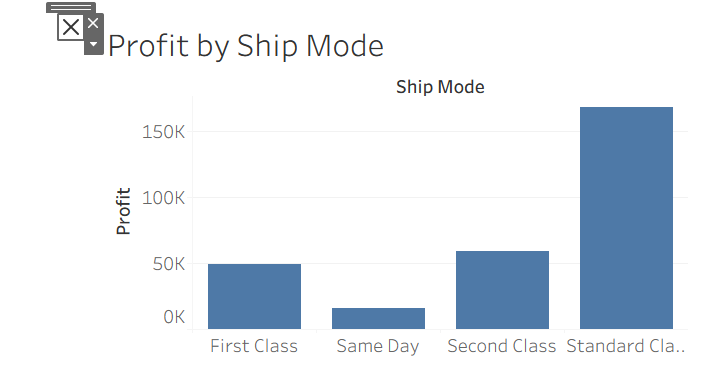
- Tableau places a small default button (a grey cross) on the dashboard.
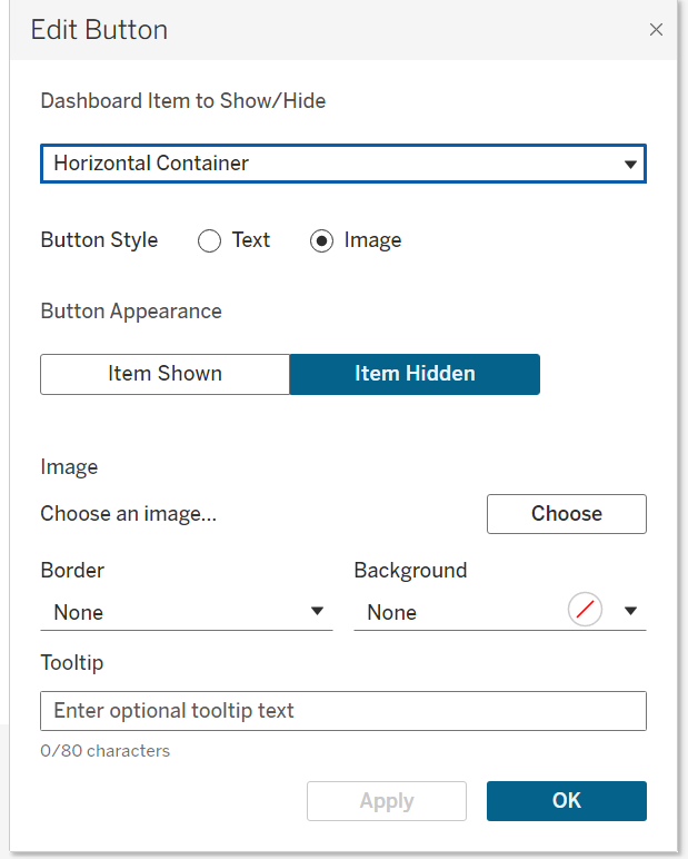
c) Customize the Button Appearance
With the button selected:
- In the Layout pane, you’ll see options for "Item Shown" and "Item Hidden".
You can use different icons for each state (e.g., an “X” to hide, a “hamburger menu” to show). - Use PNG/SVG icons for a professional look (transparent background works best).
- You can also adjust the size, colour, and position of the button.
d) Test It
Alt + Click the button, and the container and all its contents should hide and reappear. The button automatically switches between its Shown/Hidden icon.
3. Practical Use Cases
i) Collapsible Filter Pane
Instead of keeping all filters visible (taking up valuable space), group them in a vertical container. Add a “Filter” button; users open it only when needed.
ii) Details-on-Demand
Show headline KPIs by default. Place detailed tables or breakdown charts in a hidden container. Add a “More details” button.
iii) Mobile-Friendly Dashboards
On small screens, space is at a premium. Show/Hide buttons let you create pop-out menus or legends to keep the layout compact.
iv) Accessibility Toggles
Provide a "Simple View / Detailed View" toggle for neurodiverse users. Hide complex visuals by default; let the user reveal them only if they want more context.
4. Tips and Best Practices
a) Plan the Layout
- Show/Hide buttons only work on layout containers, not individual sheets.
- Group everything you want to toggle into one container before adding the button.
b) Floating vs Tiled
Buttons themselves can be floating for easy placement. The container can be tiled or floating. Test both to see what aligns best with your design.
c) Adjust Padding and Size
When hidden, the container collapses to zero size. Make sure hiding it doesn’t break the dashboard layout. You may need to play with container padding or placement.
d) Use Custom Icons
Replace the default arrow with icons your users recognise (filter symbol, info “i”, hamburger menu). This improves UX.
e) Add Descriptive Tooltips
Screen reader users and keyboard-only users benefit if the button has a tooltip that explains what it does, e.g. “Click to show filters.”
f) Test on Tableau Public/Server
Sometimes, button positioning behaves differently in the browser than in Desktop. Always test your published dashboard.
g) Accessibility Considerations
- Keep icons large and high contrast.
- Provide a clear label or tooltip for what the button toggles.
- Avoid hiding essential information, this is so that users should never miss critical context.
Summary
Show/Hide buttons are a simple but powerful way to make Tableau dashboards cleaner, more interactive, and more inclusive. By placing elements inside a container and adding a toggle, you empower users to control how much information they see.
Used well, this feature:
- Keeps dashboards focused.
- Supports different user needs (basic vs advanced).
- Improves mobile layouts.