After one week of tableau training we were given our project wherein we were tasked with revisualising our original application viz. Which seemed fairly straightforward - although there was one slight caveat - we only had around 3 hours to complete this task and at the end we would have to present our critiques and our new dashboard to the rest of cohort. We had to consider both safe, i.e. changes that we were confident we would be able to implement, and unsafe changes, i.e. those that we were unsure about, as they either were new to us or we were unsure we would be able to complete them in the time provided.
After learning so much in my first week of Tableau training, I had many critiques for my initial visualisation, although there were also aspects of it that were useful and worked well. In particular, I feel that my initial application allowed an in-depth exploration of the data and followed a logical path as well as allowing the user to make easy comparisons.

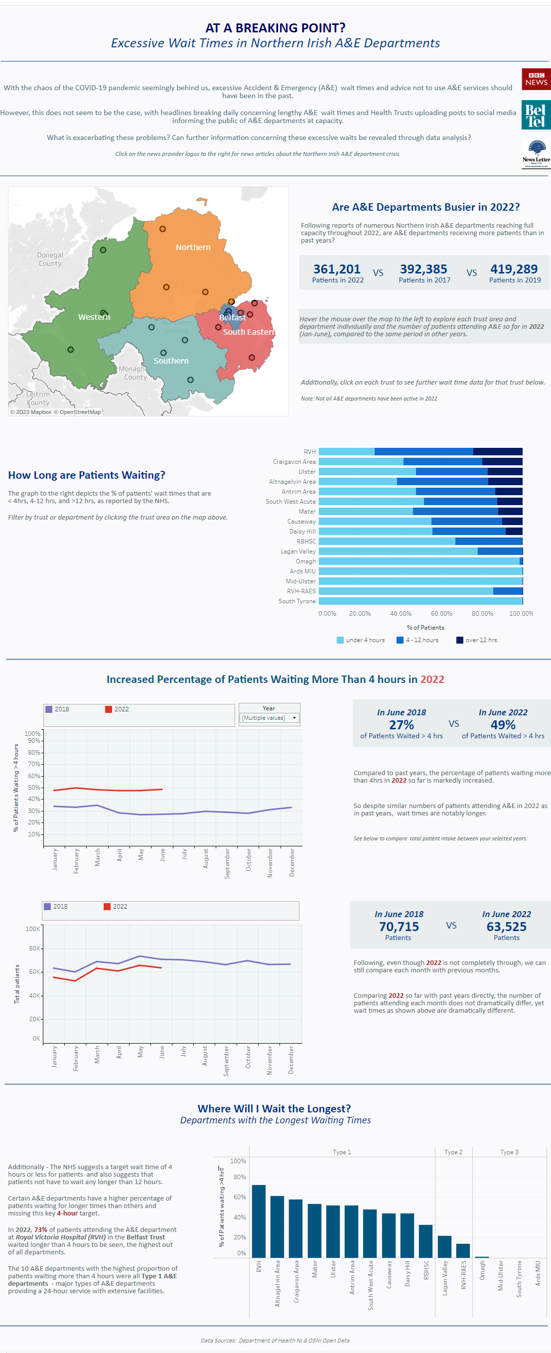
To give a little background - my initial viz explored the wait times reported at A&E departments across N.Ireland.
Interestingly, my entire approach to this task was a bit on the “unsafe” side as I decided to completely revamp my original viz. Additionally, because I had so many “safe changes” that I wanted to implement, the number of these also pushed me into “unsafe” territory as I knew I would not be able to complete all changes in the allocated time period and thus would have to prioritise certain aspects.
There was a large amount of text on my initial viz - which may actually be overwhelming for the typical user. Coming from an academic background I was so used to writing lengthy figure legends that I feel this may have echoed through in my viz, so in my reviz I definitely wanted to cut out a lot this irrelevant text. Additionally I also learned that if I do feel that it is necessary to include text, that I can hide this in a information icon - so it is still accessible but not taking up visual space on my main dashboard.
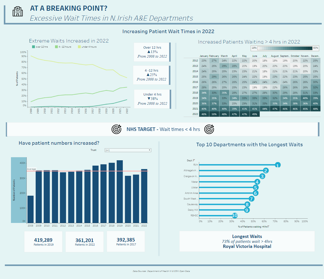
I also included a map in my initial viz, however, this map was slightly defunct as it only served to illustrate the boundaries of the N.Irish Health trusts and the locations of the A&E departments themselves. Also, useful line charts were almost hidden within tooltips within this, and were only revealed when the user moused over the map. In my reviz I wanted to pull out these hidden line charts and have them in place of the map - as by themselves they offered more insight than the map.
Furthermore, I wanted to improve the part of the viz where I allowed users to compare the percentage of patients waiting more than four hours between years, and also be able to see this data on a month by month basis. I had originally visualised this with line graphs that allowed users to filter but I think this made it more complicated than it needed to be and in my reviz I wanted to try visualising this data as a heatmap.
Additionally, I also wanted the portion of the dashboard where I explore the hospitals with the longest wait times to be more clear and I thought it would be more intuitive to understand as a ranked lollipop chart - with the ranks displayed in the lollipop bubbles - which I also ended up changing in my reviz.
Finally, in terms of formatting changes, the scaling of the initial viz was slightly off, and could be improved so that the viz fills the entire screen view when loaded up. Additionally, there was some double encoding that may have made some aspects of the initial viz more confusing for users as some charts had the same colours as other charts, despite differing topics.

