


A moving average is an average calculated over a specific number of data points over a period time, for example a 12 week moving average would be calculated over 12 weeks of data points. Although as the time period progresses, and moves forward a week, the previous weeks data points are dropped and the current weeks are picked up. Hence the term "moving average" as average "moves" as the period progresses.
Moving averages are useful in data analytics as they allow us to smooth out short term variations in our data and allow us to see the underlying trends more clearly as well as allowing us to detect outliers. Moving averages are oftentimes used in the financial sector for forecasting. Thankfully, Tableau desktop has made it fairly straightforward to calculate moving averages with table calculations.
In this #HowTo, I will be showing you how to create a moving average in Tableau Desktop, using the classic Sample-Superstore dataset and creating the moving average with sales data, so you can follow along if you wish.
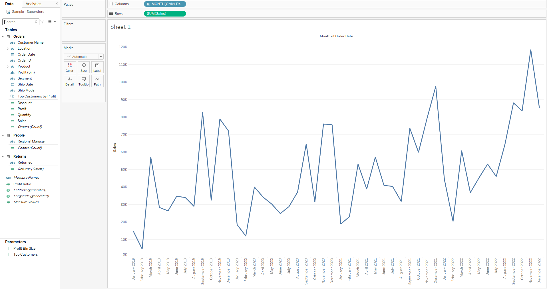
- To start with, I have set up my workbook as illustrated below, with my SUM(Sales) pill on my Rows tab and my MONTH(Order Date) pill on my Columns tab, which produces a nice line graph for me. However, I want to add some average sales information to my line graph, and not just any average - a moving average across 5 weeks.
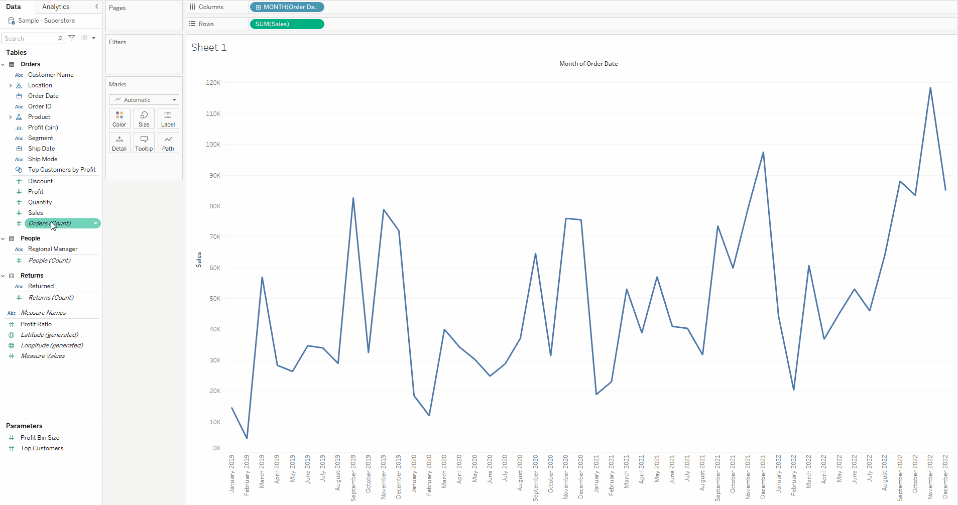
2. Drag another [Sales] pill to the rows tab, so that it sits alongside your original one. Click the downward arrow on the pill and mouse down to the Quick Table Calculations options, from there click on Moving Average.
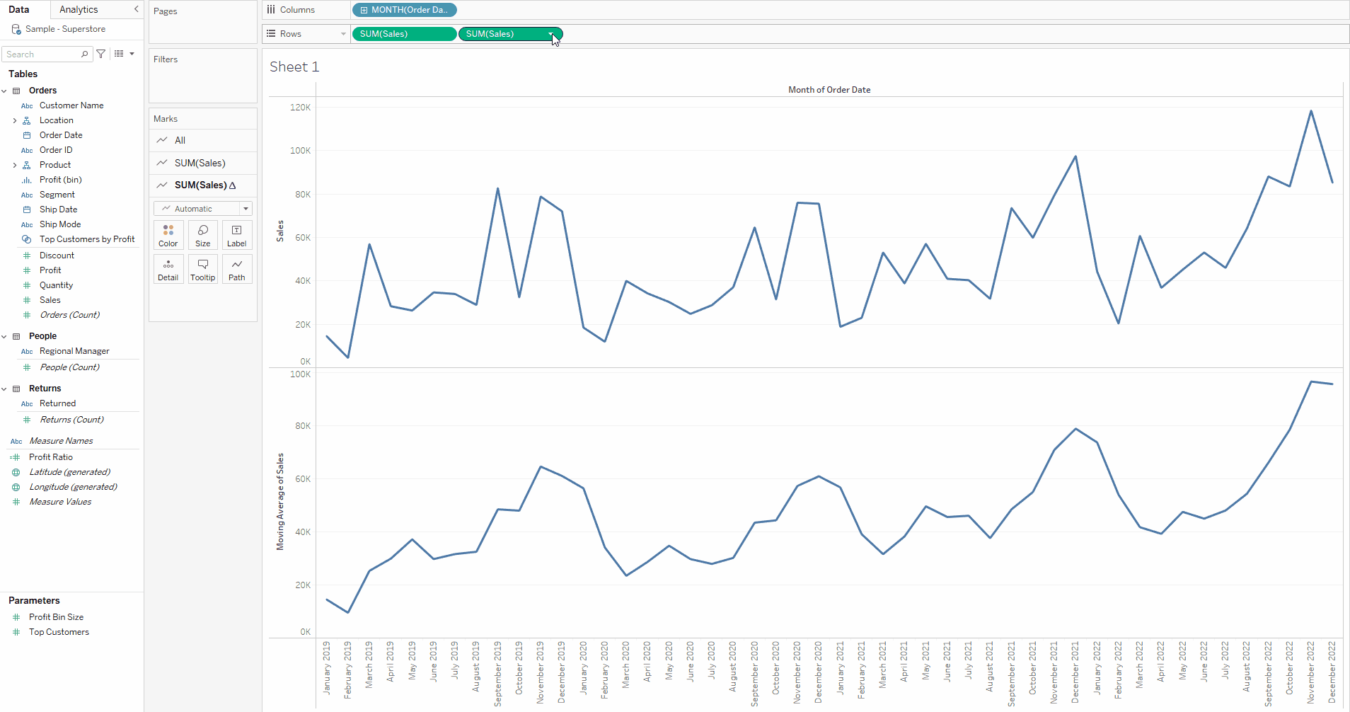
3. Next we want to edit this moving average so that it is a 6 week moving average including the current week. Go to the same downward arrow dropdown as in the previous step but this time click on Edit Table Calculation. Under the Calculation Type header, click into the Average drop down where "Previous 2" is automatically selected. This is where you can change your period for your moving average - be it 6 months to 8 months. In the previous values option , I have typed in 4, and insured that the current value option is ticked - this ensures the current date period is included - and we have 5 periods in total, the previous four and the current one.
4. Now we just have some quick formatting changes to make to ensure that our moving average line lies atop our original sales data line graph. Again go to your pill containing the table calculation on the rows tab and click the downward arrow dropdown. Click on dual axis, now the two graphs should be on the same chart. However, the axis do not match and are not synchronised - to fix this right click on the axis on the right hand side and click on Synchronise Axis. Once the axis are synchronised you can also right click on the right-hand one to unselect the show header option so that you only have one axis labelled as needed.
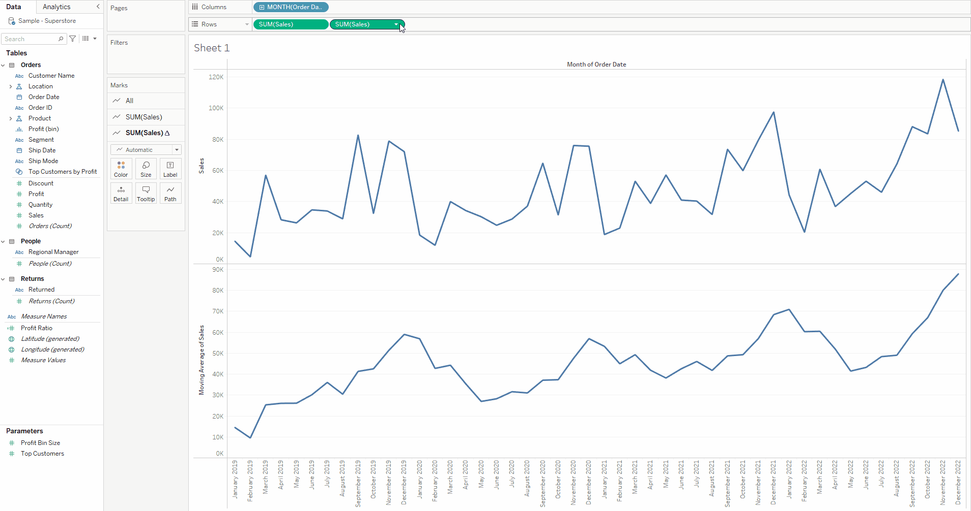
Now you have your lovely moving average line graph atop your original line graph, however you may want to make further formatting changes to tidy up the overall design and visuals.