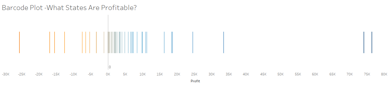
A Barcode Plot is a type of plot where each Bar represents a single value or group.
They are useful for highlighting key values and outliers in a plot, and also allow the viewer to easily identify trends.
In this #HowTo, I will be walking you through how to make a simple and straightforward Barcode Plot in Tableau Desktop - using the Superstore data set.
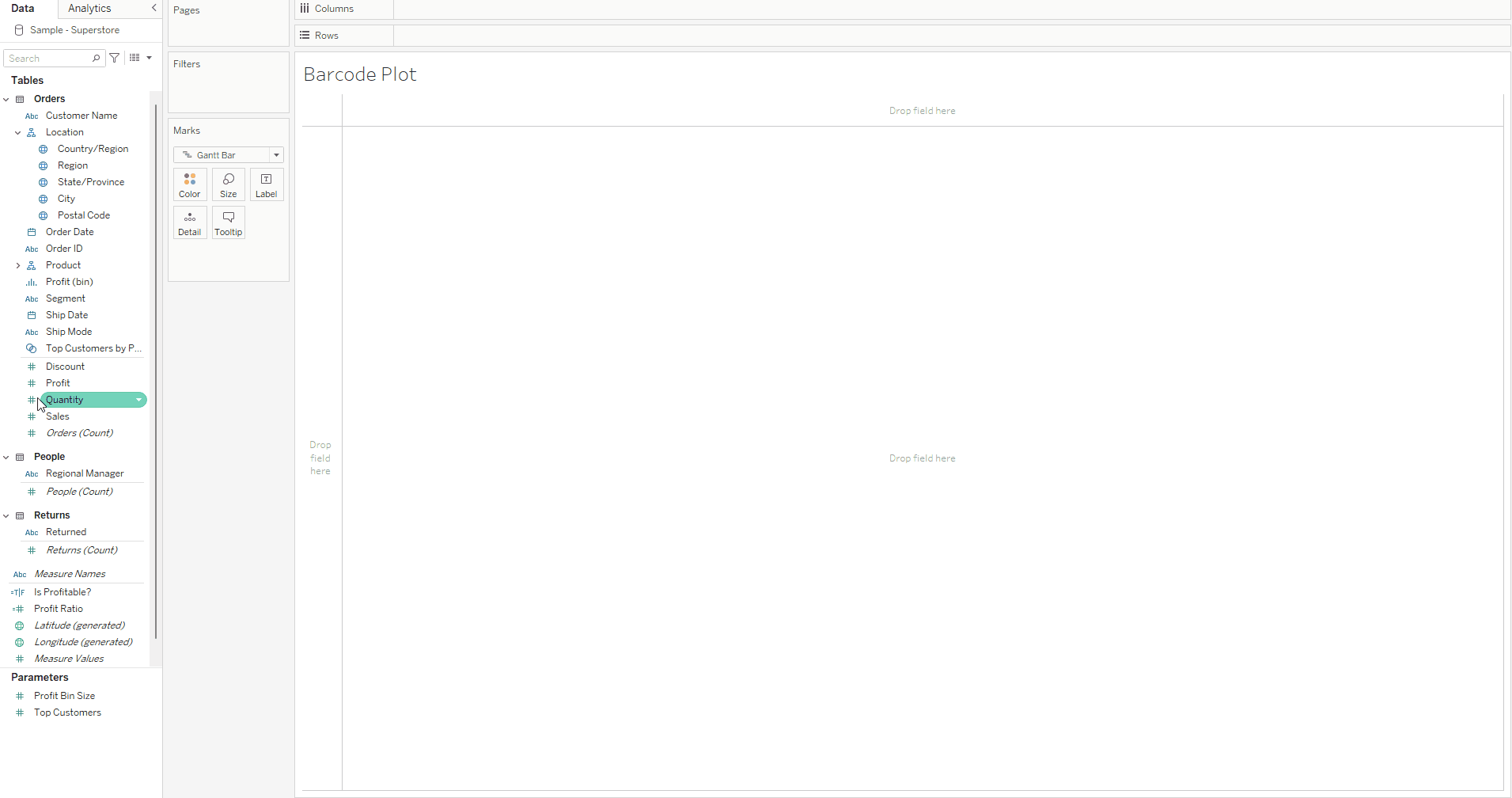
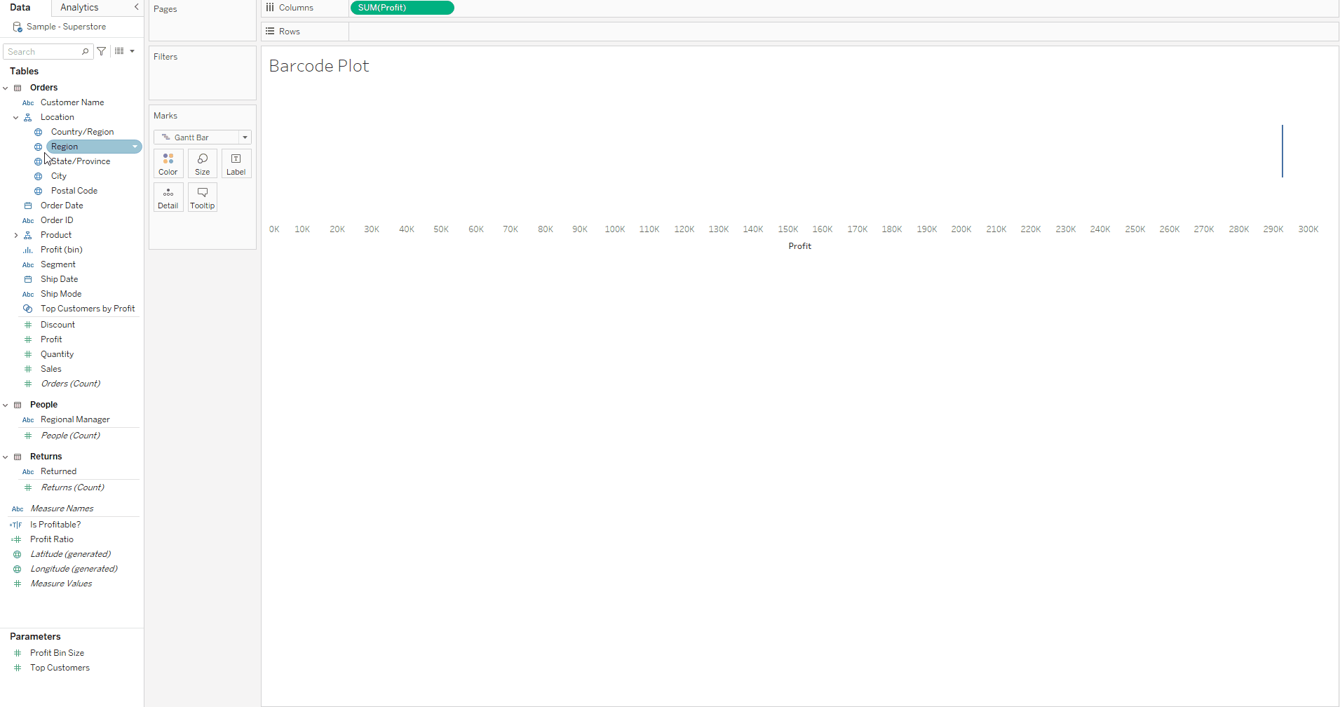
1. First drag your continuous measure onto the columns shelf, in this example I will be using profit as the continuous measure, and I want the sum - so I also ensure that this is selected on the pill.
2. Then drag the measure that you want to become the individual bars of the bar code onto the details card - and for this example I will be using state , as I want each bar to represent a singular state and the profit for each state. We can then see that the chart now shows individual lines for each state and their place along the axis corresponds to the sum of their profit. It really allows us to see the outlier states that are making a lot more profit than the majority of states, and also the states aren't doing so well profitwise. We also should ensure that our tooltips are turned in so we can see the relevant information for each bar when we mouse over the individual bars.
3. Congrats! You now you have a basic barcode chart.
You can also further format as you want - for example here is my finished barcode plot after a little extra formatting.