


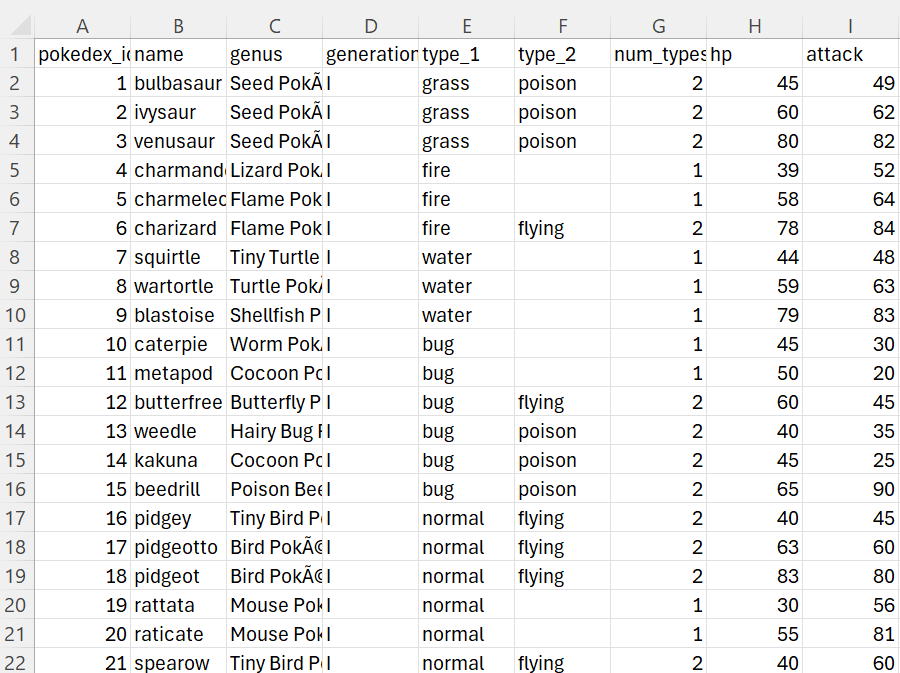
This project uses a Kaggle dataset covering every Pokémon from Generations 1–9. Each row represents a Pokémon, with 43 columns including stats like HP, attack, and defense, as well as categorical attributes such as type, genus, and whether the Pokémon is legendary or mythical.
The goal is to analyze trends in Pokémon strength and balance. Key questions include: Do newer generations introduce stronger Pokémon? Are certain types (e.g., fire, dragon, water) statistically stronger? How much stronger are legendary and mythical Pokémon, and are they becoming more common over time?
These insights can help Pokémon game designers and balance teams ensure that all Pokémon remain meaningful in terms of gameplay, player choice, and overall popularity.
You may recognize this dataset from my previous blog on loading flat files into Snowflake. For this project, I modeled the data in snowflake into a schema with smaller tables at different aggregation levels, then related them in Tableau to build the dashboard. This approach improves performance by querying only the necessary data instead of loading the entire dataset each time. You can learn more about how (and why) this is done in Jacob's blog about Translating A Single Data Table Into a More Efficient Schema.
This is the final data model, where the raw dataset was split into smaller, more focused tables and then related within Tableau.
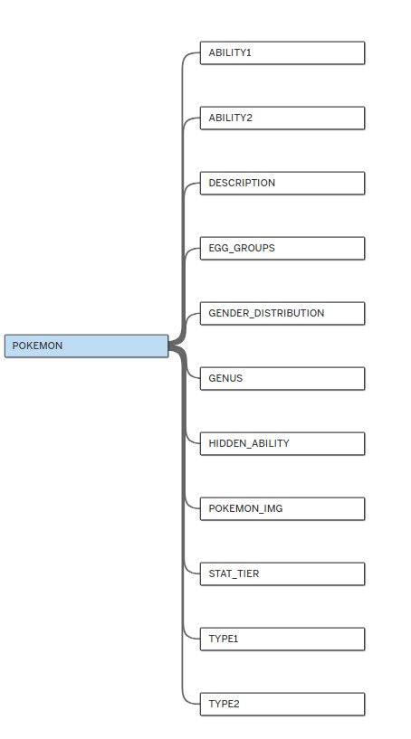
One important note: although I created a schema from this dataset, you could still use the raw data and have access to the same data points. The main difference would be performance, and you may need to do some additional cleaning, such as converting the generation column from Roman numerals to integers.
With that said, here is the dashboard created using this model.
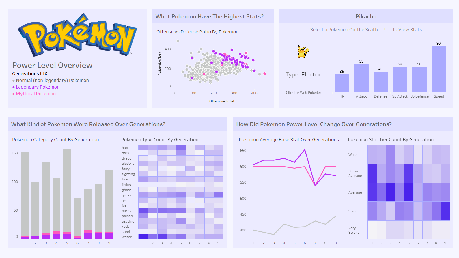
Note: The color scheme used throughout the dashboard helps distinguish between different categories of Pokémon. Gray represents normal (non-Legendary) Pokémon, purple represents Legendary Pokémon, and pink represents Mythical Pokémon. Therefore, any points, bars, or lines shown in gray represent the entire group of normal Pokémon, while purple and pink similarly represent the Legendary and Mythical groups, respectively.

Some analysis that can be made from this dashboard is:
- What Pokémon might be overpowered?
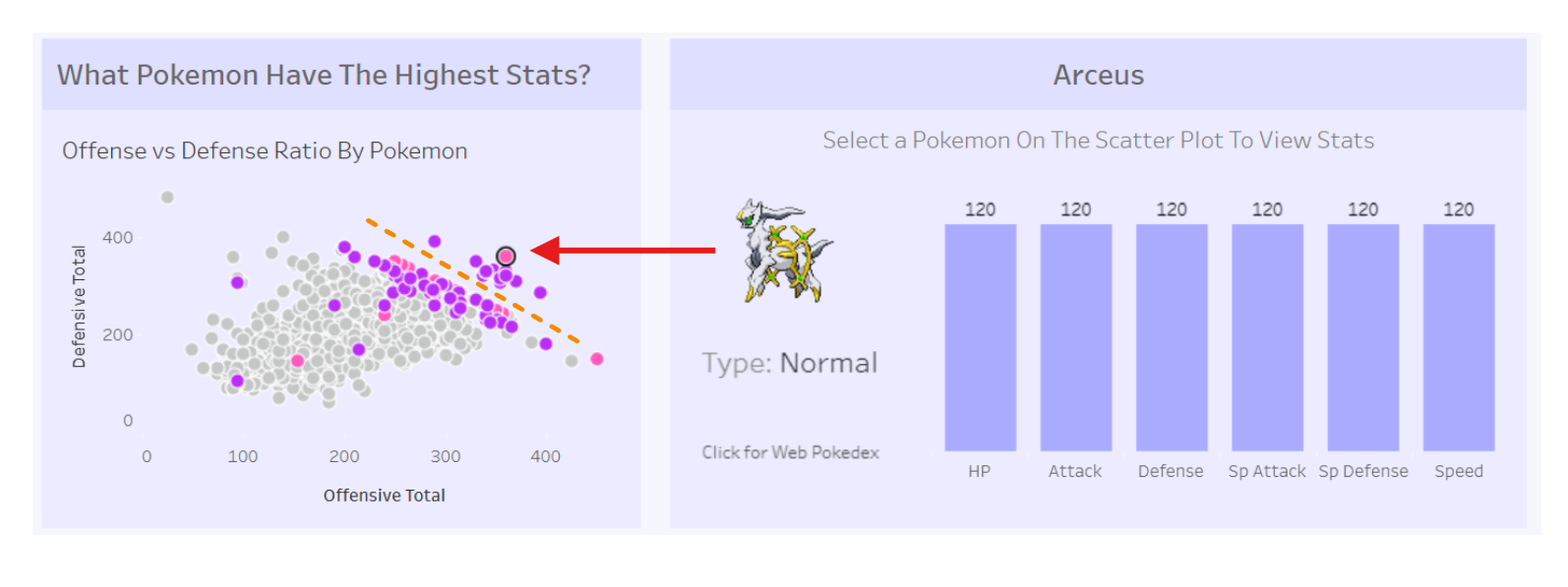
You can determine this by looking at the scatterplot and identifying Pokémon with both high offensive and defensive stats (those in the upper-right region). A clear pattern shows that Mythical and Legendary Pokémon consistently occupy this space, outperforming most regular Pokémon. There is also a noticeable gap that separates this top tier from the rest, suggesting a distinct class of exceptionally powerful Pokémon. These Pokémon can be considered a tier of their own and are likely to be popular in gameplay, but they may also require further investigation for balance issues. For example, clicking on a top data point like Arceus shows a very balanced stat distribution, which may make it overpowered since it lacks clear weaknesses and reduces opportunities for strategic counterplay.
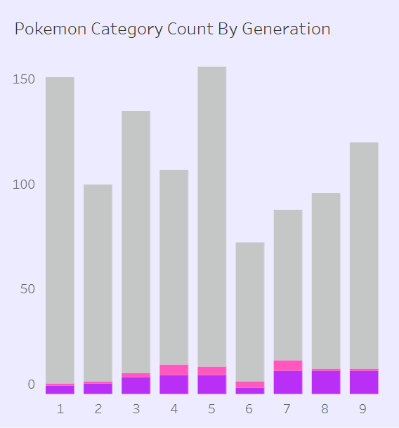
- Are we releasing too many Pokémon of a certain kind? Are Mythical or Legendary Pokémon becoming too common?
You can analyze this using the bar chart on the bottom left. Although the total number of Pokémon introduced after Generation 6 is lower than in earlier generations, the number of Legendary Pokémon remains relatively high. The trend shows that around 11 Legendary Pokémon are introduced per generation, while the number of Mythical Pokémon has slightly decreased over time.
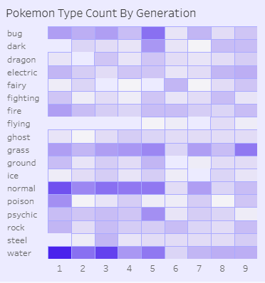
- Are certain types becoming more common in recent generations? Looking at the bottom left heatmap, earlier generations had a high concentration of Water-type Pokémon, whereas more recent generations appear more balanced across different types. However, one notable trend is a slight increase in the proportion of Grass-type Pokémon in Generation 9, which game designers might want to be aware of.
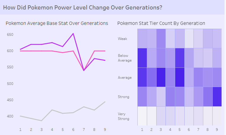
- Are Pokémon getting stronger over generations? Are we releasing too many strong ones recently?
We can answer this by looking at the bottom-right line chart and heatmap. In the line chart, there is a noticeable dip in the average base stats of Legendary and Mythical Pokémon following a spike. This suggests that designers may be attempting to balance the game by introducing weaker Legendary and Mythical Pokémon after releasing a batch of stronger ones. More interestingly, the average base stats of non-Legendary (regular) Pokémon have been steadily increasing over generations. This indicates that newer “standard” Pokémon are gradually becoming stronger, which could create imbalance if older Pokémon are not adjusted to remain competitive.
The heatmap reinforces this concern. It shows the number of Pokémon categorized into different stat tiers by generation. In earlier generations, the majority of Pokémon fell into the average or below-average tiers (indicated by the darkest colors). However, in the most recent generation, the strongest tier has become more prominent. This shift suggests that stronger Pokémon are becoming more common, which could raise balance concerns for game designers.
Conclusion
The focus of this project began by thinking about what questions the user—in this case, the game designers—would want answered. This user-centered approach helps guide not only the choice of charts and visual design, but also how the data itself is structured and modeled.
By starting with the questions rather than the visuals, it becomes easier to determine what type of charts and analysis are most relevant. This can even influences how the data model is prepared, ensuring that the most important features are available and easy to analyze.