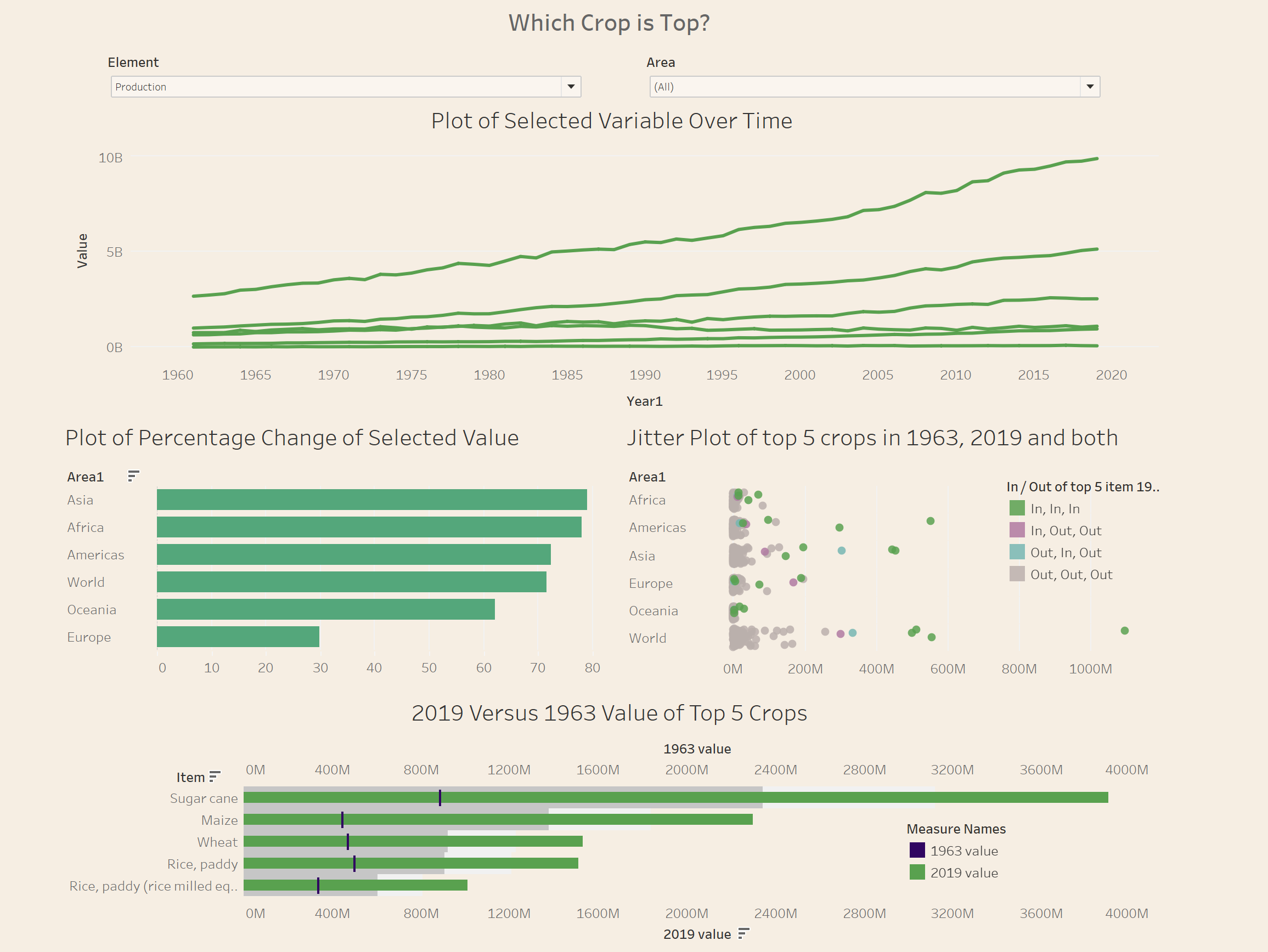
The project for week 2 was to recreate a Makeover Monday Viz of our choice and use skills leant that week to critique and improve the viz in Tableau. I originally chose to remake a bicycle statistic viz, but was persuaded not to by my cohort after realizing that my last project was a similar idea. I therefore decided to use a previous viz describing the worlds' biggest cash crops.
Outset: The viz was a pretty well polished one, starting with a bar chart describing the top 20 crops by more planted, fecund, popular and by revenue (https://data.world/makeovermonday/2021w11). However, the second half of the viz contained a bubble chart. Not a huge fan. It's not a fantastic way of describing data and its very hard to compare different values. That said, the icons on the bubbles really added to the effect of the circles, and combined with the values written underneath almost made the chart type acceptable.
Re-modelling:
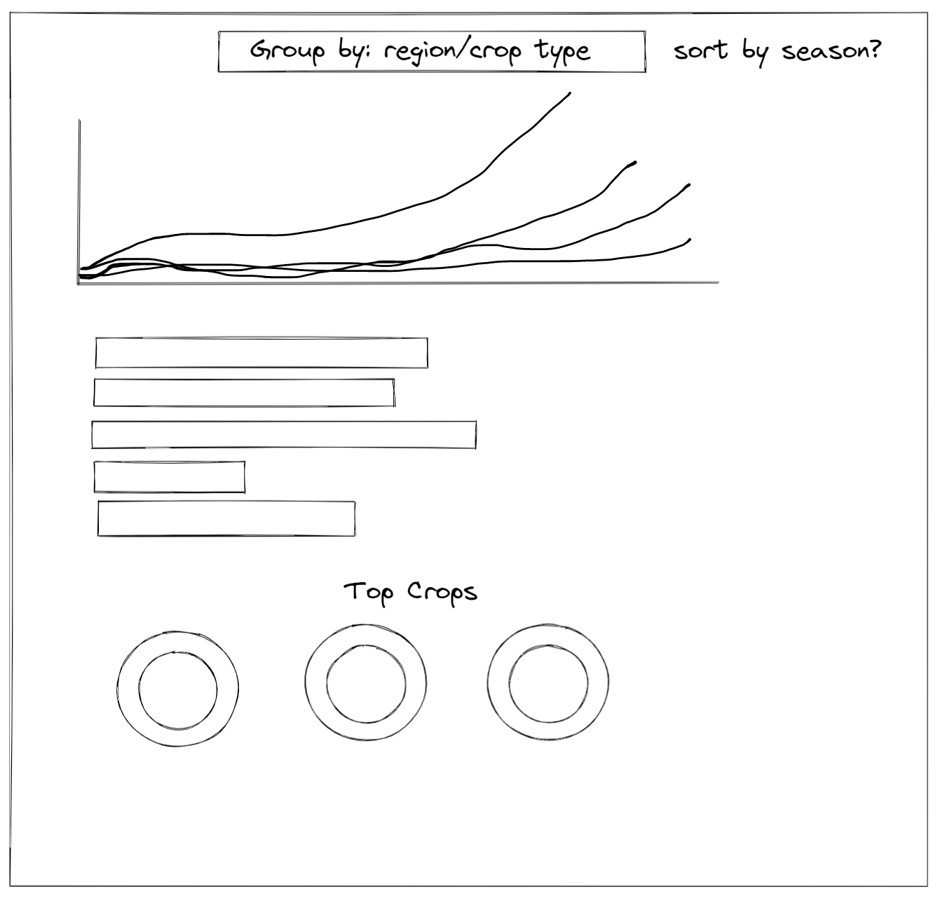
When playing around with the dataset I realized a large section that had been missed by the original viz was that there was time data ranging from 1963 to 2019. This inspired the idea to put a line chart at the top of my re-worked viz, as it draws the user in and describes the time-oriented data really well. Following this I decided to follow up with a version of the bar chart from the original makeover monday viz. However, my one would be shorter and instead be categorized by continent. This attacked the data from a different, and I thought more interesting, direction. I also plotted a jitter plot with the most valuable 5 crops in 1963 and 2019 overlaid. This created an interesting looking chart, with the overlapping crops in both top 5's highlighted in a different color to further show the most popular crops over time.
As you can see in the sketch above, I also decided to place filters at the top of the viz. This added an extra layer of interact-ability, and changed the data that was modelled by the charts, aside from the charts that already showed all continents. This was particularly powerful as it allowed me to change quickly between values of planted area, total value and production for each crop type.
All of this required skills learnt over the week, such as grouping and calculated fields. However, as I had to do a fair few of them and I'm trying to keep this blog short I wont list them here. However, if you are interested there are plenty of resources online to show you the way.
Final viz: