Using dividers is a quick and simple way to add some extra breathing room to your dashboards, increasing their readability! This blog will guide you step-by-step on how to add dividers to any dashboard.
The Dashboard

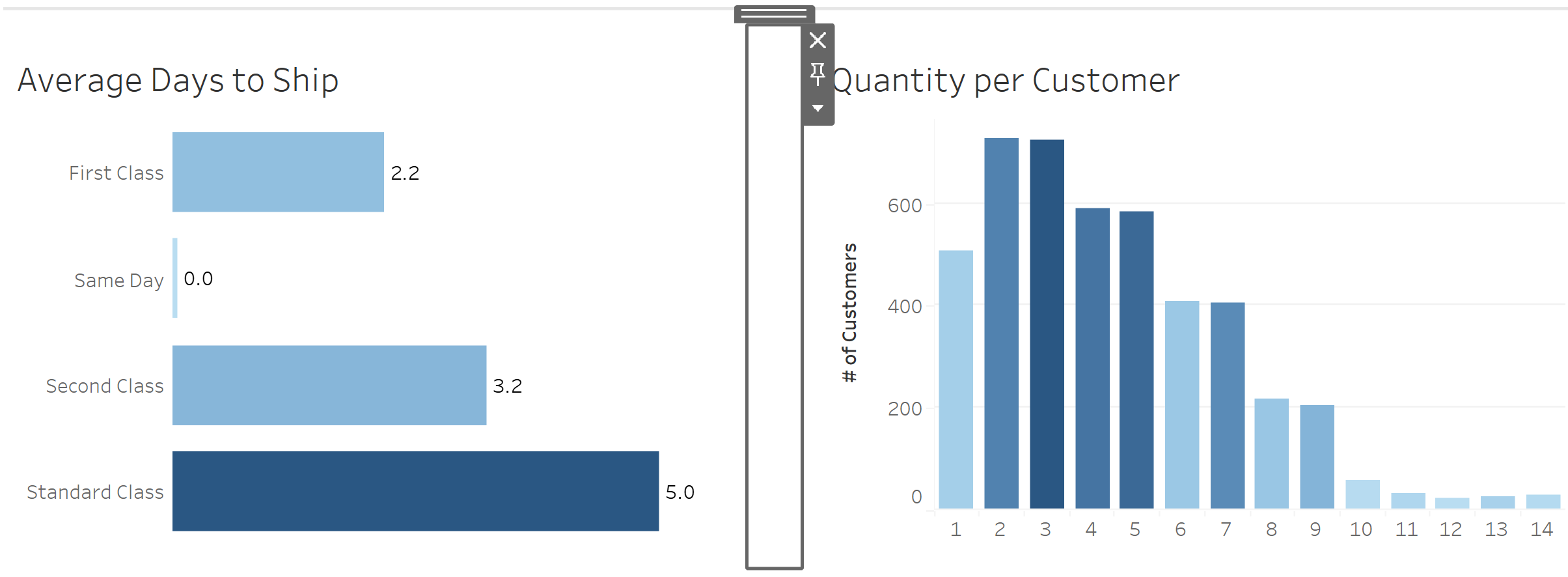
Above is a screenshot of my dashboard where I have inserted two worksheets side-by-side in a single container. I want to add a thin divider between the two charts.
The Dashboard Pane

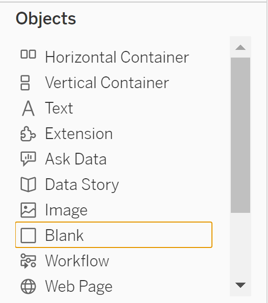
Drag a blank object from the Objects section of the Dashboard Pane on the left of the screen to between the two charts. Let go of the blank object when a blue dashed line appears between the charts. The blank object should be inserted and the result should look like this:

Divider Setup
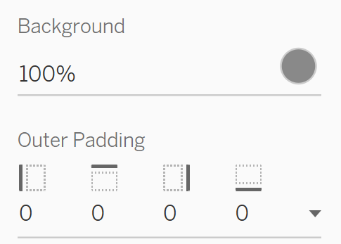
With the blank object selected, navigate to the Layout Pane on the left and choose the colour of your divider and change the outer padding to zero on all sides

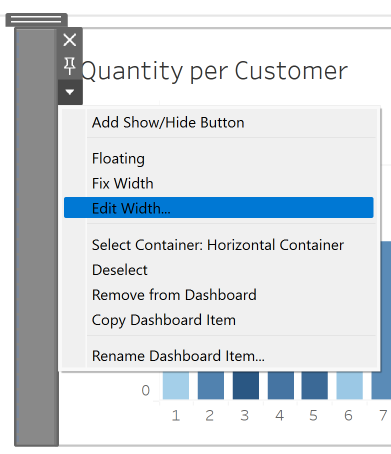
Next, right-click the newly coloured blank object and select edit width. Then change the width to 1 or 2 pixels.

Finally, return to the Layout Pane and change the outer padding on all sides from 0 to 10. This adds the breathing room either side of the new coloured divider in its container. The result should look like as follows:

For horizontal dividers the process is the same, except that when you right click the coloured blank object you'll have the option to edit the height instead!
