


A quadrant chart is a scatterplot that is divided into four sections. They can be very useful in many scenarios, particularly when you want to divide your results into different categories based on a certain criteria. In the example below I'm going to show you how to create a quadrant chart in Tableau using a mock dataset containing various information pertaining to a fictional superstore.
Choose your measures
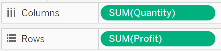
To begin, drag the two measures you want to display into the columns and rows shelves. For my data, I want to look at Quantity and Profit:
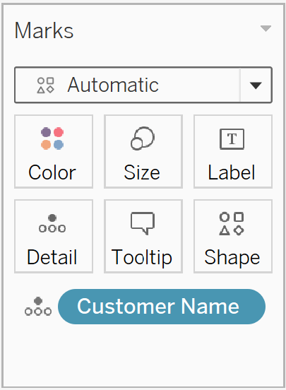
I want to divide my data by customer, so I then drag the Customer Name dimension into the marks shelf as a detail:
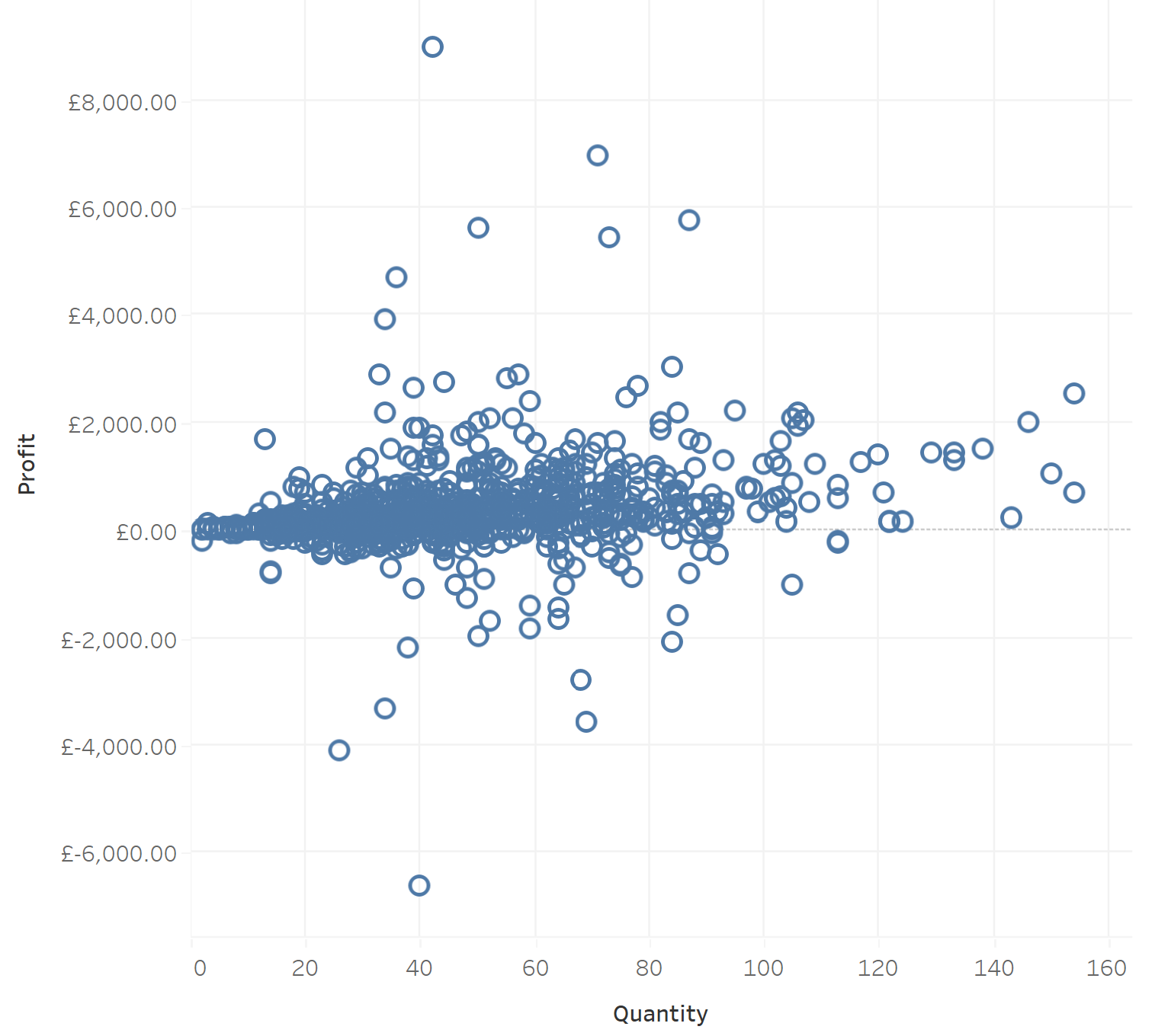
Which displays the following scatter plot:
Create sets
Now I want to split this scatterplot into different categories. For example, I would like to group customers according to whether or not they are profitable, as well as whether or not they make 60 or more purchases.
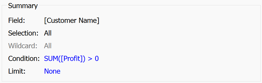
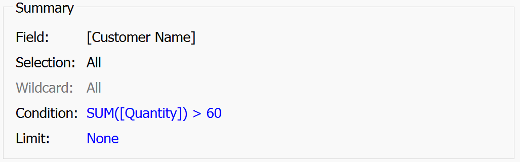
To do this I have to create two sets. Firstly, to create a set for profitable customers I right click on the Customer Name dimension and click Create>Set. I then click on the "Use all" option under the general tab (since I don't want to exclude any customers before I group by profitability), the I create my rule under the condition tab. In this case, the summary of my set found under the general tab will look like this:
I can repeat this process for my second group, for which the summary of my set will look like this:
Now I need to create a combined set so that my two sets can interact. To do this, I can right-click on either set and click "Create Combined Set" which leads me to the following screen:
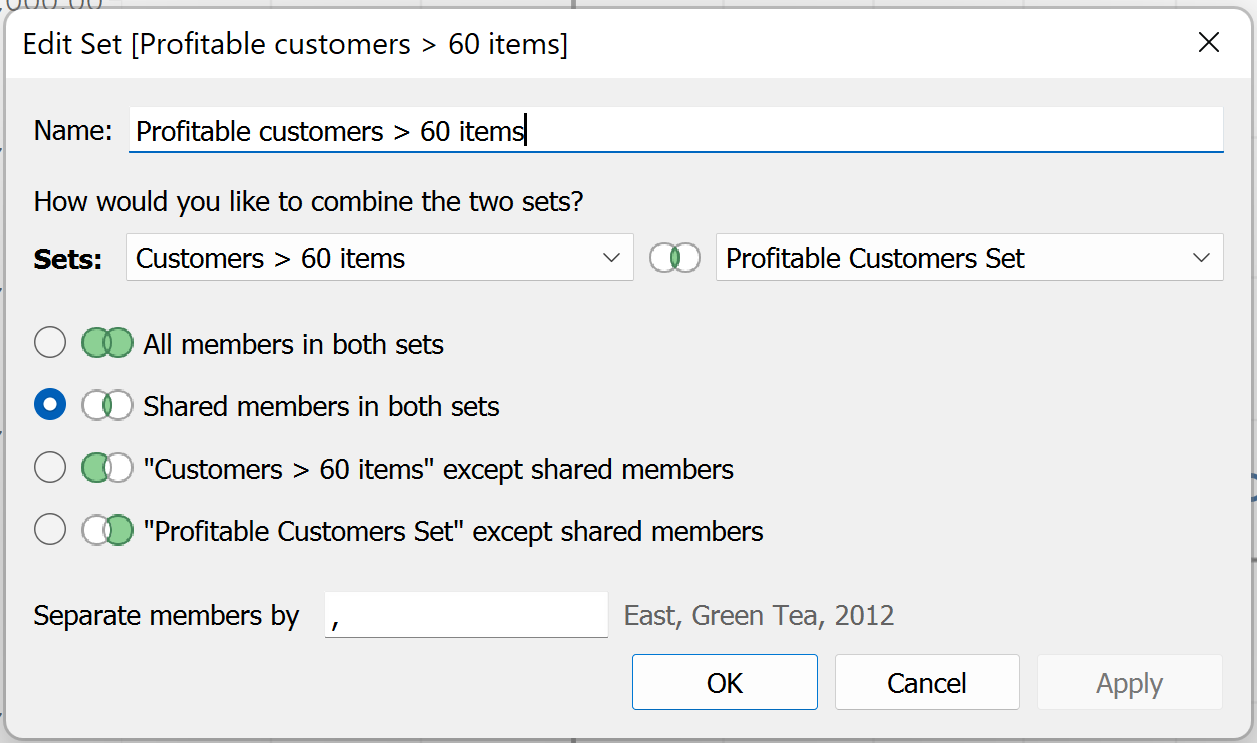
Here I can name my new set, choose which sets to combine and how I would like to combine them. By choosing how you combine the sets you determine which marks are highlighted in your chart. Since I want to highlight just the customers who are both profitable and have ordered more than 60 items, I select the "Shared members in both sets" option.
Final Product
By dragging our new combined set into the colour shelf on the marks card, we are greeted with the following quadrant chart!
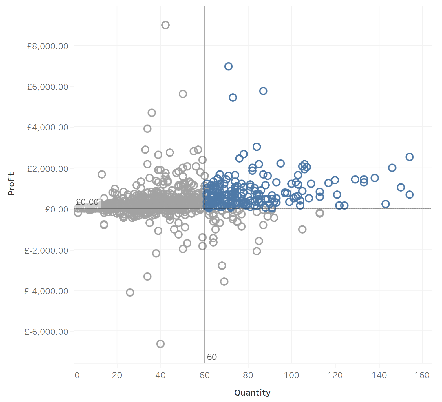
I have also added in constant lines from the analytics pane set at Quantity = 60 and Profit = 0, just to help visualise the different quadrants of our new chart! Now all of the customers who are profitable and make more than 60 orders are highlighted!