


On July 3, 2020, Carmen Ang at the Digital Capitalist released the following article and visualisation. She aimed to explore international differences in the price of mobile data. Whilst in many ways she succeeded, there are several ways in which her work could have been improved. In this post, we'll identify the weaknesses of this visualisation, and suggest a more streamlined design.
A clear weakness of the jitter plot approach in this visualisation is that countries are represented by circular flag icons. These are densely packed around $0—$5 and lack labels. This makes it difficult to estimate the exact cost of mobile data in these countries and assumes a comprehensive knowledge of country flags. Whilst her work is visually attractive, its message could be conveyed more simply. After downloading the dataset, I spent the morning reworking this vis into a drill-down bar chart. Let's talk through a couple of the techniques I used to achieve this.
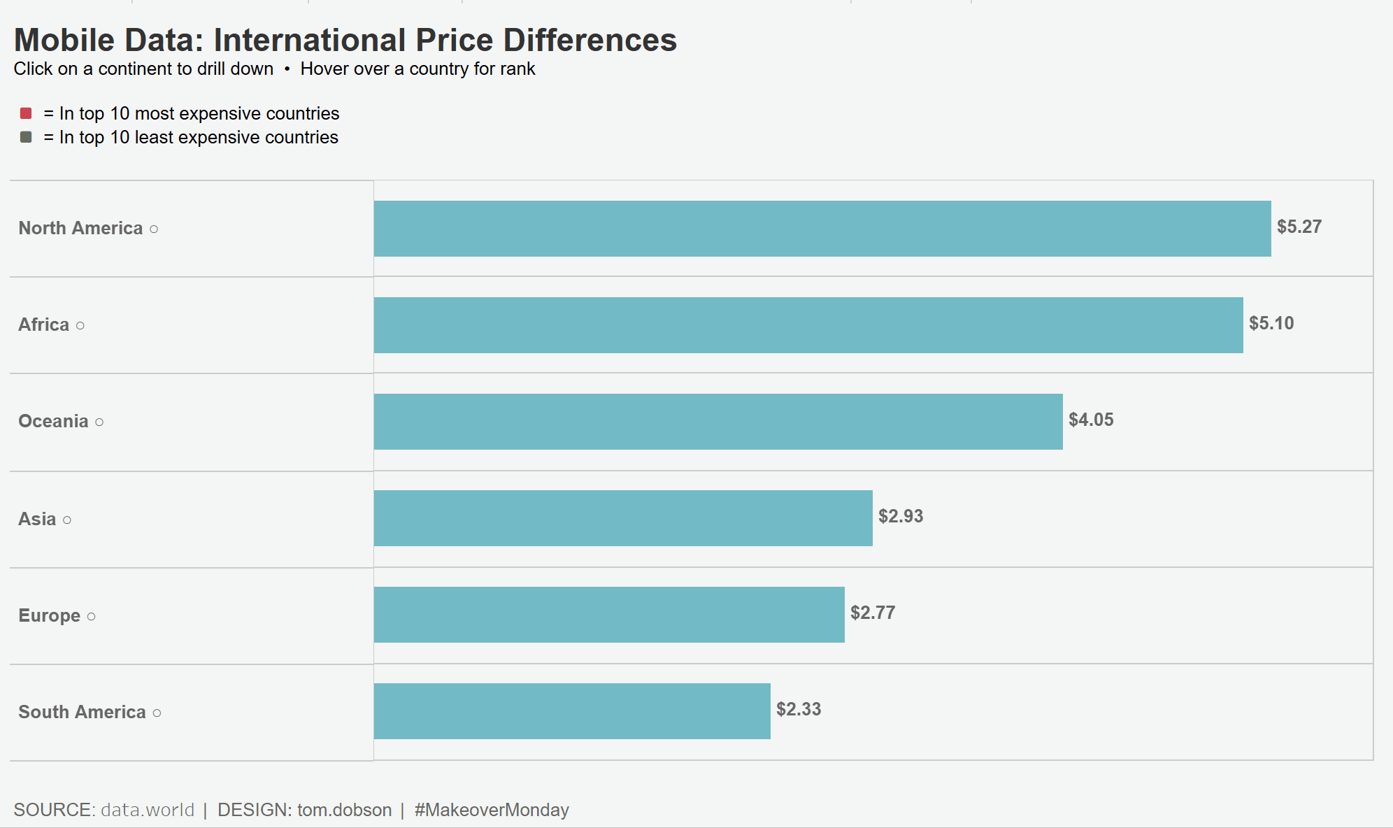
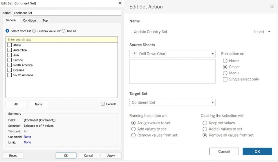
A visual scan of Carmen's dataset turned up only country names and average mobile data costs. To create a drill-down, it was therefore necessary to supplement this with continent information for each country. This can be achieved by downloading and appending the necessary data in Tableau. Building a chart which can drill down from continent to country was a multi-step process. First, I built a simple bar chart showing continents and countries by the cost of mobile data. I then created a placeholder set containing the continent names and a set action directed at this set. This will update the set based on the selected continent and clears the set following deselection. The selected continent, and therefore the contents of the set, are communicated to the bar chart using a simple calculation, which replaces the country field on the rows shelf.
If [Continent Set] then [Country (Continent)]
ELSE ''
END
To provide a visual indication of drill-down status, I next added a Unicode circle following each continent which is filled after selection. This was achieved using another calculation, which replaces the continent field on the rows shelf. For this to work correctly, the continent field should also be placed on the detail card. To keep continents in descending order these were manually sorted. Using a combination of sets and calculations, I also coloured the ten most and least expensive countries.
[Continent (Continent)] +
IF [Continent Set] then ' ●'
ELSE ' ○'
END