Unlike Tableau Prep, Alteryx has two separate tools used for pivoting data: 'Cross Tab' and 'Transpose'. The Cross Tab tool is used to transform rows to columns and the Transpose tool transforms columns to rows. "Transpose makes rows" is a simple rhyme I use to help remember the difference between t two tools. In this blog, I will demonstrate how to transpose fields in Alteryx.
Firstly, to understand why would we ever want to transpose data, let's consider the following example.

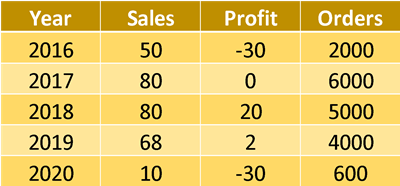
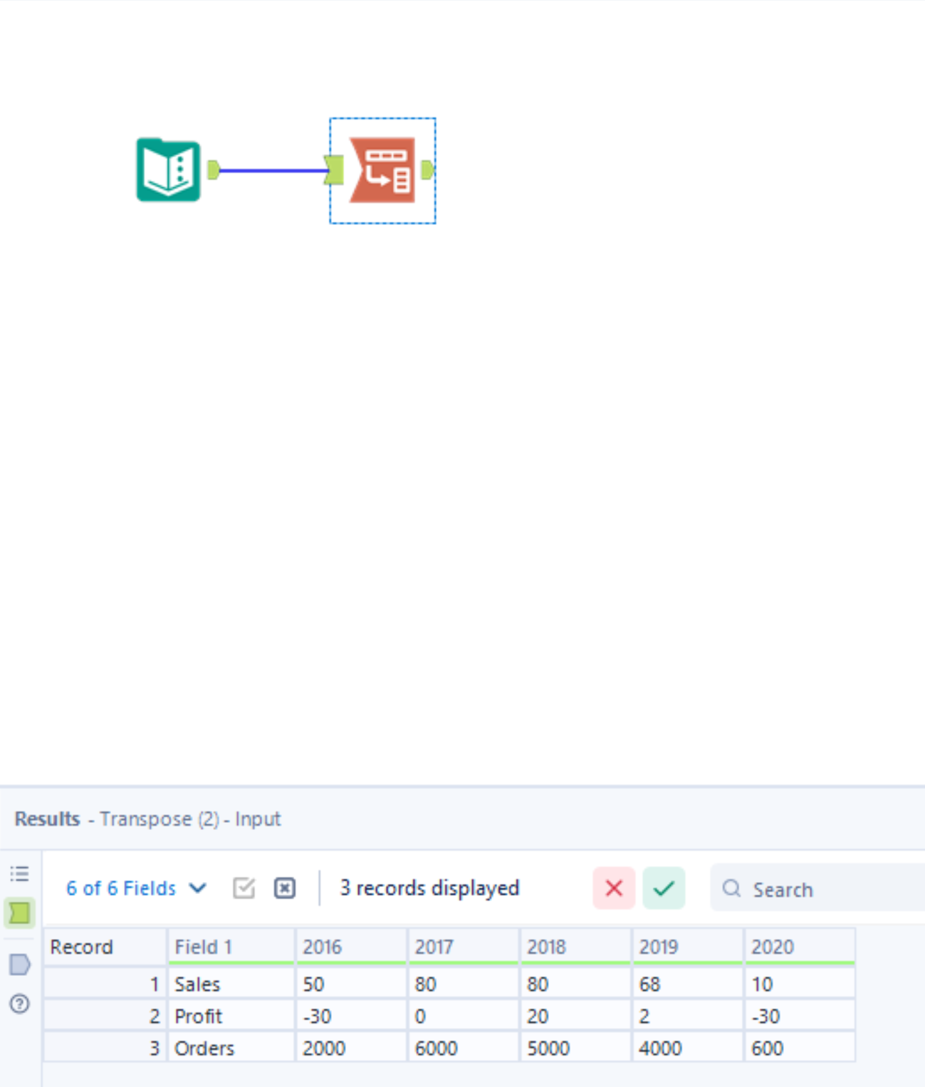
Above, we have a classic spreadsheet. This is a great option if you are looking to read the data in a table, but isn't the most 'computer-friendly' option for formatting data due to its wide structure. If we were wanting to create charts with this data in a tool such as Tableau, it would be much better to pivot our columns to rows under a single column (see table below). This tall structure of formatting is also much more future-proof, as we no longer need to create new fields when we look to input 2021 metrics.

We can easily achieve this in Ateryx using the transpose tool, and this is how:
1) Drag in the transpose tool to your workflow and attach it to your input data.

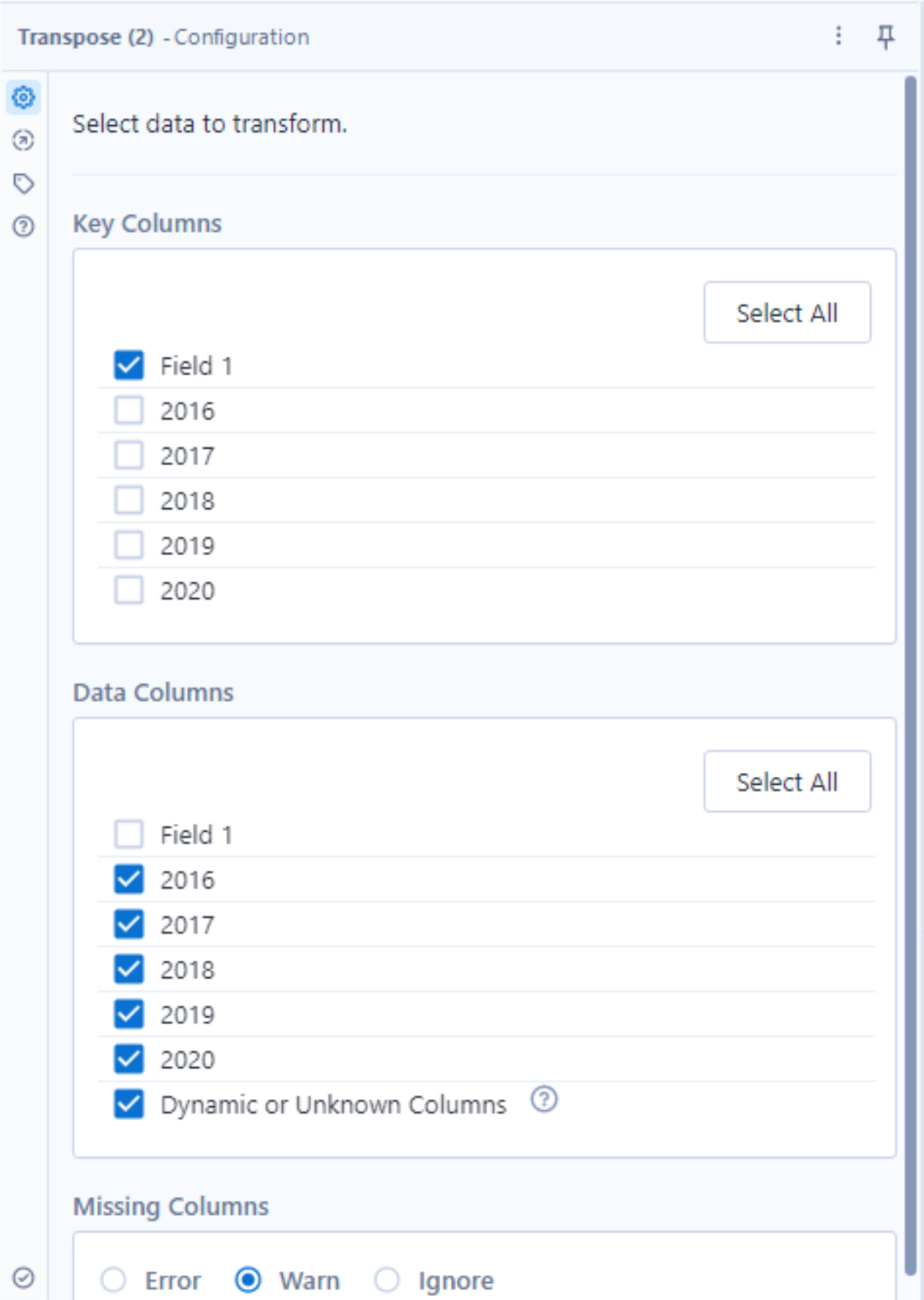
2) Configure your transpose tool.
After adding the transpose tool, you will notice that the configuration window on the left-hand side of the screen is split into two main sections: 'Key Columns' and 'Data Columns'. The key column pane is effectively asking to select the columns that we wish to lock in, whilst the data columns pane is asking us to choose the ones we wish to convert to rows. In this case, our key column is 'Field 1', since we want it to remain in a fixed position. Atleryx will then automatically select the remaining columns in the data columns pane as these are the columns we wish to transpose. By keeping the 'Dynamic or unknown column' box ticked, our workflow will automatically update when new entries are inputted into the data, for example, 2021 metrics. The final tool configuration will look like this:

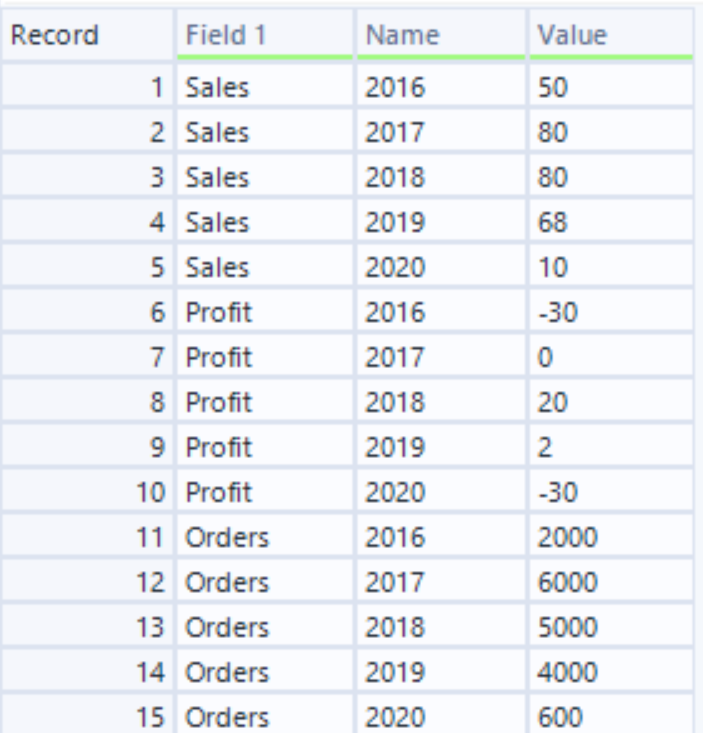
3) The final step is to click 'Run', located by the top-right of the canvas, or by pressing 'CTRL'+'R'. Thus, returning the following output:

Now our data is suitably formatted for data visualisation!
