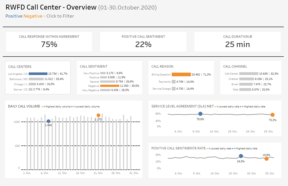
Hello everyone! This blog post is about why and how you should use whitespace when designing dashboards in Tableau. So if you are interested in improving the accessibility of your dashboards stay tuned.
The first best practice is to apply whitespace. Adding whitespace in your containers helps to guide the user and to speed up the processing time to understand the information on the dashboard. Moreover, whitespace reduces the messiness and thus, makes the dashboard more pleasant to look at. Sounds great, doesn't it? So before we talk about how to apply whitespace in a dashboard here is a visual example to see the effect of whitespace.
Dashboard with no whitespace:

Dashboard with whitespace:

The second dashboard is clearly more structured and accessible!
Now you may think great, but how do I apply whitespace? Fortunately that is fairly easy in Tableau. Simply go to your dashboard and select a container. Then you select the Layout Pane and increase the inner and/or outer padding to apply additional whitespace. You can test how different padding values change the look, but usually the inner or outer padding does not exceed 25.
All in all, applying whitespace is simple, but yet powerful. Exactly what we want. The next best practice post will be about text usage in a dashboard. See you then.
Cheers, Tobias
