Hello everyone! Welcome to part two of the dashboard design series. In part one we talked about the application of whitespace. Meanwhile, this blog post will be about proper text use in dashboards, which is also part of the best practices with respect to dashboard design.
So why should you care about the text in your dashboards? First, you help the user to understand the information on the dashboard faster. Second, you can raise the interest into the dashboard by the right choice of words. Last but not least, varying the font size helps to guide the user to the information that is essential. Rule of thumb: the more important the information the bigger the font size.
Sounds great, but how can you achieve advantages of proper text use?
1. Choose titles/descriptions that are easy to understand.
2. Directly address the user by using ‘you’.
3. Ask questions in the chart title.
4. Combine points two and three.
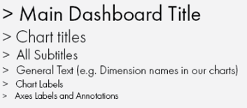
5. Use a font size hierarchy.
Never heard of font size hierarchy? No worries! A font size hierarchy simply defines the font size for different text elements. Usually titles have larger font sizes than axis titles for examples. Might seem obvious to some, but sometimes you have to talk about the obvious things! A hierarchy might look something along the following:

Though, you can adjust the sizes to your needs as there is of course more than one solution to the font size hierarchy problem.
That is it already for this time. Remember that proper text use can drastically improve the information presented on your dashboard. Moreover, the next best practice post will be about chart choices. See you then.
Cheers, Tobias
