


This was a chart I learnt when creating the Rick and Morty Portal. It is known as a honeycomb chart I had never really seen it before until doing this challenge. I thought this was very creative chart to create for the Rick and Morty API.
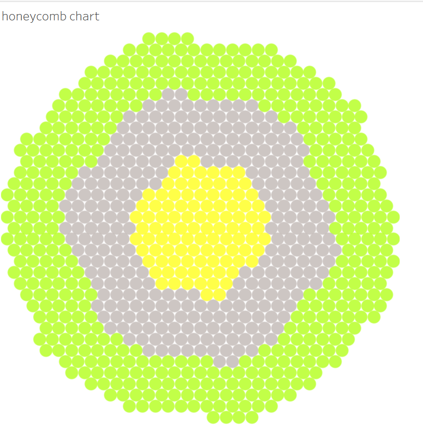
This graph is a little hacky and is not best practice however if you are trying to make something with a creative element this blog will walk through the steps on how to make this.
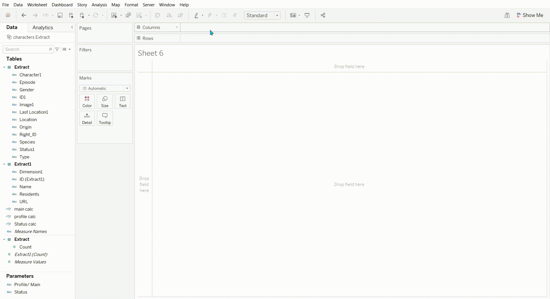
Step 1: Add 1 to both columns and rows and make both of these a discrete dimension.
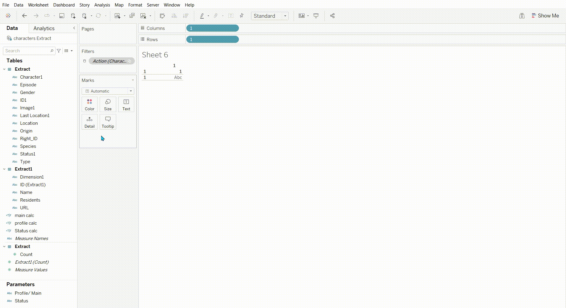
Step 2: Then add min(1) to size and Change the shape to a circle.
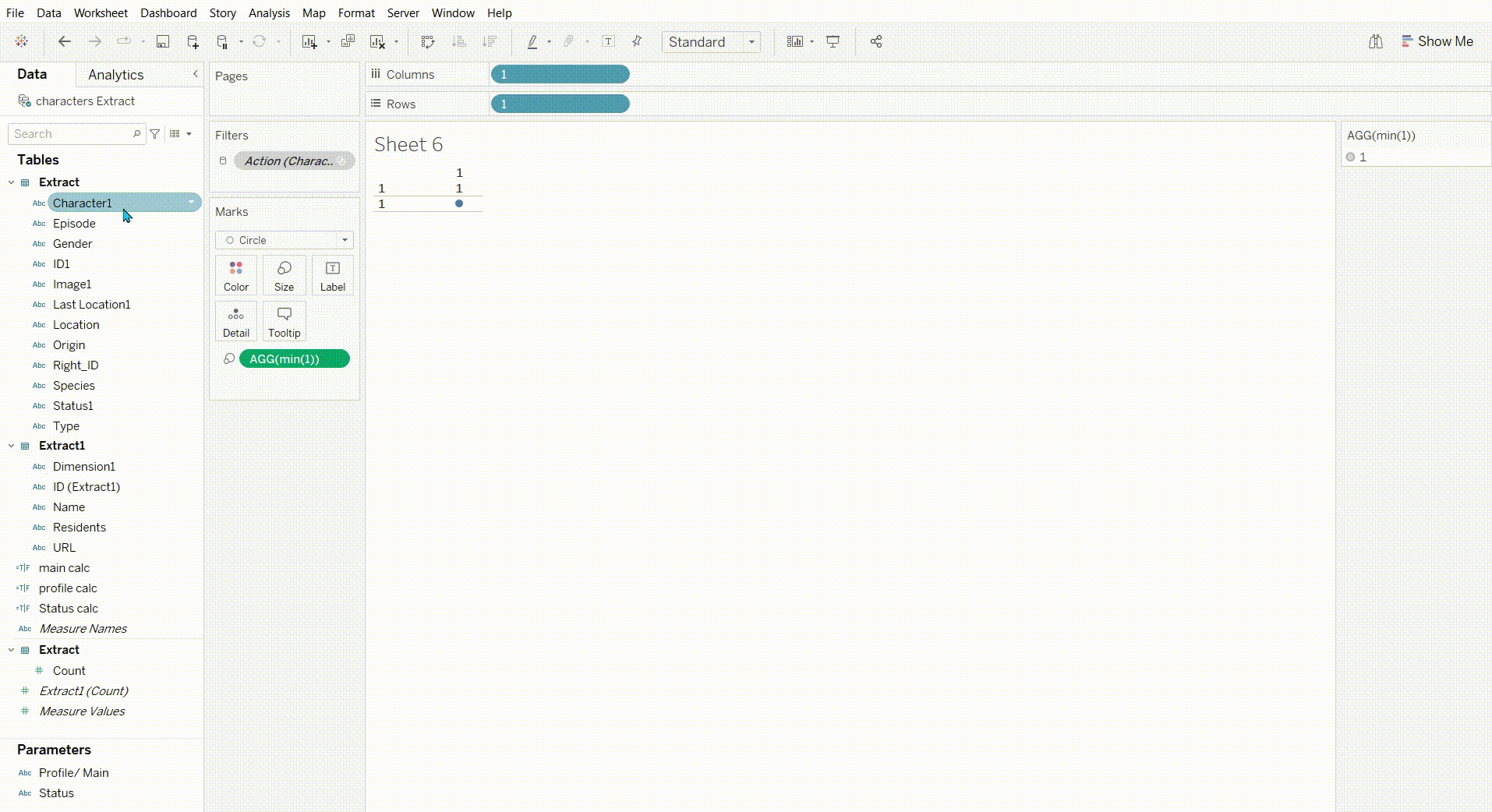
Step 3: Now add something to detail to produce all the circles and finally add something else to colour.
This can also be used in a map which maybe another way to visualize this and maybe better.