
Today was a day packed full of LOD's and Table Calcs (fun). One of the tasks given to us was to create a Bump Chart, something I had never done before.
The Bump Chart can be used to display change in ranking over time. Whilst it may seem initially complex, its actually fairly easy to create if you follow these steps
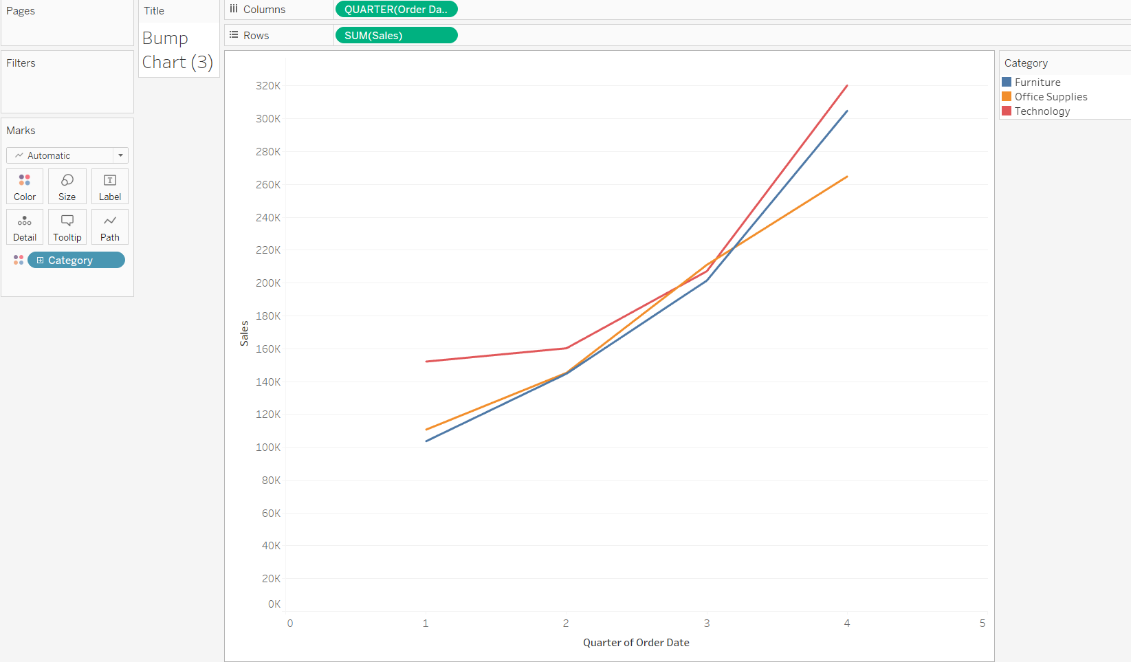
Step 1: Firstly, you require at least 2 dimensions and 1 measure as shown below
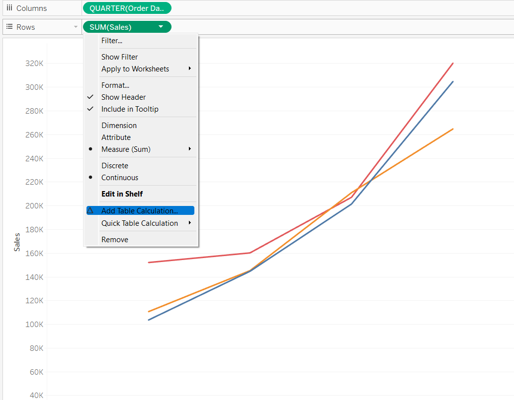
Step 2: A quick table calc can be used to rank the two different dimensions we have added. The option for this can be accessed as shown below. Note: the measure value must also be set to continuous instead of discrete:
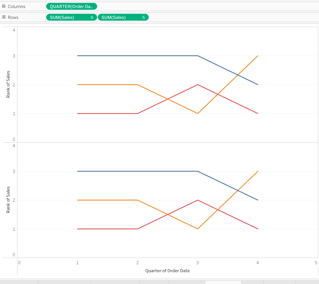
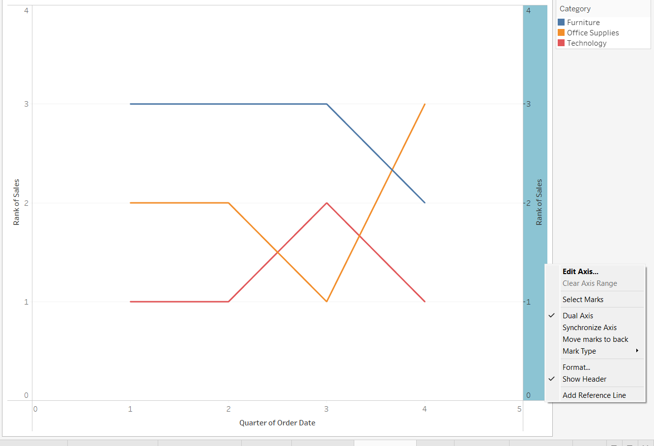
Step 3: For us to be able to create a bump chart, we essentially require a line graph and a circle graph on top of each other to create the visual we desire. We do this by duplicating our measure and adding it beside our original measure in the rows section of tableau:
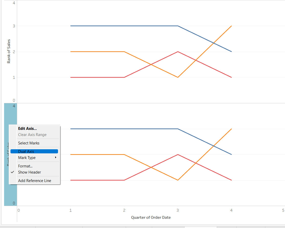
Step 4: We then have to select the dual axis and synchronize axis options to get them to overlay. Then change the duplicate measure to a circle graph in the marks pane.
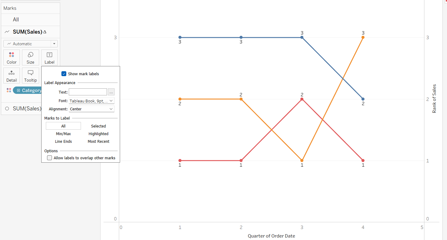
Step 5: Use the marks pane to show mark labels and adjust alignment if necessary to best display the rank number for each mark. You can also adjust the size of each 'bump' according to your preference. You can also make the circle graph a shape graph instead if you prefer.
Step 6: Enjoy!
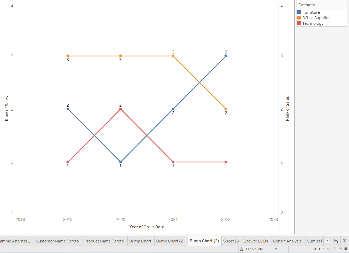
Here is our bump chart created from the previous 6 steps. It allows us to see the rank of sales between the 3 different categories over time. As we can see, furniture has risen from the depths to become a force to be reckoned with:
Bump charts can be an effective way to display rank over time to users, but it fails where you need to show magnitude or where proportion may be important to be visualized. A good use case of bump charts you may have come across before, is a league table over time in sports such as football. Feel free to play around with the settings and adjust your bump graph to your liking with custom shapes, colors and more!
