


Butterfly charts are a great way to show a comparison between two values. In two recent Makeover Mondays, I have decided to build butterfly charts to visualize the data. What I love about butterfly charts is that they are fairly simple to create and look visually appealing.
Elements needed for a butterfly chart:
- Two measures split by your groups or one measure that you can filter to specific fields
- One discrete dimension
How To:
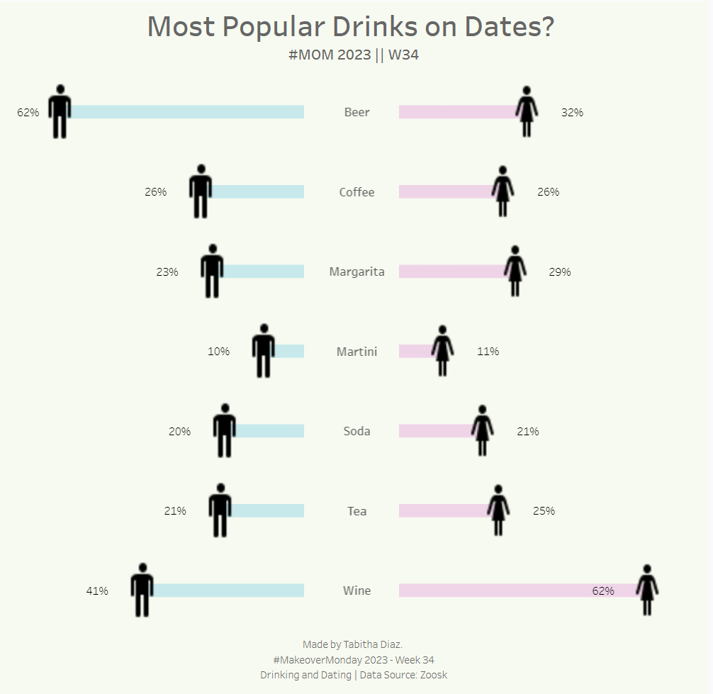
For this example, I will be showing you how to build my Most Popular Drinks on Dates dashboard. I'm using this as an example because the data is nicely prepared for such a use case and it doesn't involve creating calculations, so it's a great starting point if you're interested in learning the pieces of a butterfly chart.
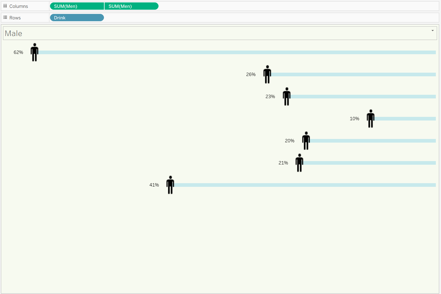
To begin we are going to create this view for the left side of the butterfly.
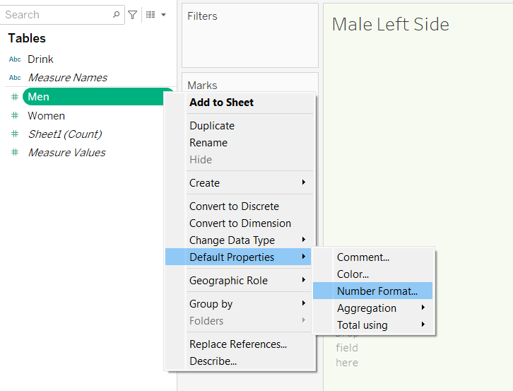
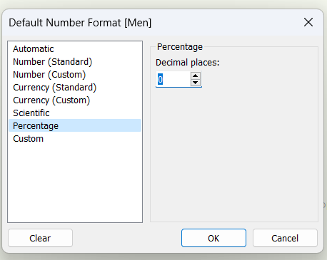
To begin, we want to confirm that the data is in the format we want. I have decided to convert the data to a percentage. Since I will be using the percentage for all fields I have opted for changing the 'Default Properties'. This can be done by right clicking the field scrolling down to 'Default Properties', selecting, 'Number Format', and changing it to the format you want. Here I have selected percentage with zero decimal places and clicked 'ok'.
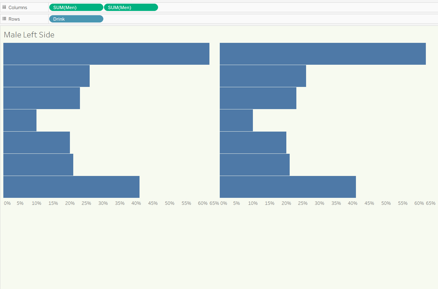
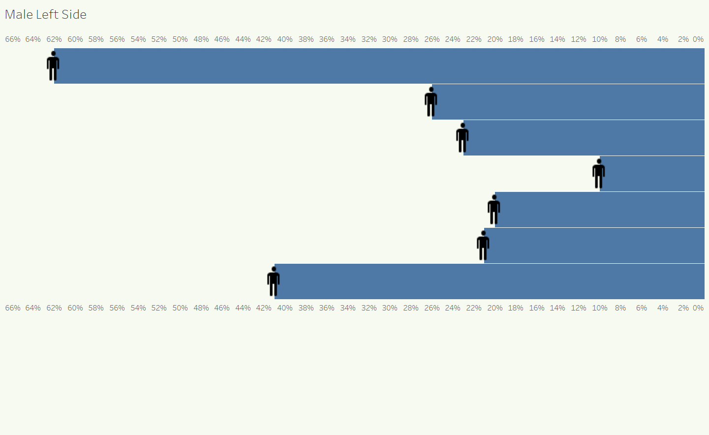
Now, we are ready to build out the chart. Begin by dragging on 2 Men fields on columns and Drinks on to rows. You should have the following image.
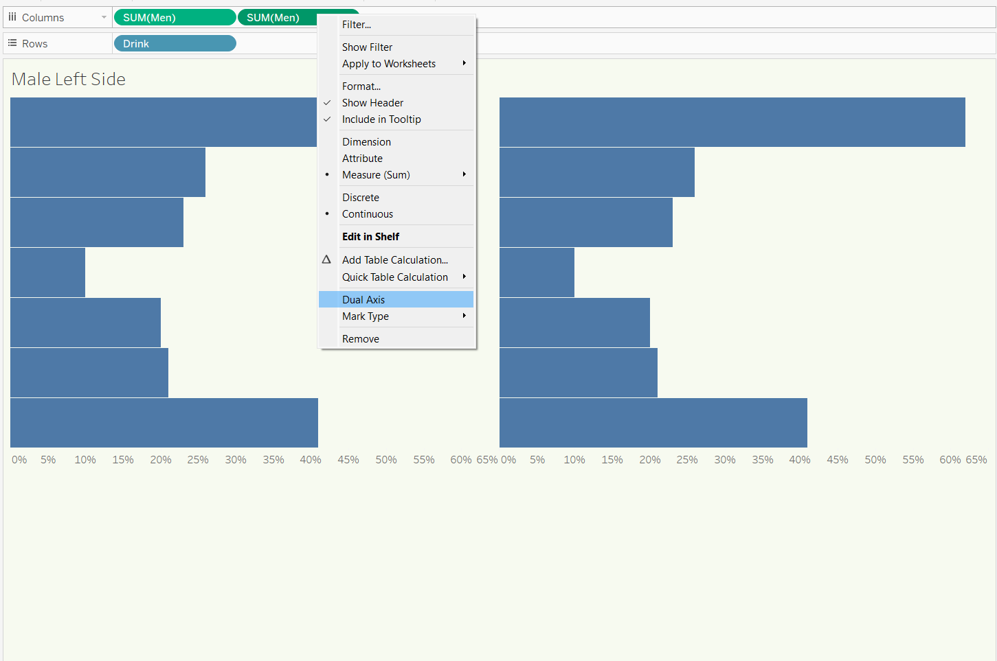
Now, we are going to dual axis SUM(Men) so both bars are displayed on one axis. This is done by right clicking one of the green pills and selecting 'Dual Axis'.
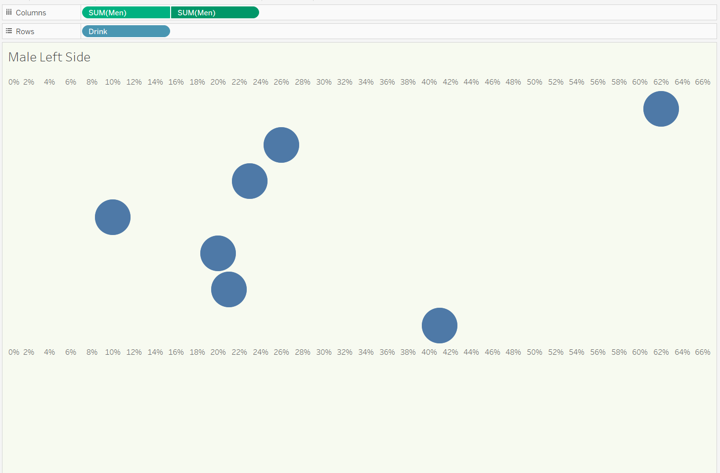
Now, both fields are displayed on the same axis. Since the marks card is set to automatic they are now displayed as dots. Let's go an change that.
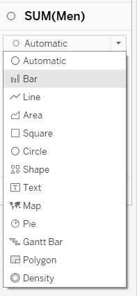
Heading into one of the individual mark cards select 'Bar'.
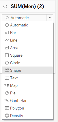
Now go into the second mark card (technically the 3rd) and select shape. I then went into shape and selected more shapes then gender.
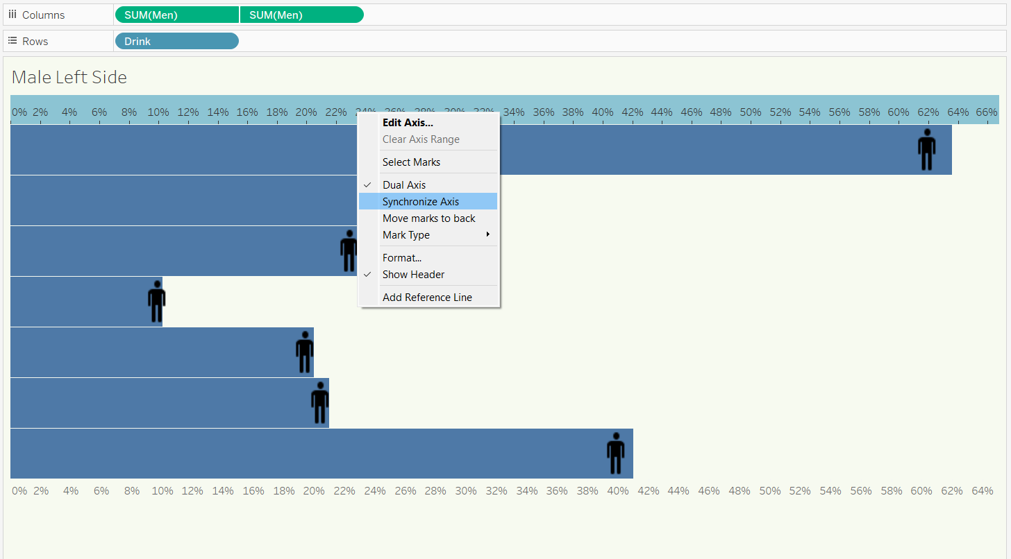
Below is how the chart should look after completing the above steps. However, with all the changes the axis is no longer synchronized. Right click one of the axis labels and click 'Synchronize Axis'.
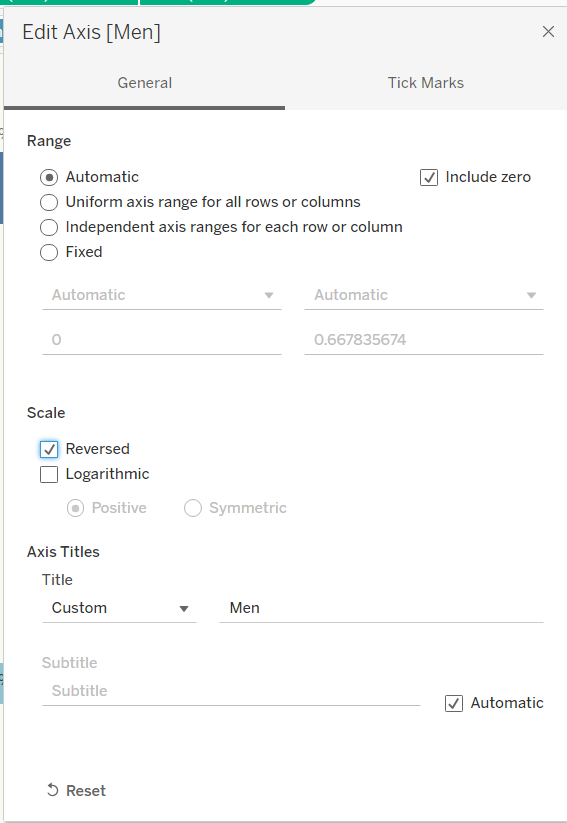
The last step will be to click on the axis again and select 'Edit Axis...'. The below screen will pop up and you will have to check 'Reversed'. By clicking this Tableau will reverse your axis with the number going from greatest to least.
At the end you should be left with the below.
Now, it is left for you to hide axis labels and format your bars images however you like.
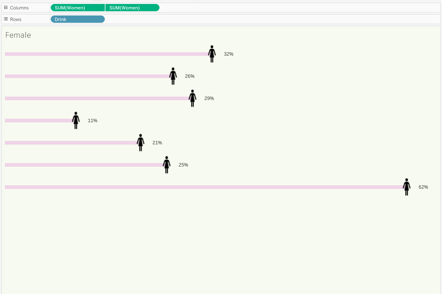
To create the right side you will do the same EXCEPT for the reversed axis part. By doing that you will have the right side of your butterfly.
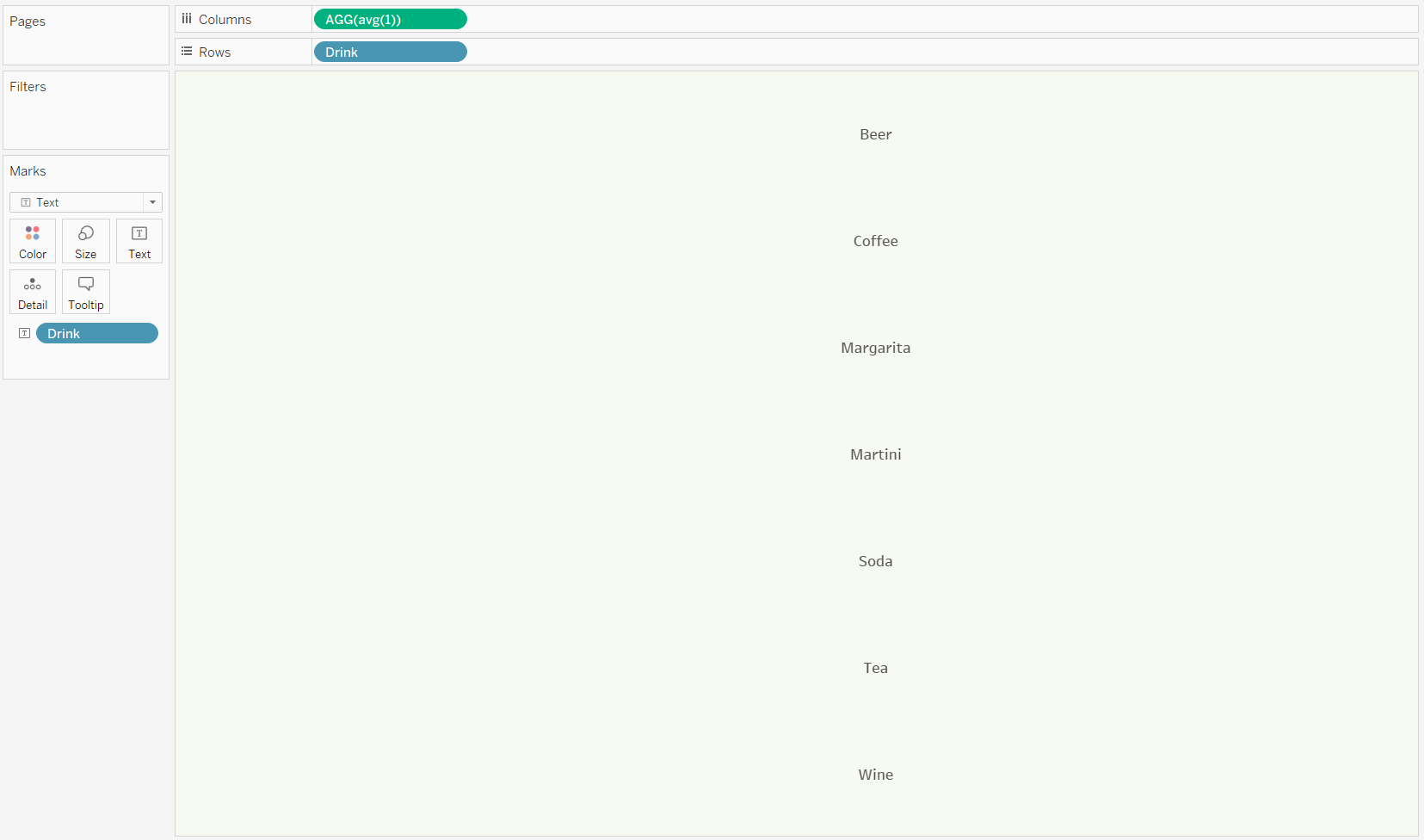
Now, lets create the middle of our butterfly. To do this we will create a dummy field, which I set up as AVG(1). Place Drinks into your rows field and place it into Text as well in your Marks card. All that is left to do is some formatting on the axis to center the text.
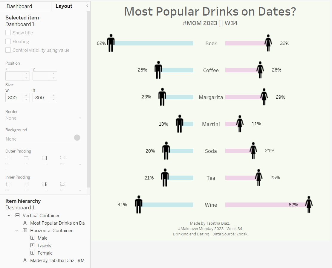
The final step in the process is to bring everything together. Begin a new dashboard and begin to place all your charts in a Horizontal Container. Work on the formatting and any additional elements and you are all done!
Want to give it a try? The dataset can be found on the Makeover Monday website.