


Dashboard week is quickly coming to a close and for day 4, we got to work with data that contained information from Spotify and Youtube on the top 10 songs by various artists.
The data - https://www.kaggle.com/datasets/salvatorerastelli/spotify-and-youtube
At first glance, the data was relatively clean and I expected to jump right into Tableau. However, that didn't end up being the case because of the specific chart I set out to build.
Wireframe
Dashboard week has been more fun when I attempt something I've never done before. Today was no different. I decided I wanted to give it a go with a radial bump chart, because of that my wireframe was more straightforward than my other projects.
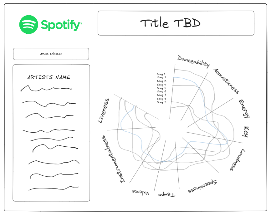
As you can see from my wireframe I wanted to build out a parameter that allowed the user to select a musical artist and display the songs/ a description of the artist on the left-hand side.
Since the data was clean I immediately hopped into Tableau. I decided to create a bump chart with the data in its current form.
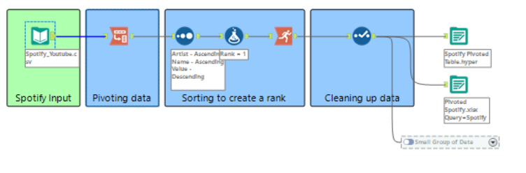
This is where I ran into an issue because to create the calculations to make this circular I would need to make sure that I had a singular field and in this make, I had to use measure values which wouldn't work. I went back to the drawing board and decided I needed to pivot my data to have it in a workable format.
Data Prep
In this workflow, I pivoted the data I needed which were the values shown above. I then used the sort tool to organize the data in the way I needed. I then used a formula tool to create a fake rank with the value of one. I then used the running total tool to generate a rank for each value. The last step was to clean up the data and output to both a hyper and Excel.
The reason I created an output for Excel was to perform some calculations for the curved lines. The final product looked like the below image.
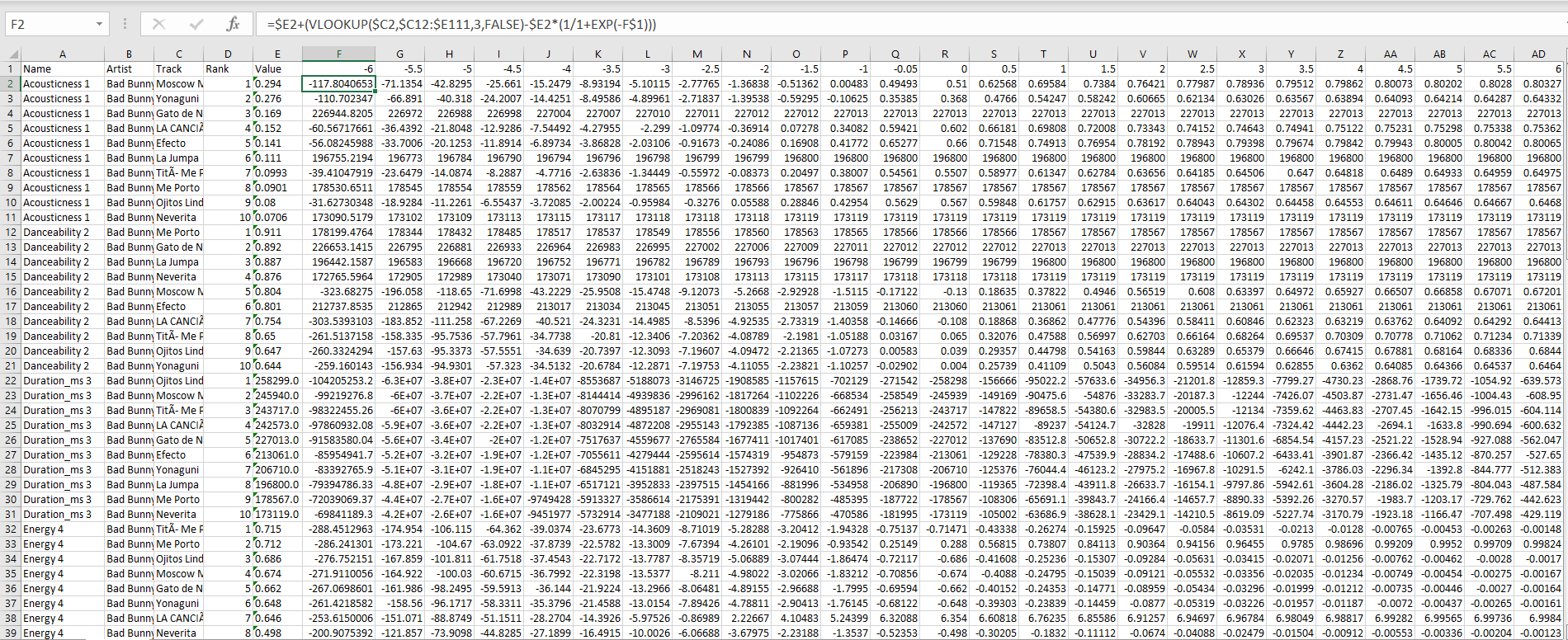
This is where I spent the majority of my time and it was great to get some Excel practice after a long break.
Tableau
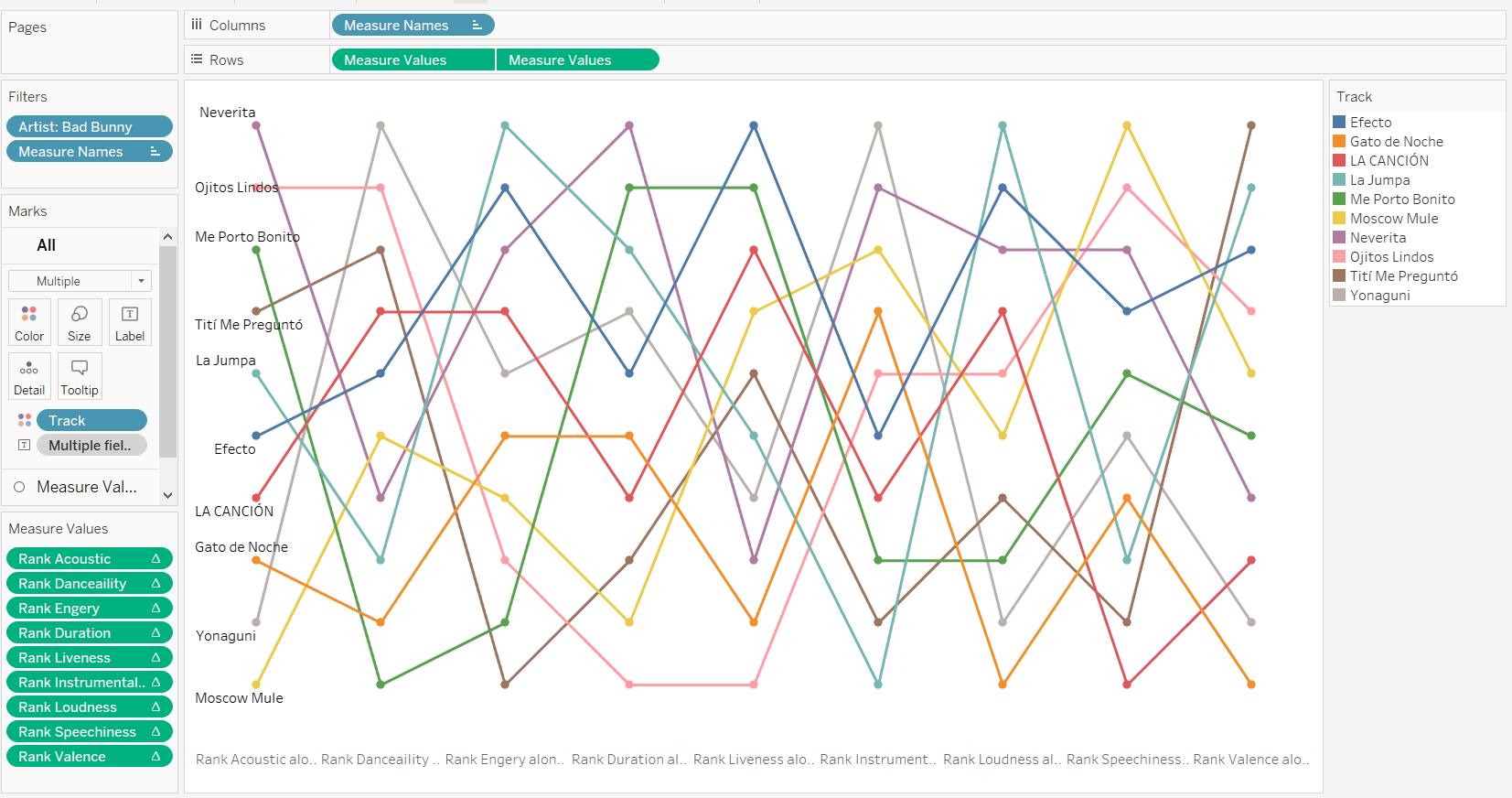
Due to the fact that I spent so much time in calculations and understanding the math needed to create a radial bump chart I had to switch the plan for my dashboard.
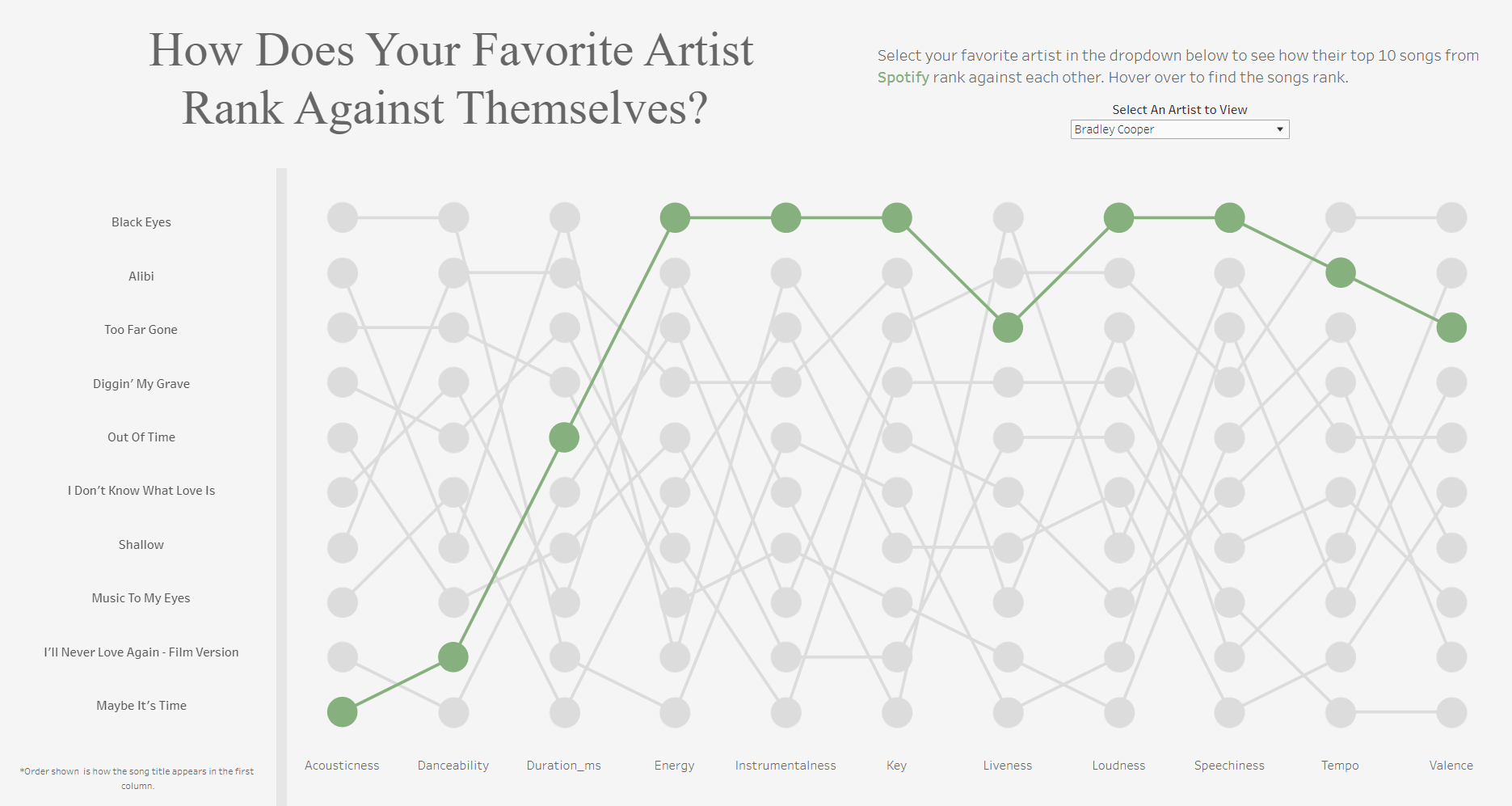
Today was a great lesson in pivoting when things don't go according to plan. Even though I wasn't able to create the chart I wanted I was able to make another plan that I knew I could execute in a tight timeframe.